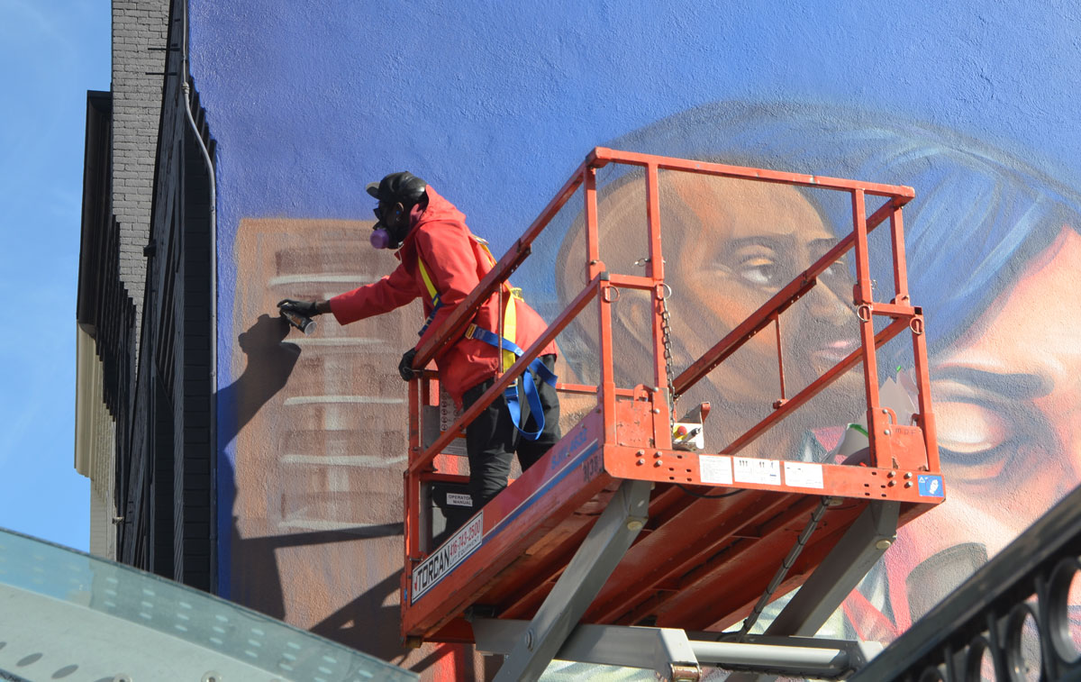
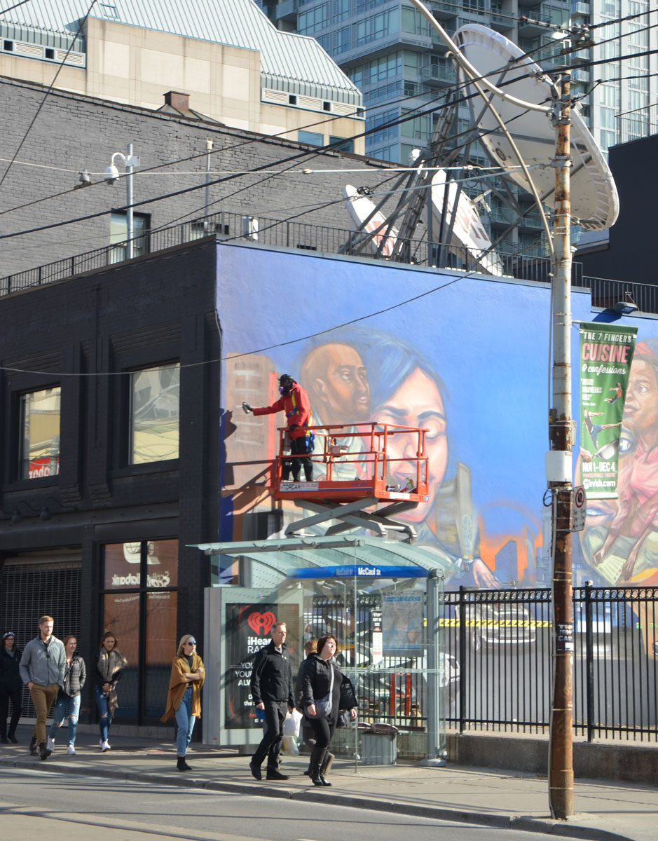
I happened to be walking along Queen Street West this afternoon when I spotted something new…
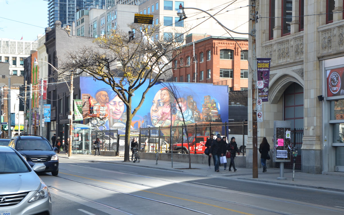
A large mural on a wall by the CP24 parking lot by elicser
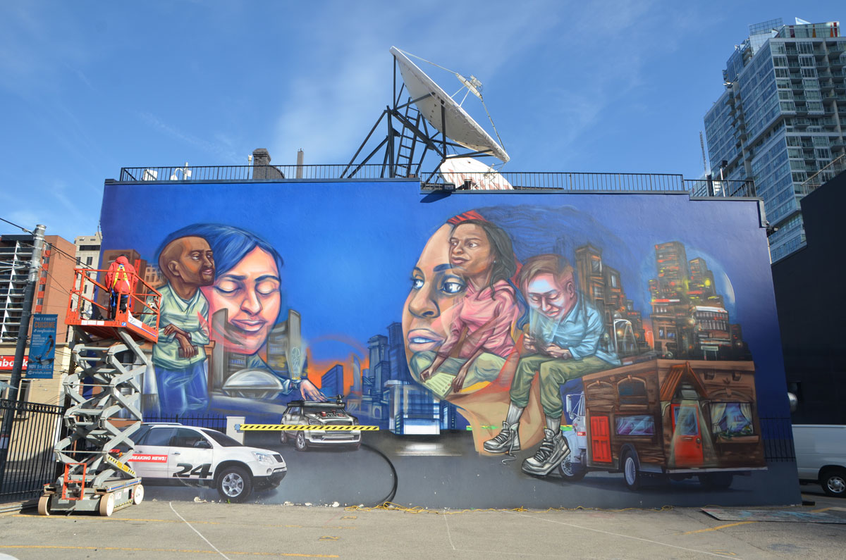
with the artist himself, putting on the finishing touches to the mural.
I happened to be walking along Queen Street West this afternoon when I spotted something new…
A large mural on a wall by the CP24 parking lot by elicser
with the artist himself, putting on the finishing touches to the mural.

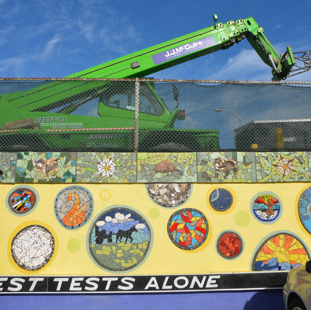
Coxwell subway station is still in the midst of its renovations and upgrades. As part of the project, the wall on the west and south sides of the station have been painted a bright yellow. This yellow was then the canvas for a large number of mosaic creations.
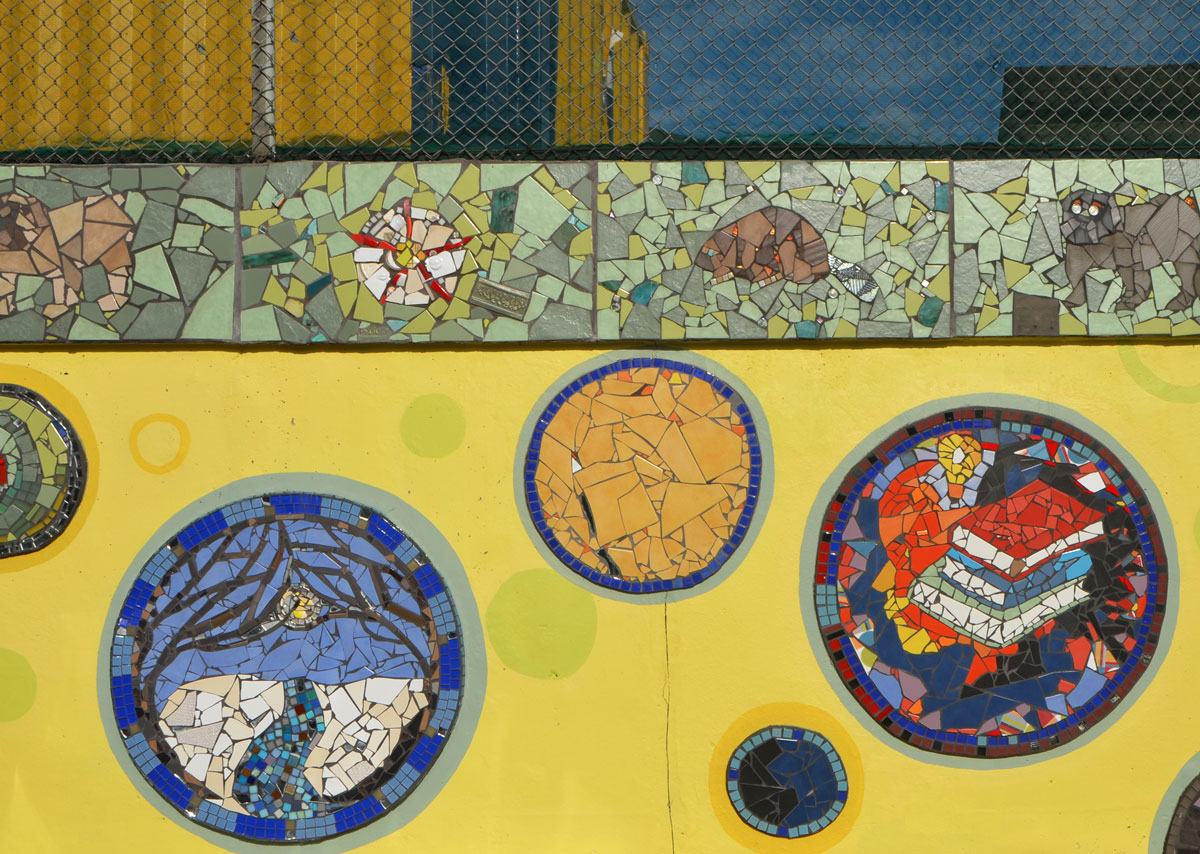
below: The new mosaic mural covers the wall alongside the pathway that leads from Coxwell station to the Danforth. The murals painted on the side of the Sunset Grill restaurant, on the opposite wall of the path, were there previously.

below: A beaver made from bits and pieces – with round eye and two large teeth.

below: At the corners of the mural are seed pods that have released their seeds to the wind.

below: The south side of the subway station is adjacent to a Green P parking lot on Danforth. Along this wall, a quote by Agnes MacPhail has been added below the mural. “We meet all life’s greatest tests alone”. Agnes MacPhail (1890-1954) was the first woman to be elected to the Canadian House of Commons where she served from 1921 to 1940. After her time in federal politics, she represented the provincial riding of York East in the Ontario Legislature. In 1951 she was responsible for Ontario’s first equal pay legislation.
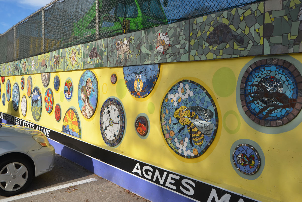
below: West side of the wall, looking towards Strathmore Blvd.

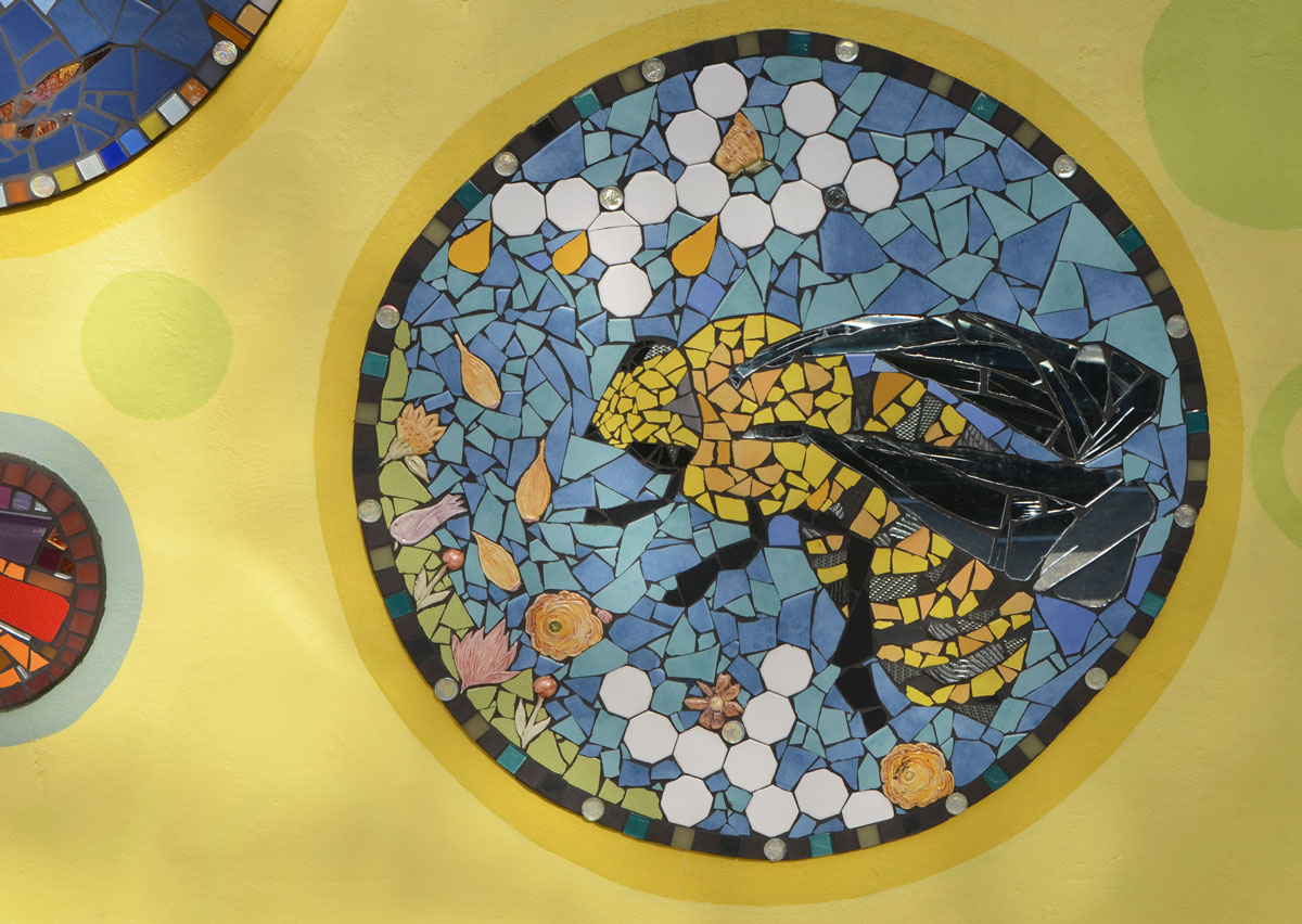
below: A mosiac bee amongst the flowers…
below: … and a real bee sitting beside a mosaic red rose.

below: Two mosaic pieces, a circle with the names of the artists and a semi-circle rainbow with the names of those who contributed to the creation of the mural. The transcription of the words is given below.
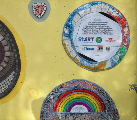
Lead Artist: Cristina Delago,
With Boloebi Charles Okah, Bronwen Parker, Holly-Jo Horner, Jing Tian, Karen Roberts, Melanie Billark, Robin Hesse, Sarvenaz Rayati, Shae Stamp, Shashann Miguel-Tash, Skyy Marriot, Somayeh Nasiri, Victor Fraser, Will Spratley.
Special Thanks: Woodgreen Community Services, Dulux Painter, Tomasz Majcherczyn, Cathy & Barry Joslin, Cercan Tile, Jacqui Strachan, City Councillor Janet Davis, Jeff Billiard, John & Ed at Danforth Brewery, Mark Wrogemann, Clara Lou, Eleanor Ryan, James & Cooper, John Kenneth & Cherie Daly, Lowe’s, Maisie Fuss, Melanie Morris, Michelle Yeung, S. Dimitrakpoulos, The Vogls, The Zeelie-Varga Family, Wyatt & Teagan, as well as Laurie, Chantal and Gavin

First I heard a rumour that the Art Gallery of Ontario was going to remove that sculpture from the corner of Dundas & McCaul, you know, the one that everyone climbs on and takes their picture with, the one near the AGO entrance.
Then I read about in a newspaper.
You know, that curvy bulky slippery thing by Henry Moore, the one with a title that’s almost as shapeless as the sculpture, “Large Two Forms” although no one calls it that. Oh, what do they call it anyhow?
Then I read about it online.

It’s sat on that corner since 1974. That’s 42 years. Longer than the average Torontonian has been alive.
Can you say synonymous? …. as in synonymous with the corner of Dundas and McCaul.
Apparently it’s going to be moved to Grange Park. That’s the park behind the AGO, the one that is being renovated.
The expression “Rob Peter to Pay Paul” comes to mind.
How about new public art for a renewal of the park?


But walking the site and looking at the plans made me start to think. The sculpture is being moved into its own space in the park and as I looked at the drawings and the artist rendition of the future space, it dawned on me that the redesign of Grange Park was possibly (probably?) done specifically to accommodate the sculpture. The Art Gallery owns Grange Park after all. Toronto does a lousy job of placement of their public art so maybe I shouldn’t complain about this?
Maybe.
As I tried to take photos of the sculpture where it is, I was reminded of how the streetscape in Toronto gets short shrift.

Henry Moore competes with old poles as well as bus shelters that are designed to maximize Astral Media ads. At least there isn’t a ghastly trash bin beside the sculpture. And at least the art is solid enough and strong enough to hold its own.
But this is going to be a problem for any artwork that gets put on that corner.
Oh dear, assuming that something will replace Henry Moore?
Don’t mess it up even more AGO, don’t leave the corner empty.
We have more of a cultural memory than you give us credit for.
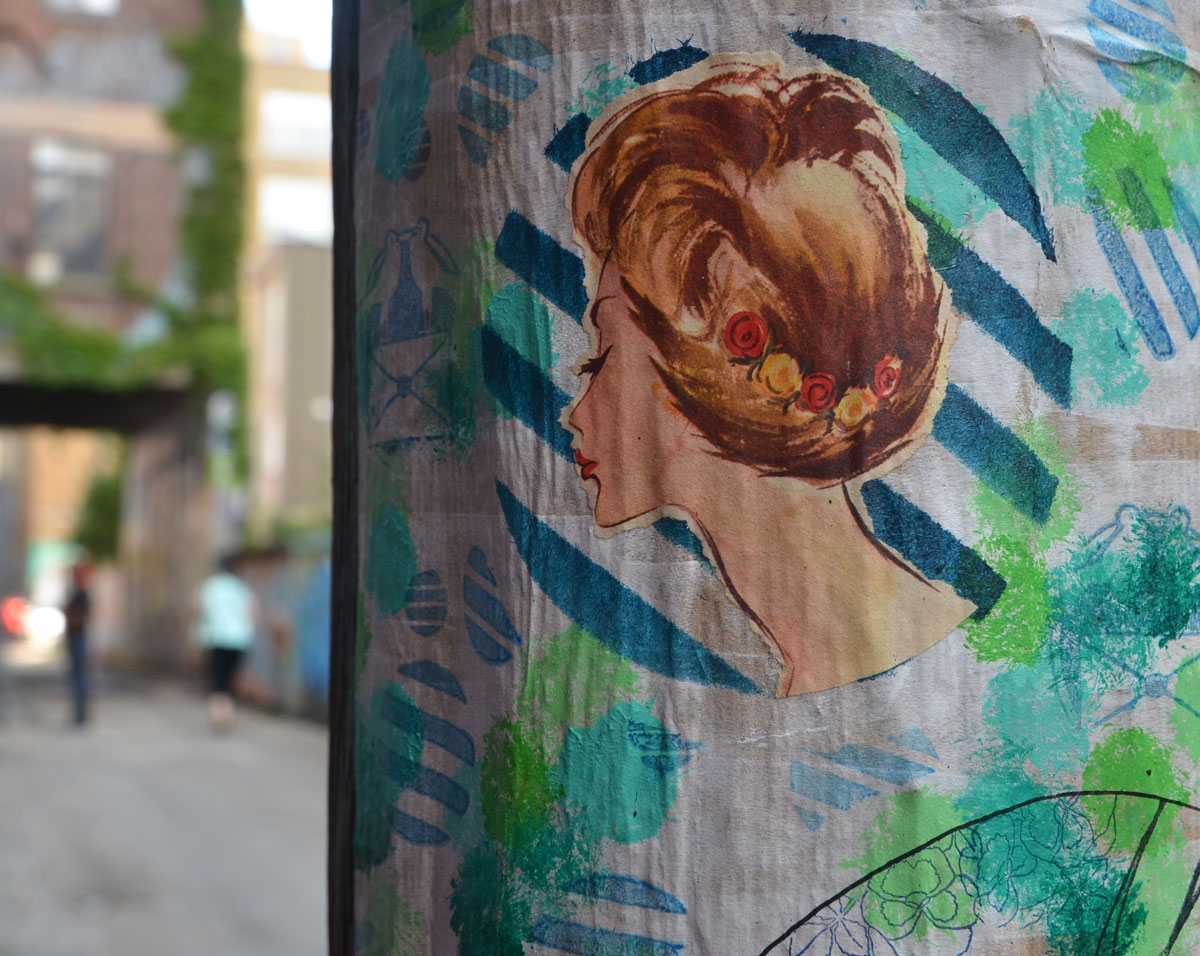
On a hydro pole in Graffiti Alley, facing more to the nearest wall than to the alley, I discovered an intriguing collage. It was made of a series of pictures, old-style coloured pictures of women who look like they’d be more comfortable in the 1940’s and 1950’s….they’re straight out of vintage magazines.
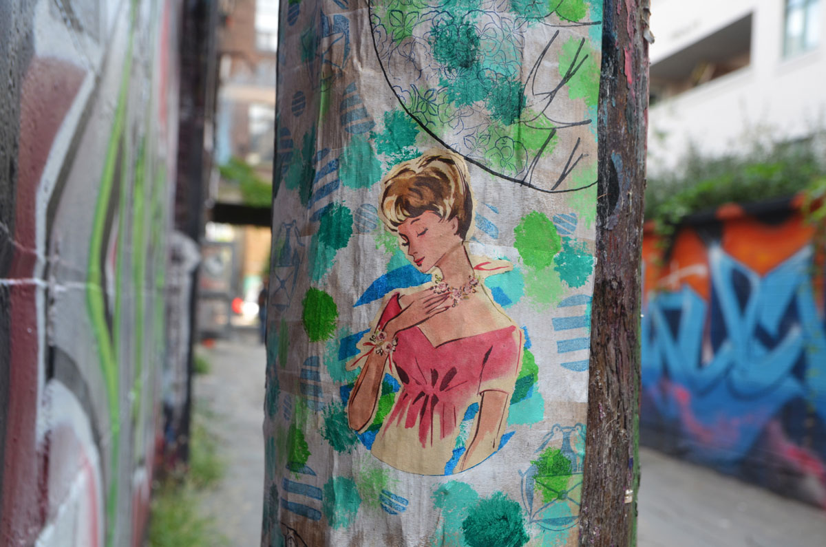
below: A signature on the bottom of the artwork, Mademoiselle Berthelot. She’s a street artist from Paris who recently left her mark in Toronto.
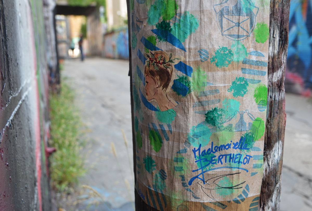
Stylish women, like this one with long white gloves, surrounded by circles (bubbles?). Circles made with splotches of paint and blue striped circles made with rubber stamps.
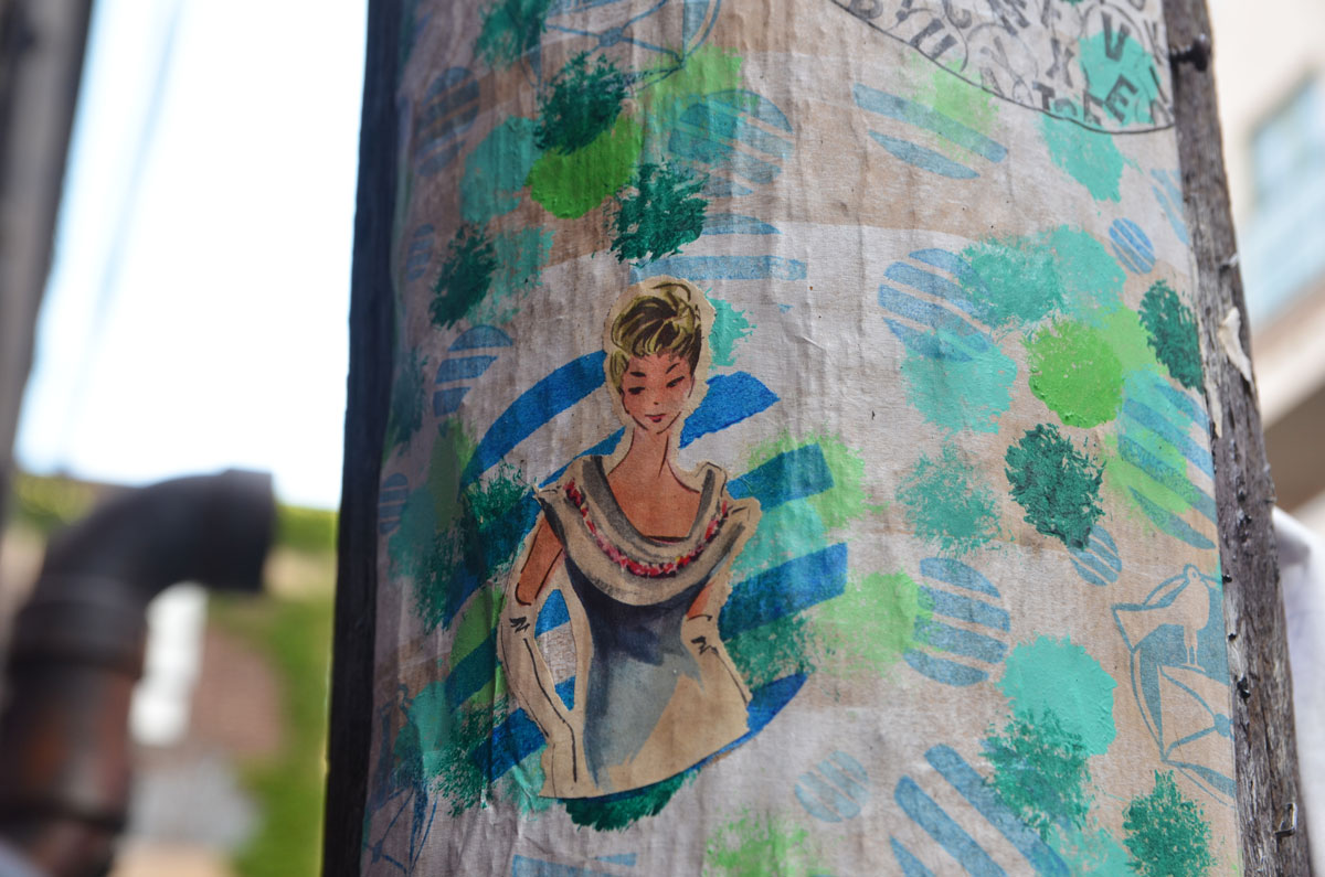
If you look closely, there are pairs of birds sitting together on top of sealed envelopes.

So far, this is the only piece I’ve seen by Mademoiselle Berthelot. Are there more in Toronto?
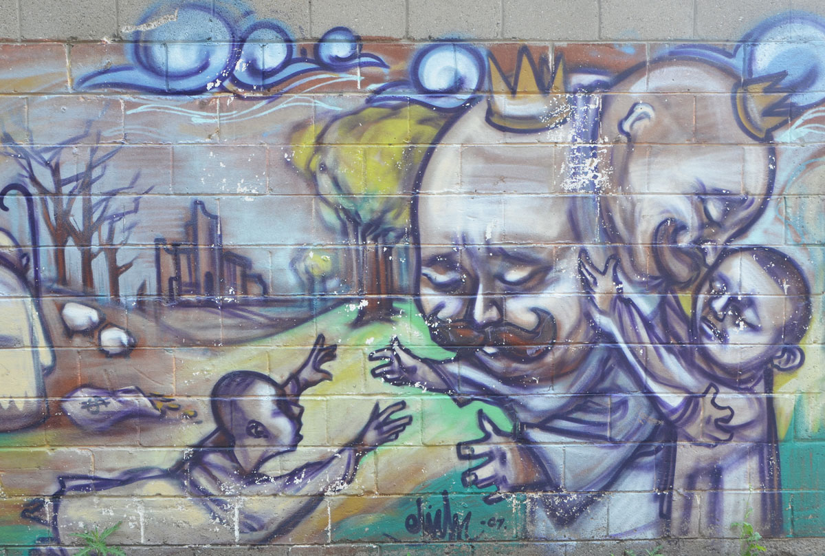
Today’s story begins back in 2007 when elicsr painted this mural behind a store that fronts on Eglinton East.

It depicts the bible story of the prodigal son. A very brief summary of the story – A wealthy king had two sons.

The younger son took his half of his father’s money, left home, and squandered the money. He fell into hard times. He realized that he would be better off as a servant in his father’s household than living in penury on his own.

So he returned home to repent. His father celebrated the return of the son and forgave him and his prodigal ways.
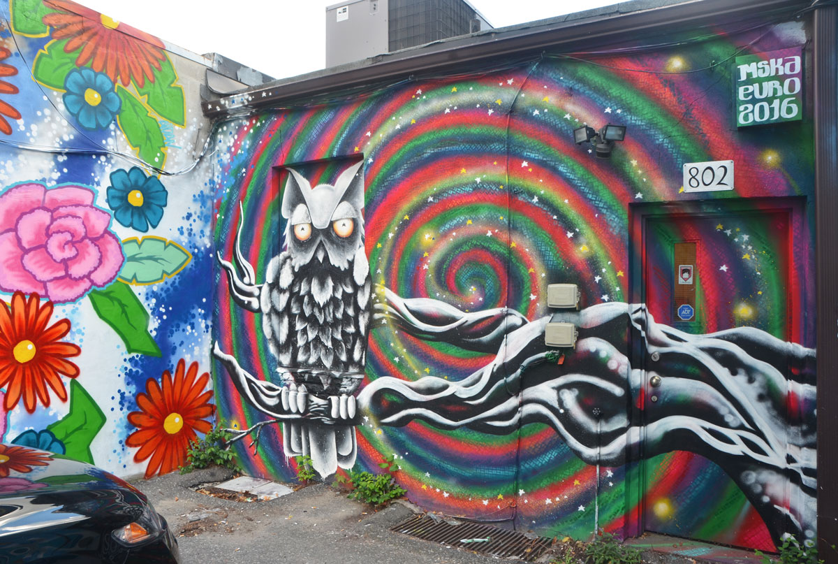
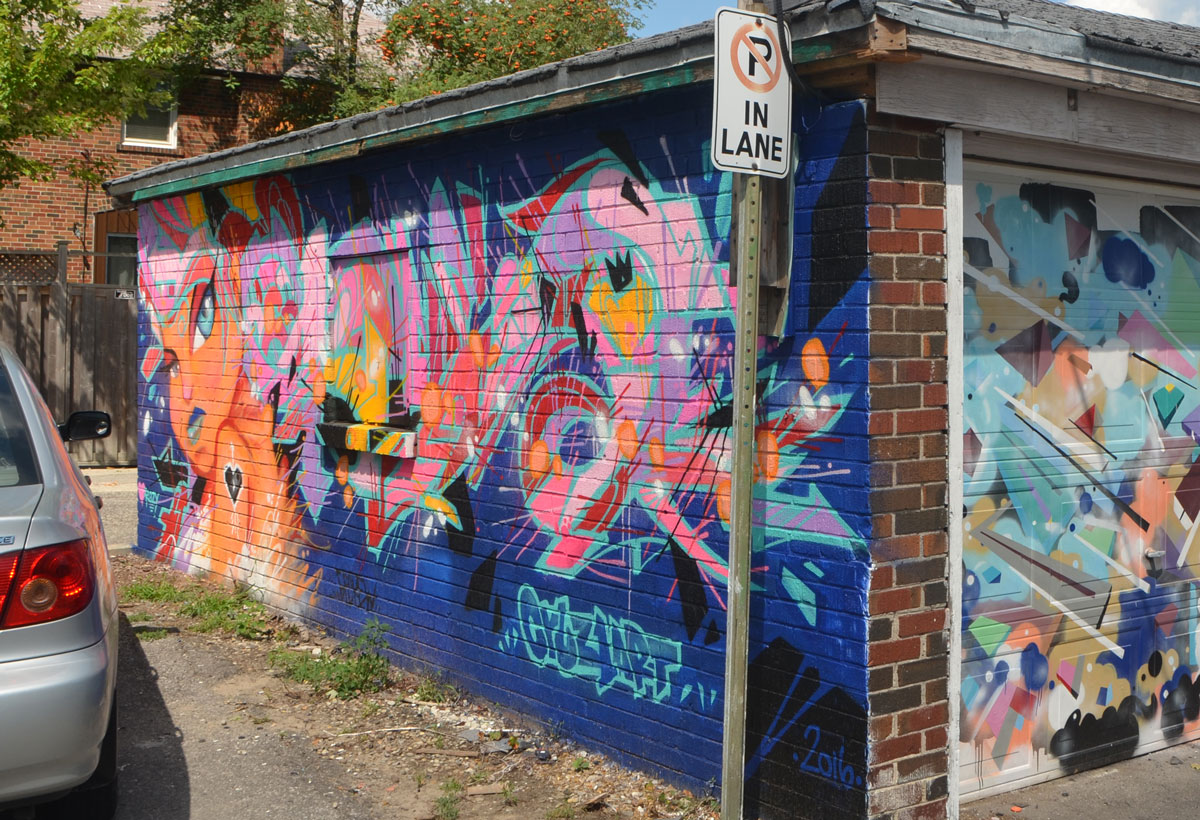
Fast forward to August 2016 when the alley became a canvas for 46 street artists and their Wall Expressions project, Go Big or Go Home. I walked the alley on Thursday and this is what I saw.
[Warning: a lot of the street art is text or abstractions which may not be your cup of tea. ]
below: Girl power skull with pig tails by dudeman.

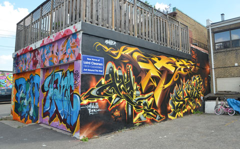
below: Under the weather vane, a newer garage door painted with a mural by Mediah IAH aka Evond Blake.
below: Black and white owl on a branch by mska
below: SPUD bombs and swirls on the back of Eco Cleaners.

below: And another SPUD creation on the other side of the lane.
A few skulls seemed to have snuck into the painting!

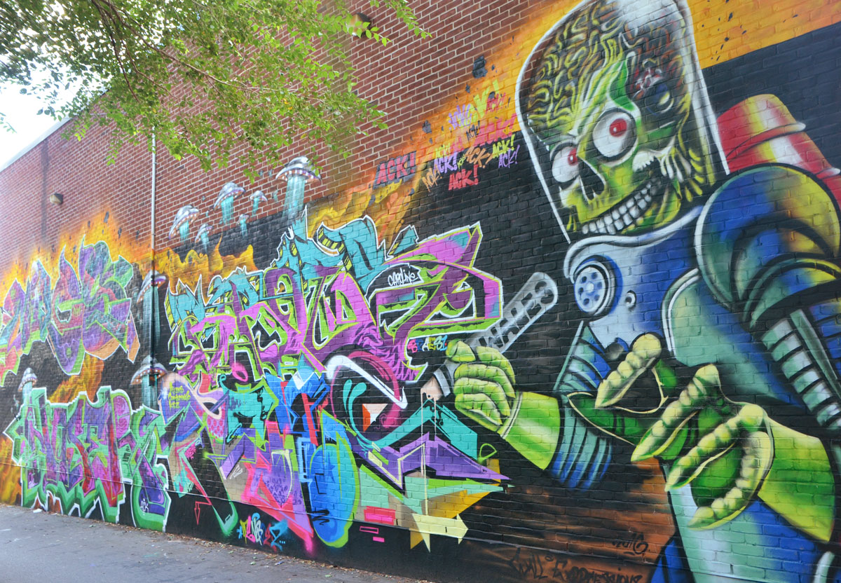
below: ‘Mars Attacks’ by the ACK crew, wales, miles, noser, braes and tensoe.
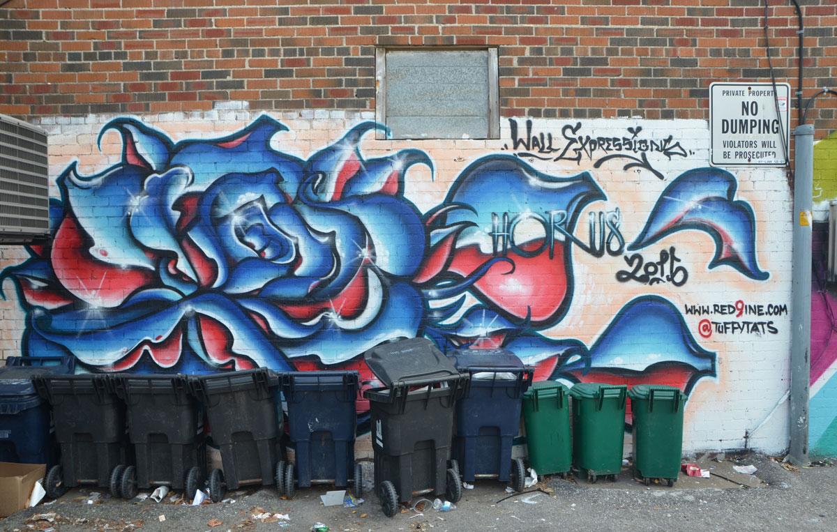
below: Garbage bins lined up in front of a horus/tuffytats rose in blue and red.
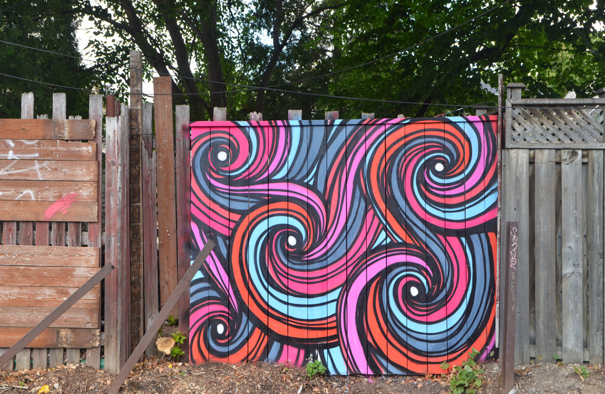
below: A swirly wavy mix of colours brighten up a wooden fence.
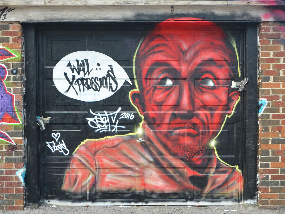
below: Red head (and shoulders) man
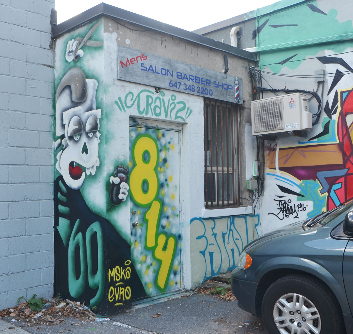
below: The Men’s Salon Barber Shop now has a mska creature, complete with scissors in hand, by the back door.
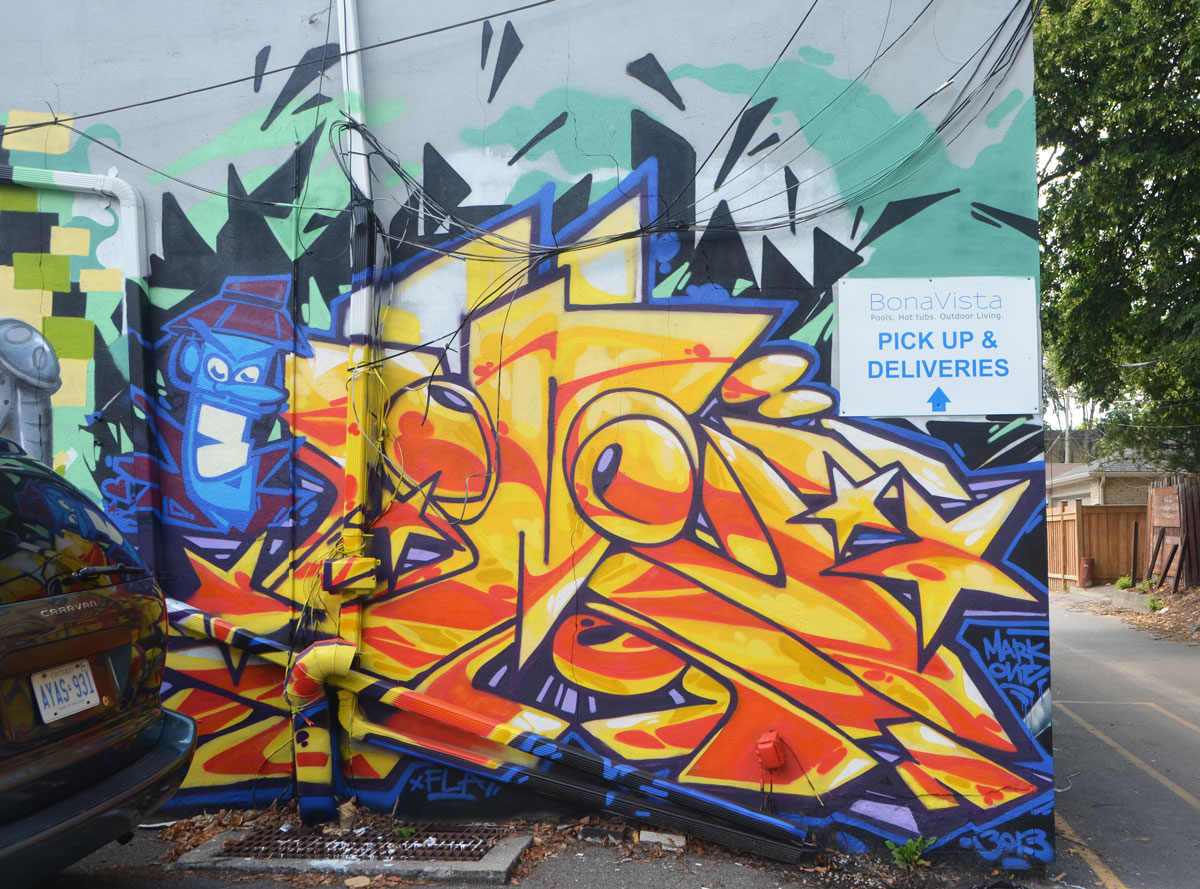
below: Next to the barber shop is this mural, or at least this is part of it. The next photo….
below: … is the end of the mural. I’m not sure who painted it but the marks on this are: Mark One, BOB (or 13013) and xFLA,.
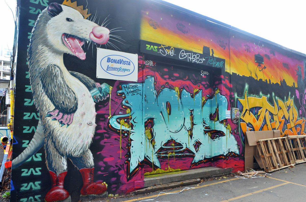
below: A mural for Loui by minus two (and others?)

below: More text and abstractions, this time by manic, roam and acuse. Loui gets another mention too.

below: In the foreground, a Nick Sweetman shrimp swims across a mural with help from peru and ctr.
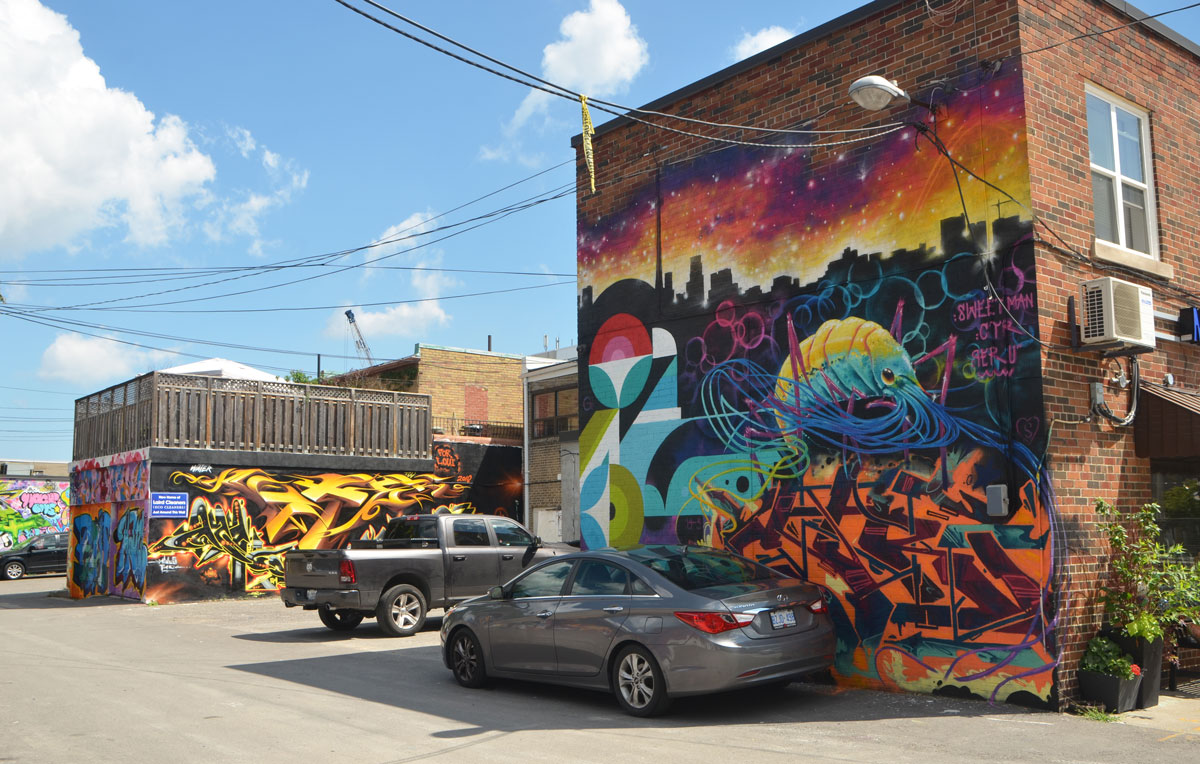
below: A closer look at that shrimp

below: Another large mural with more than one photo. At one end there’s a zas possum hanging out, spray paint can in hand – possibly up to no good?
below: And at the other end there’s another animal that is usually nocturnal, a raccoon. An animal that is no stranger to Toronto!

below: Look up, way up! There’s a dog on the roof.
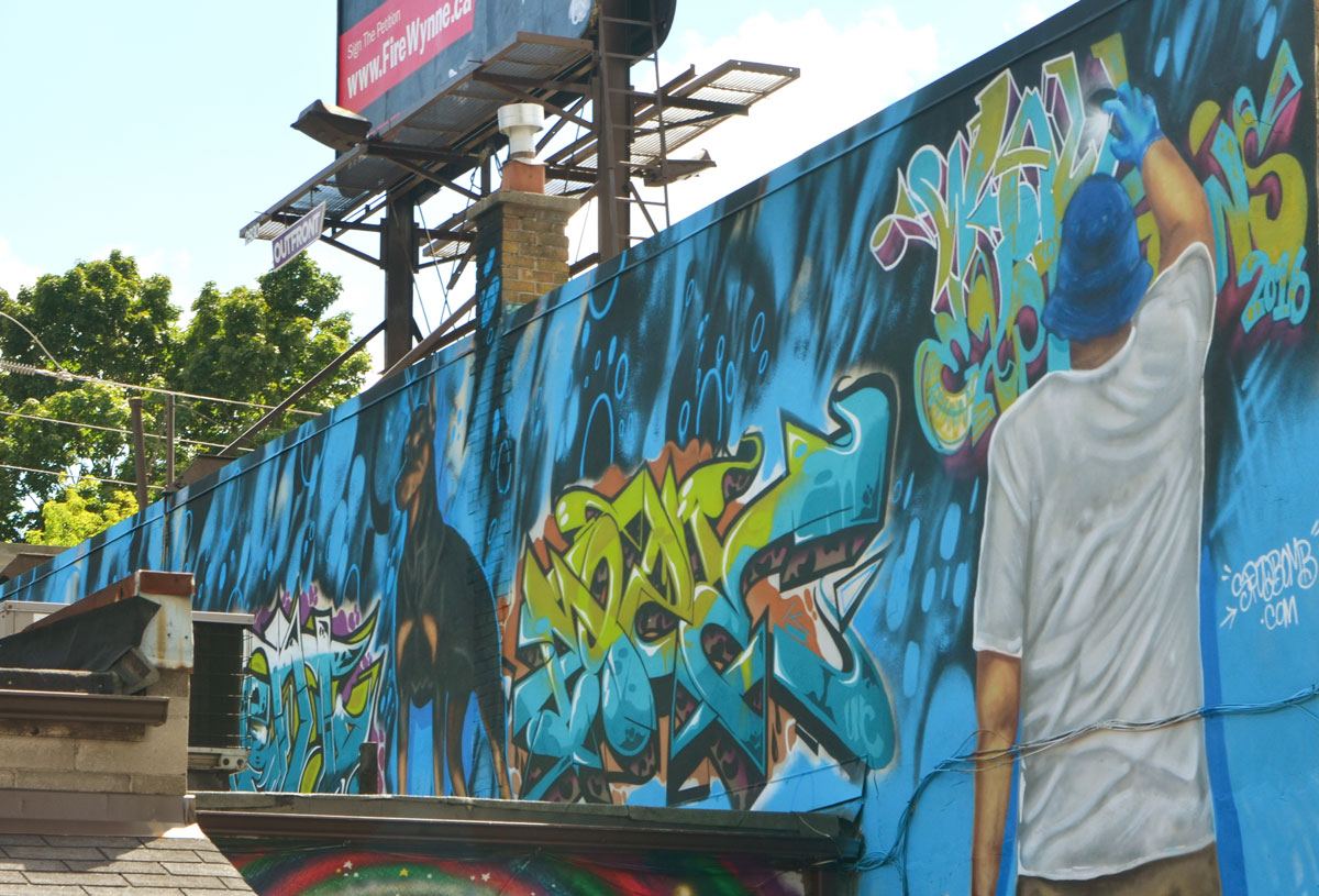
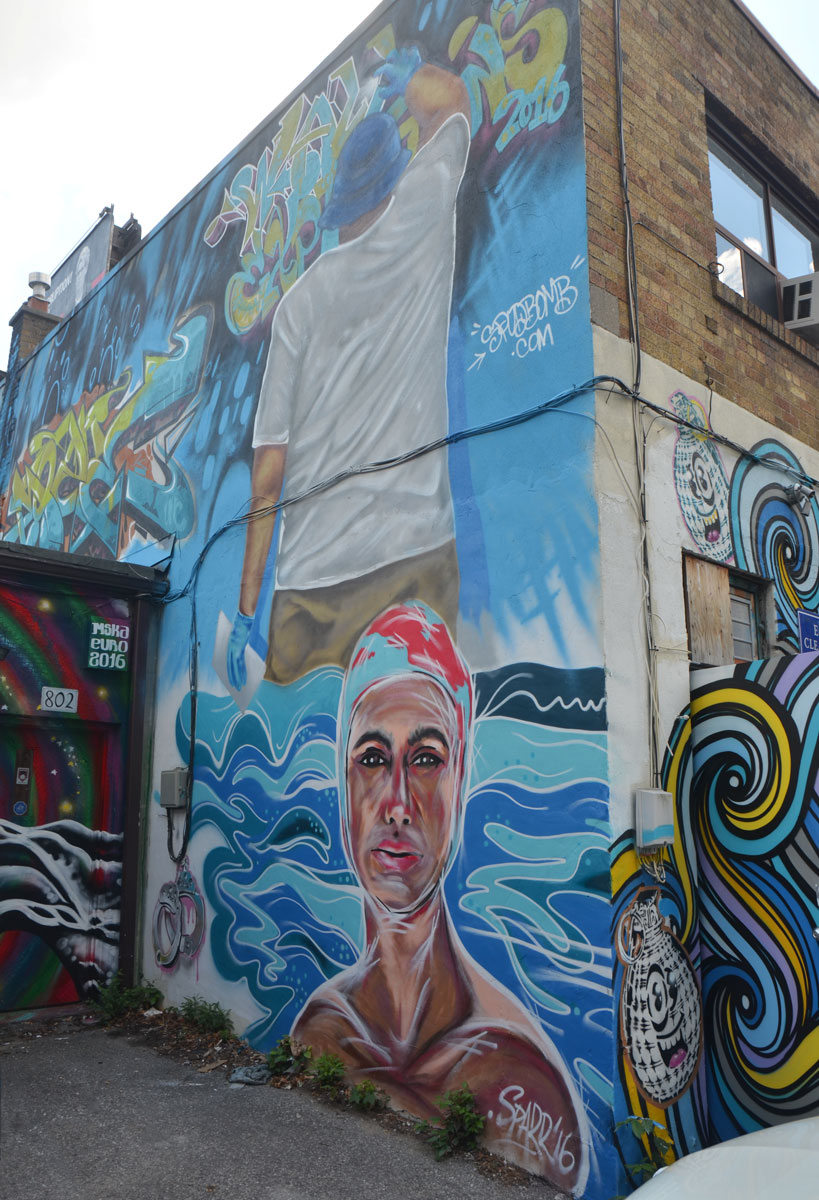
below: Swimmer with a bathing cap looking at you, by sparr
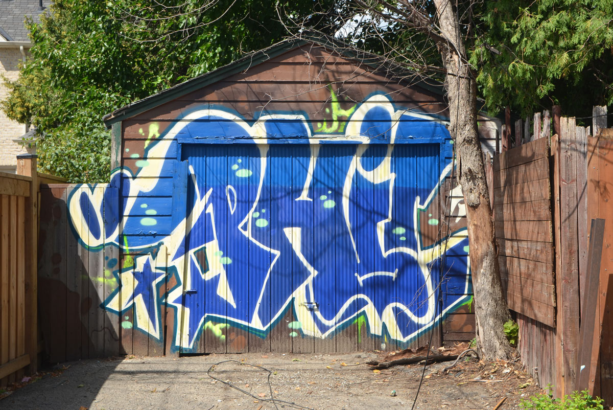
below: Phil wrote his name on a garage door.
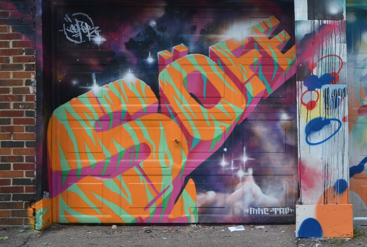
below: Sofe in orange and green tiger stripes
below: Two more garage doors.

below: Bright colours stand out on the side of this garage near the entrance to the lane.
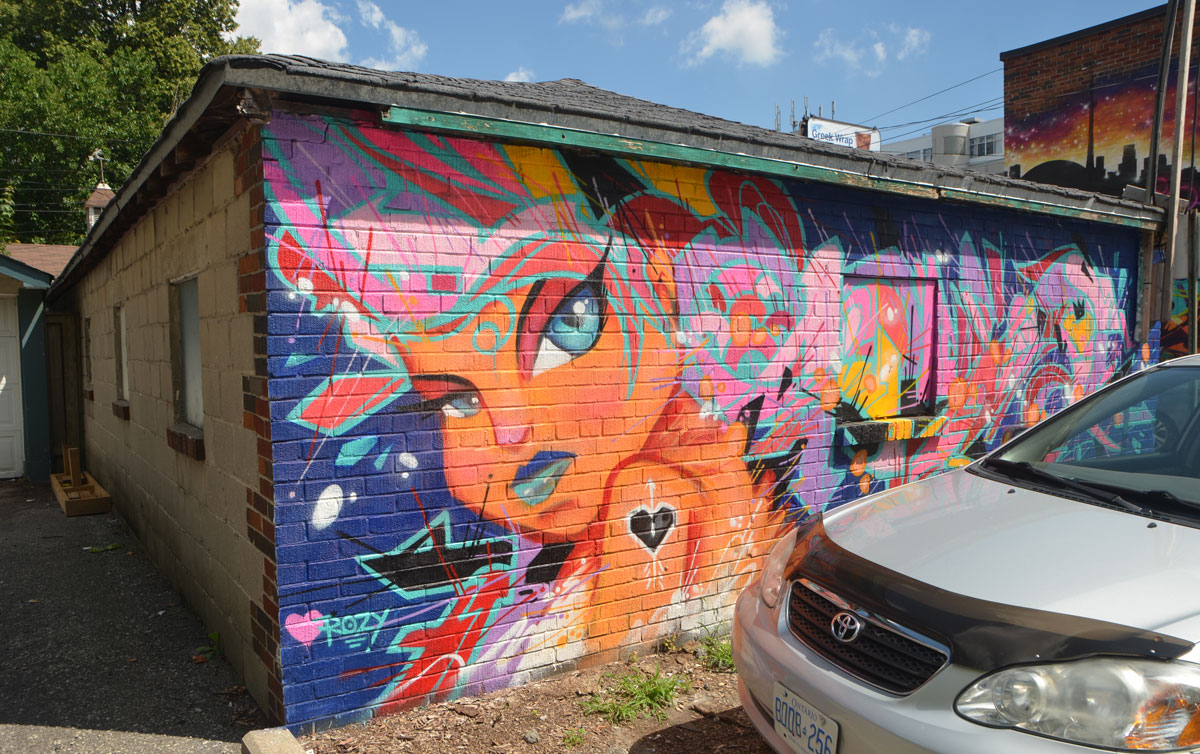
below: Rozy, from the other side.
below: someone beginning with the letter m? (m–?) and lerch.
below: Big fat P in pink by bias? at number 153

below: And last, a little snail
This project had help and support from Toronto Police (53 division), Stephensons Rental, Dominos Pizza, and StreetARToronto.
video of the event on vimeo
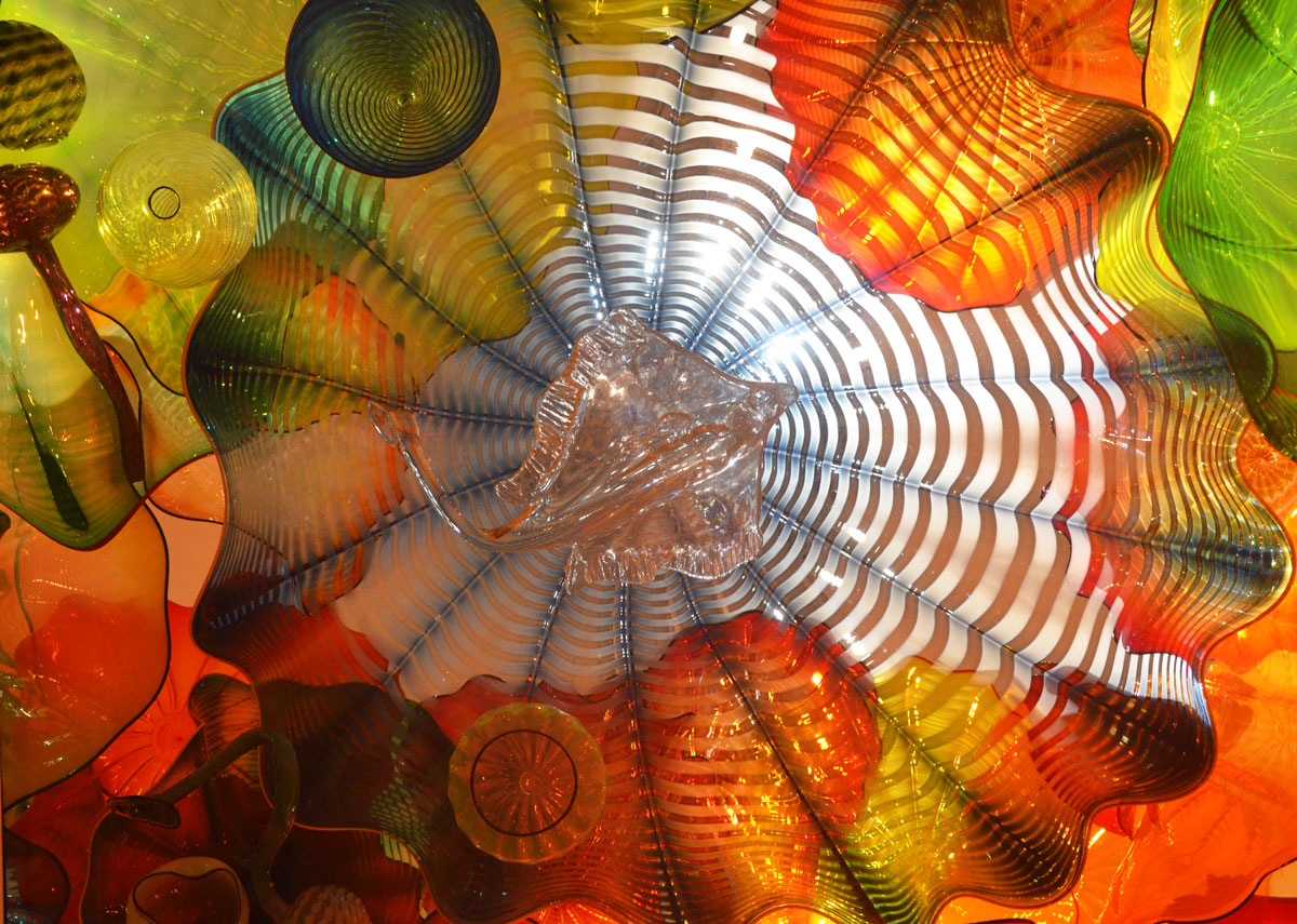
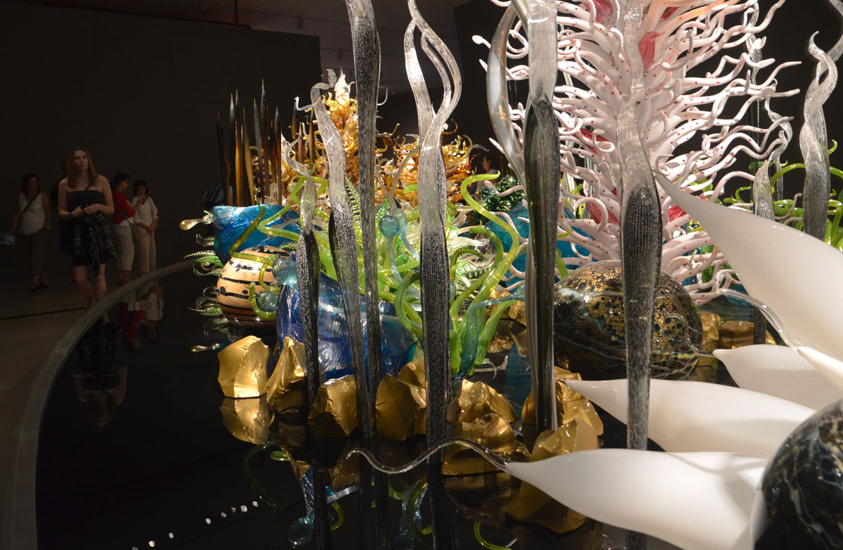
The word Chihuly in the title refers to Dale Chihuly, an American artist who has been working in glass since the mid 1960’s. At the moment there is a special exhibit at the Royal Ontario Museum (ROM) of some of the sculptural work produced by him and his team.
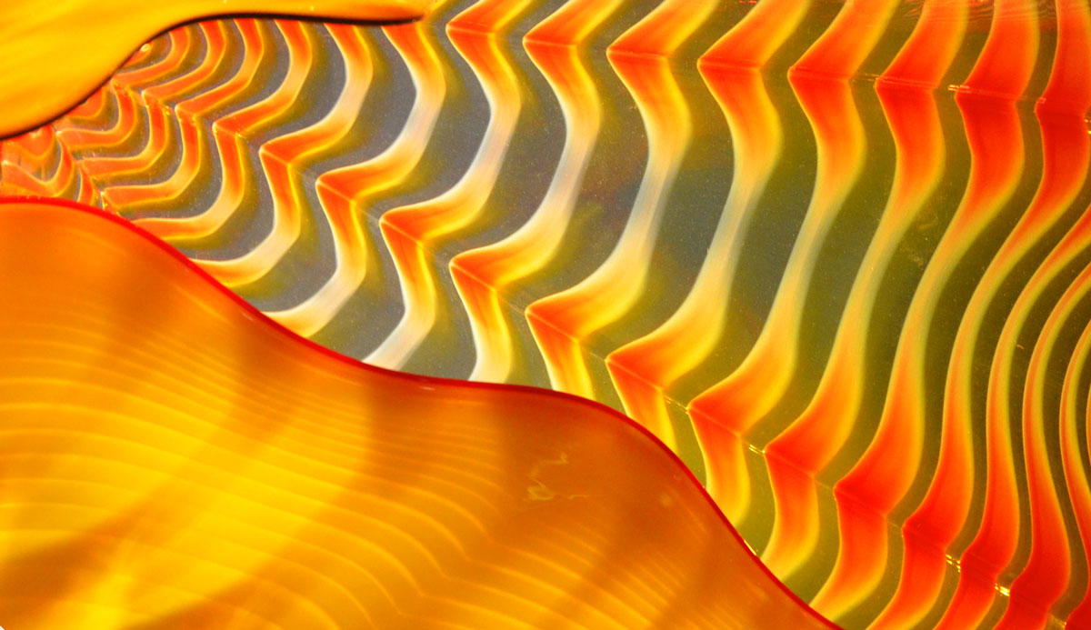
I’ve now wandered through this exhibit three times. The first time, I found it a bit overwhelming and I wasn’t sure how to photograph it. The second time I went I just looked. Yesterday I went back with my camera and tried again. I’m reasonably happy with the photos but I know that I have only captured a small part of the art. Perhaps it is enough to enable you to imagine more of it, or to refresh your memory if you have already seen the exhibit.
below: Admirers looking at “Persian Ceiling”, 2012 . Large cushions were provided for those who wanted to lie down to get a view of the ceiling in its entirety. Of course, looking at the sections up close was also fascinating. All the different shapes and colours overlap and produce new colours and textures.

below: Section of the “Persian Ceiling” installation.
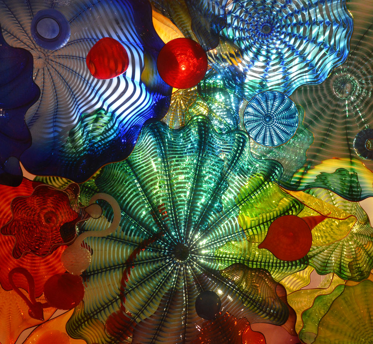
The round slight scalloped glass shapes that look a bit like flowers are called Persians. At least that’s the name that Chihuly has given them as described in this quote that appears on the wall just outside the room. “I just liked the name Persians. It conjured up sort of Near-Eastern, Byzantine, Far East, Venice, all the trades, smells, sense… I don’t know, it was an exotic name to me, so I just called them Persians.”
below: A ray swims amongst the waves of colour.
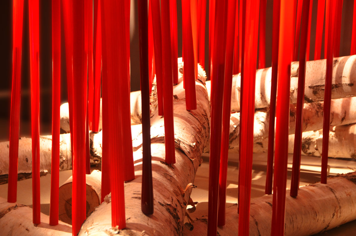
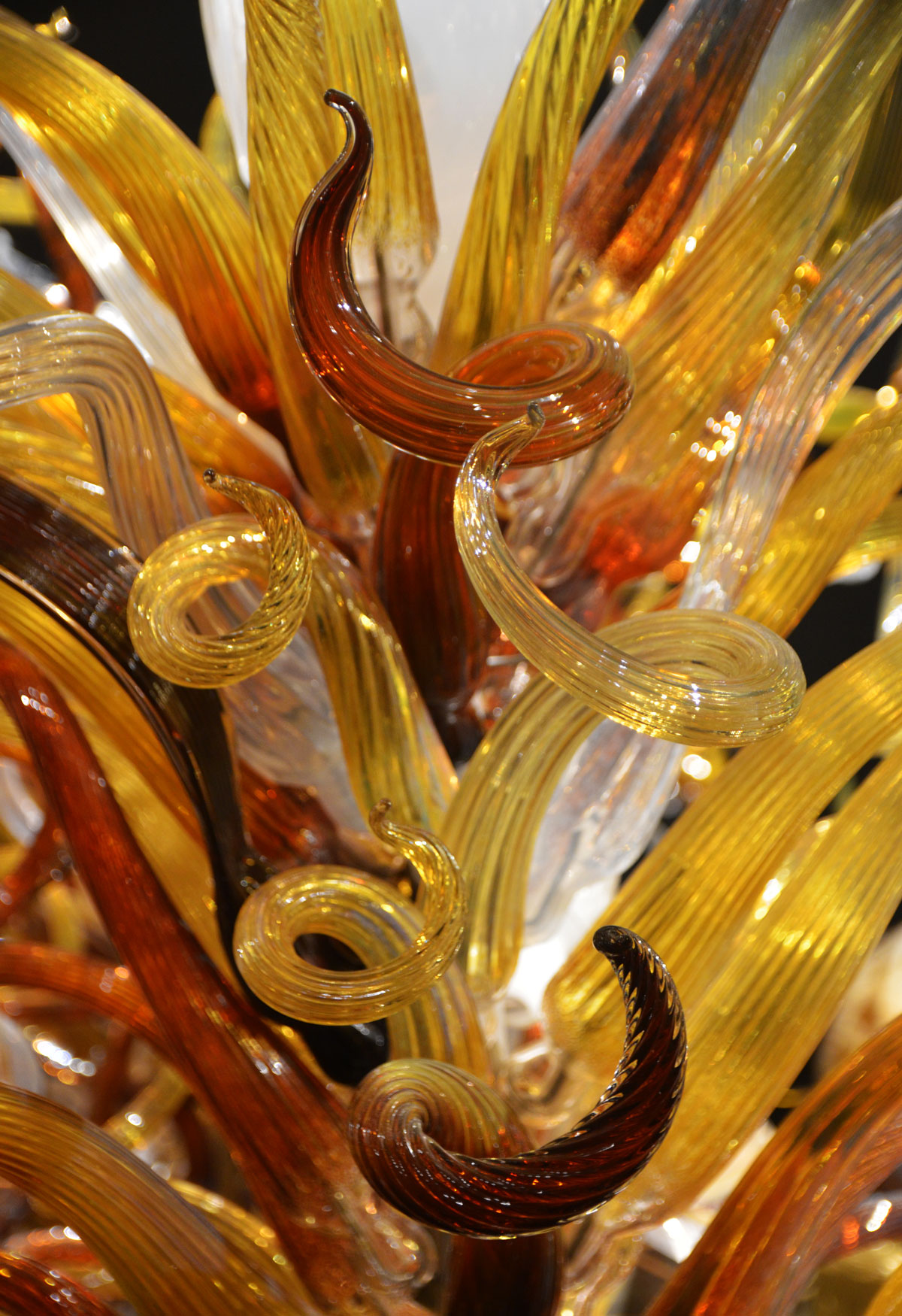
below: “Red Reeds”. I thought of candles when I first saw this piece, red candles in a birch bark candle holder. Then the young girl standing beside me announced that it was a campfire and I changed my mind. I think she’s right. Marshmallows anyone?
The red tubes are hollow glass. Metal rods have been inserted into the birch logs and the glass tubes sit over these rods. You can see the darker sections at the bottom of the tubes where the metal rods are.
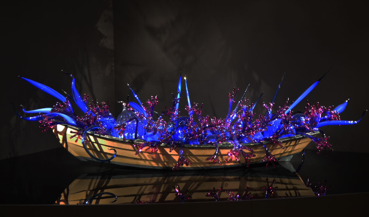
below: “Blue and Purple Boat, 2006”. Back in 1995 Chihuly floated some glass pieces on a river in Finland. Local teenagers collected the pieces in their wooden boats and this provided the inspiration for a number of installations featuring glass in boats. This is one of two on display at the ROM. It is on a reflective surface, like a calm river.
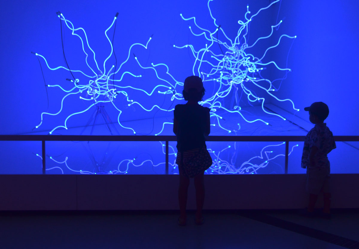
below: “Sapphire Neon Tumbleweeds” constructed from factory made neon tubes that have been heated and bent into organic shapes. The lighting is magenta in real life but blue in my photos.
below: The next few photos are of a large and elaborate installation called “Laguna Torcello”, named after a lagoon island in Venice. It is a garden of fantasy in glass. Parts seem to be aquatic, growing under water.
As an aside, I suspect that the logistics and cost of transporting and installing these pieces is not minor. Like the red tubes above, this garden is made of hollow glass pieces that are arranged on, and supported by, rods. The whole thing sits on a flat, dark, and reflective surface which adds another dimension to the artwork.


The exhibit continues until the end of 2016.
This post is subtitled ‘Staying Cool on a Hot Hot Day’. When the temperatures are into the 90’s (old style) and the humidity makes the air thick, walking streets and alleys is not very comfortable. Instead I took refuge in air conditioned arty places. With the help of the (mostly) air conditioned TTC I only needed to take a few steps outside.
below: At one point I walked through an air conditioned building rather than going outside. This is what I found there. ‘August 6, 1945’ by Matthew Day Jackson. Moments after I pulled my camera out of my backpack, a security guard appeared. I was sure that once again I was going to get the “this is private property” talk but instead we ended up discussing the work and how it is displayed.
It is constructed of four panels and it’s very heavy. The base is made of lead; you can see the lead where Lake Ontario is. It is attached to the wall with 18 very long bolts and each bolt is wired to an alarm.

below: Looking a bit more closely at it you can see that it is a map of Toronto. As you might have surmised, the title is a reference to the dropping of the atomic bomb on Hiroshima by the USA during WW2. This isn’t just any map of Toronto, it’s an aerial view of a burnt out city after a nuclear explosion. It is one in a series of cities given similar treatment, all with the same title.

From the effects of man made death to the life enhancing effects of nature….
below: A few steps outside took me past the Gardiner Museum where I noticed that the front garden was redone about a year ago. ‘Vertical Crevice Garden’ was designed and donated by landscape artist Neil Turnbull. From the Gardiner museum website, a quote by the artist: “When the massive forces of continental drift push against layers of sedimentary rock, they cause it to crack, break, and rise. Over centuries, through exposure to wind, sun, and the freeze-thaw cycle, the layers split open. These fissures and crevices collect rain, dust, and an array of windblown bits like seeds and spores; plants take root, and life takes hold.”

below: When walking past the Gardiner Museum, one can’t help but notice the striped head. It’s actually called ‘Untitled’ (why do artists do that?) and it’s by Jun Kaneko, 2002. It’s made of glazed ceramic and galvanized steel. Before heading underground at Museum subway station I took a few minutes to try to take a ‘pretty’ picture of the head. The plants in the garden next door haven’t quite grown up enough to hide that ghastly table that the head sits on. I have always wondered why the museum chose such a mundane bland platform for the sculpture but now that I look at it again I wonder if it’s possible that the table is actually part of the artwork. Could it be?

below: A photograph in the doorway of a gallery caught my eye. The picture below is not the one in the doorway, but one that was hanging on a wall inside that I liked even more. ‘Paris Rooftops 4’ by Michael Wolf. It is 48″ x 68″ and is a chromogenic print (full-colour silver-based photograph), edition of 9. To buy it will set you back $22,000 but looking is free – check out more of Michael Wolf’s work on the Bau-Xi gallery website.

below: A man with a camera stares at a painting on a gallery wall. ‘Watching’ 2010, (26 inches high) by Tom Campbell on the left and ‘Brown Trail #7’ 2016 by Shi Le, a Toronto based landscape artist. These are at the other Bau-Xi gallery (the non-photography one)

below: Three paintings by NUBARR Gallery, a collection of the works of Armenian-Canadian painter Noubar Sabag (Noubar Sabbaghian) 1920-2006. These, and others by the same artist, are on show at the Art Square Cafe & Gallery but unfortunately I just learned that today is the last day.

below: How many people try to paint pictures like this? How many people sell such paintings, not to mention have them hang in the Art Galley of Ontario? But they aren’t Robert Motherwell. So I ponder on the age old question of what makes a piece of art valuable or collectable? Is the AGO (and other galleries) collecting paintings or names? Motherwell painted this in numerous variations – a few changes in colour, a slight change in the lines. Cheating? Or brilliant marketing? One for every gallery of note? This is Motherwell’s ‘Untitled (In Orange with Charcoal Lines)’ c1970. There’s that “untitled” again, the most popular name for an artwork.

My last stop of the afternoon was at the photography exhibit by Thomas Ruff at the AGO. Part of the exhibit was a few large photographs of stars, ‘Sterne’. Large pictures of stars in the night sky were made from negatives that Ruff bought from the European Southern Observatory in Chile in 1989.
below: They are difficult to look at, or rather it is difficult to what is the picture because the blackness of the photograph creates a mirror when placed behind glass. This is me taking a picture of the picture – me plus the picture on the opposite wall plus the lights and light fixtures in the ceiling plus a table plus another person in the room plus a few white spots that are stars.

below: ‘Walking Away, Walking Through the Universe’ a manipulation of a manipulation.

below: One last photo. Let’s end this on a positive note and give Thomas Ruff credit for some interesting work. These two pictures are part of his press++ series where he has taken old photos used in print medium and merged the front (picture) and back (words and markings) of the print into one.

Thomas Ruff, Object Relations, at the AGO until 1 August 2016
A comparison of sorts. Two painters from two different time periods. One looked north and the other looks south. The north with its barren cold and blue in comparison to the south and its lush greenness. A famous anglo Canadian painter who went searching for simplicity and a relatively new British painter with Jamaican roots who explores complexities.
Lawren Harris and Hurvin Anderson. You should know which is which!
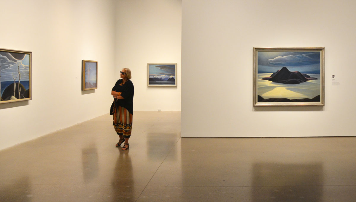
I didn’t purposely set out to compare them. I saw the ‘The Idea of North’ exhibit that features the Steve Martin paintings of Lawren Harris first. As much as I like the Group of Seven, Harris’s minimalist snow and ice paintings have never been my favorite. Still, it was an interesting collection to see. After I finished there, I headed up to the contemporary art floors. The fifth floor is still closed (new installation opening later this week) but I discovered that the fourth floor is devoted to the works of Hurvin Anderson. As I walked around the Anderson installation I kept thinking of similarities and differences between him and Lawren Harris.

below: Mountains in Snow: Rocky Mountain Paintings VII, 1929. One of the many famous Lawren Harris snow and ice paintings. Light, reflected light, shadows, and contrasts. The elements reduced to their simplest form. The landscape itself is almost secondary. Or the landscape is the medium, not the message.

below: The large painting on the right is ‘Pic Island’ painted about 1924. Pic Island is an unpopulated island along the north shore of Lake Superior. Today the island is part of Neys Provincial Park.
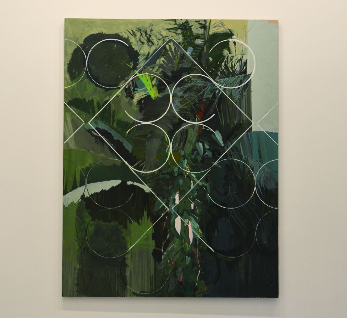
below: Two of Hurvin Anderson’s paintings from his Caribbean landscape collection. On the left is ‘Beaded Curtain – Red Apples’, 2010.

below: ‘Constructed View’, 2010. Anderson’s Caribbean paintings have grilles incorporated into them. These are the security features prevalent on houses and businesses in the Caribbean (and elsewhere in the world), metal fixtures over windows and doors to keep out the unwanted. They contain what’s inside. They are a barrier. They intrude on the landscape and cut it up. Again, the landscape is almost secondary. The message, or emotion, is more important. [aside – There is a grille in the painting above (right) but it’s more subtle.]
Lawren Harris painted his famous mountain pictures in the late 1920’s. In 1930 he visited Baffin Island and a few paintings resulted from that trip. I learned that although I associate Harris with icebergs and arctic scenery, most of his snow and ice paintings were from the north shore of Lake Superior or from the mountains around Banff Alberta.
The repetoire of both painters is not limited to landscapes. Harris painted many houses and street scenes from downtown Toronto including houses and streets that were demolished years ago. The examples of Anderson’s non-landscape work were interiors. Both men used bold colours but Anderson tends to show more detail in his paintings.
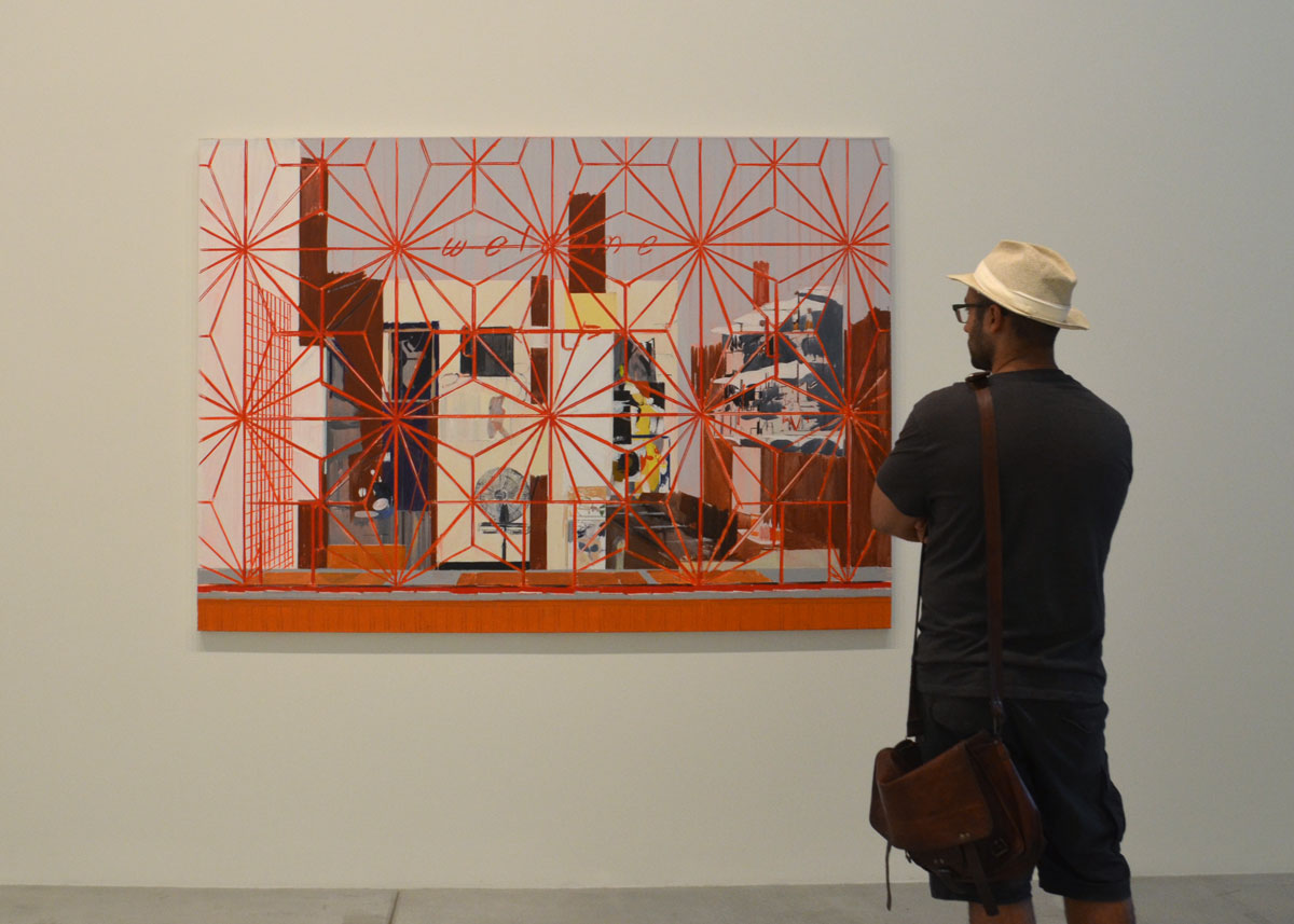
below: ‘Welcome: Carib’ The Welcome sign of the bar in juxtaposition with the red metal work covering the window. The picture beckons to us but keeps us out.
below: One of the paintings from Anderson’s Barbershop collection, ‘Flat Top’ 2008.

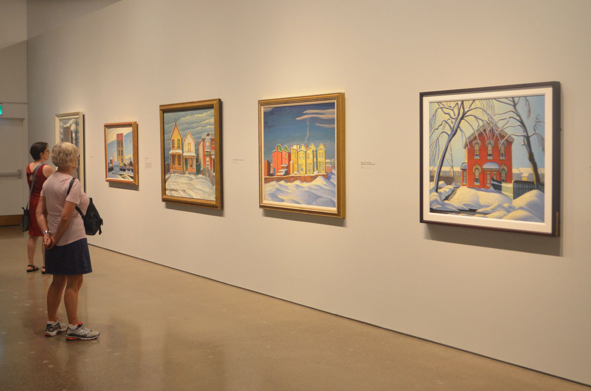
below: A selection of colourful Toronto houses in winter painted by Harris in the 1920s.
In the 1930’s Lawren Harris’s personal life went awry. The words on the wall at the AGO says that he divorced, remarried and moved to the states. That’s a bit of spin. He didn’t divorce his wife because that would be messy, apparently. Instead in 1934 he just married the wife of an old friend. And of course that turned messy and the new couple left for the USA for a few years before eventually settling in Vancouver BC. Harris’s post-1934 work is very abstract and was never as successful as his earlier paintings.
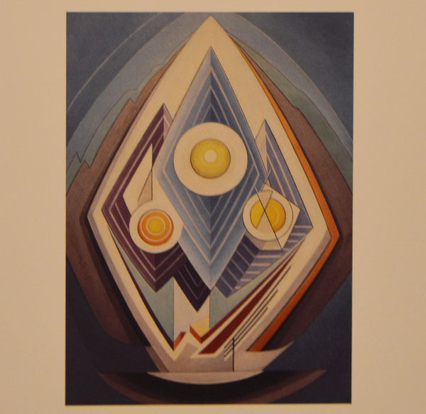
below: You can see the influence of the mountain paintings in this, ‘Painting No. 4’, about 1939, painted when he was a member of the Transcendental Painting Group. This was a collective of artists in New Mexico that Harris help to found.
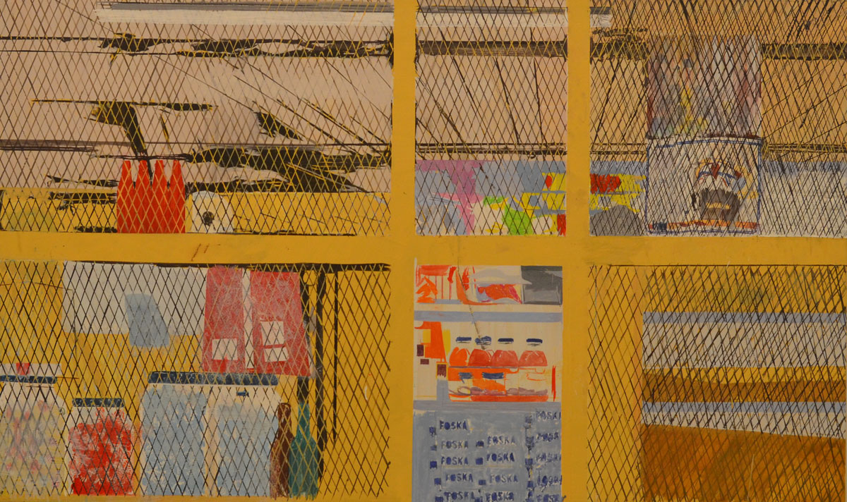
below: Since I have no idea where the art of Hurvin Anderson is headed, I will leave you with one more of his present paintings (I’m not sure those two ideas actually go together!). ‘Foska Foska’, the interior of a shop behind yellow bars and black mesh.
The Idea of North – until 18 September
Hurvin Anderson – until 21 August
#HarrisAGO | #HurvinAndersonAGO
This is another post about an exhibit from the CONTACT Photography Festival. I know that it’s now June and CONTACT was in May, but I wanted to post these photos. I actually took them early in May as you can probably tell by how many clothes the people in the pictures are wearing. They’re certainly not dressed for the warmer weather we’ve been having lately. I have had trouble deciding what to write in this post.
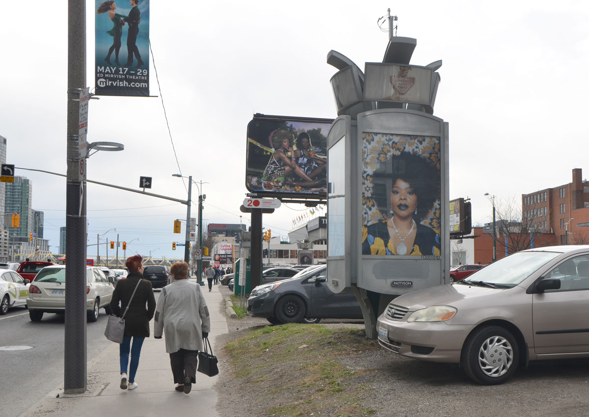
There is a parking lot at the NE corner of Front and Spadina with some billboards in it. Maybe you saw them as you drove or walked past but maybe you passed by and missed them. There are so many things on the street vying for our attention and a billboard is just another piece of street ‘furniture’.
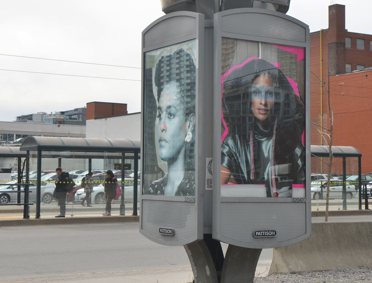
For the month of May, an installation titled ‘What it Means to be Beautiful’ by Mickalene Thomas occupied a number of billboard spaces at the above mentioned corner. All the images are portraits of women and are “shown within the context of street advertising, where women are constantly bombarded with narrow notions of female beauty.” A sample of the billboards:

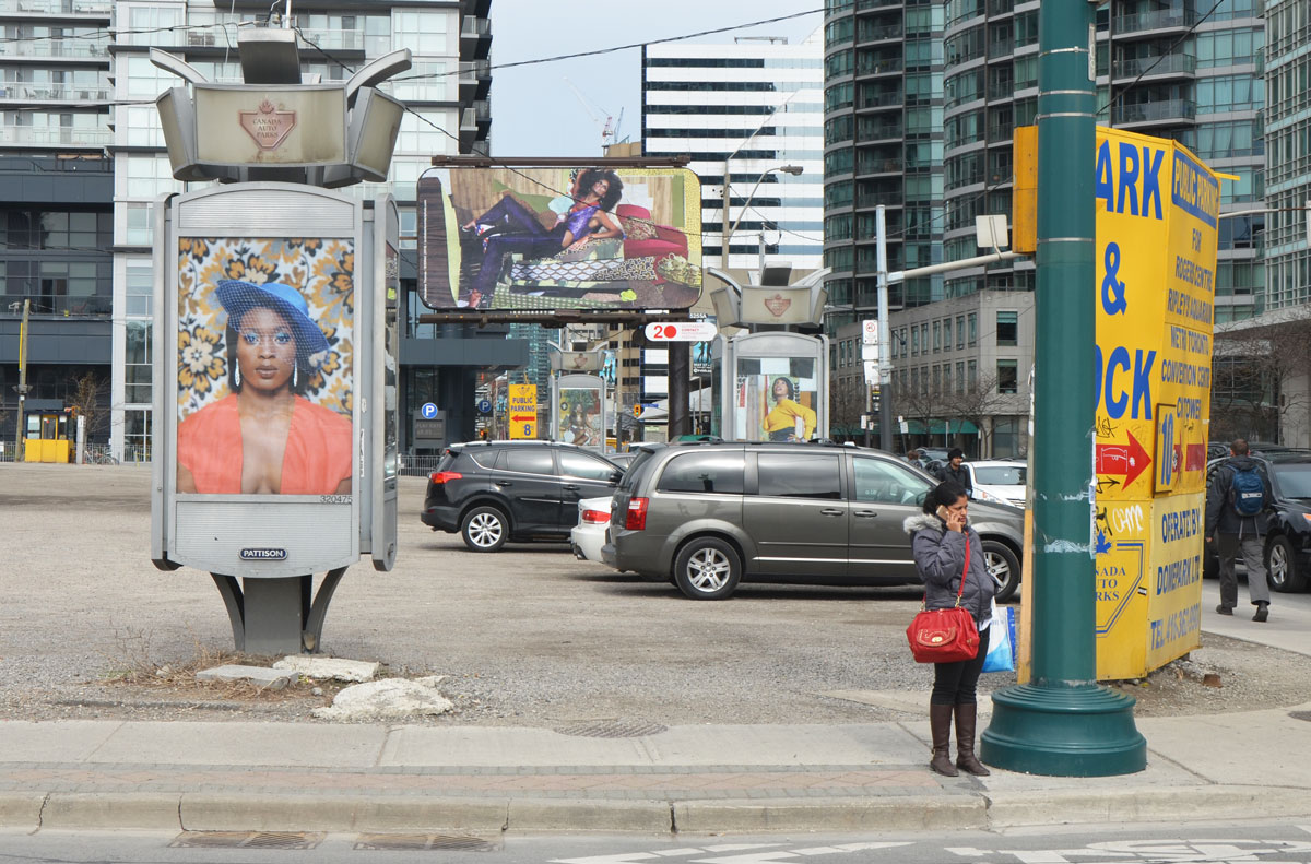

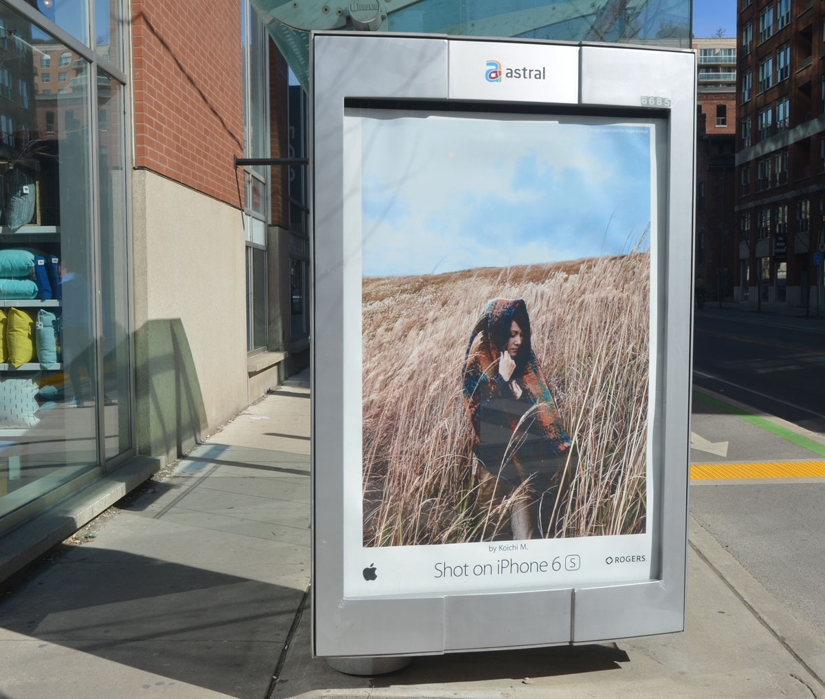
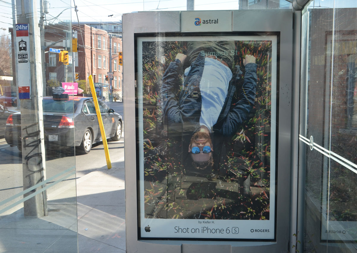
Part of the reason that I hesitated to write this post was the fact that the iphone 6 ad campaign was on at the same time. It was a campaign that used photos taken with the phone and the ads were very visual and used very few words. In my opinion, they are more eye catching and visually appealing than Thomas’s work. I found a few of them to show here (below). I know that there were many more but unless I was consciously looking for ads, I didn’t notice them as billboards are one of the things that I block out as I walk. That led to a few thoughts about what catches a viewer’s attention on the street – Faces? Colours? Contrast?
There is more going on in Thomas’s photos and collages than just visual appeal but I still question the validity of asking the viewer to look at them in the context of street advertising. Is it fair to compare her images to ads produced by, and in aid of, a large corporation? Would it have been better to exhibit her work in different form or a different place? I don’t have the answers for those questions. Do you?

And now I will go back to ignoring billboards as I walk.
On Friday morning, my original goal was to find ‘Residents of the Esplanade’, a CONTACT Photography Festival outdoor exhibit at David Crombie Park but it was such a beautiful morning that I didn’t stop there. I found more than just the ‘Residents’.
Forty years ago, May 1976, the site plan for The Esplanade neighbourhood was approved. Since then, it has become home to a very diverse group of people. And it is those people that this installation celebrates on the 40th anniversary of the founding of the neighbourhood.
Crombie Park runs along the south side of The Esplanade between Berkeley street and Lower Jarvis. The installation consists of a number of small white rectangular pillars with the picture and story of person on either side.


People were out enjoying the morning; school kids were playing basketball at recess.

Flowers were blooming.


below: Looking towards Lower Jarvis Street and downtown Toronto.

below: One street beyond Lower Jarvis is Market Street. It dead ends at the railway tracks. The long structure on the right is a parking garage.
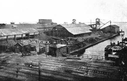
below: After a small backtrack up Market Street, I went through Conger Coal Lane to Church Street. I don’t think I have walked this way before. The lane was named in commemoration of the Conger Coal Company whose yard and wharf was nearby. It was one of the many companies that provided Toronto with coal back in the day when coal fueled the city. It was started in 1870 by Mr. P.D. Conger. In 1913, Sterling Coal company bought Conger and the name was changed to Conger Lehigh Coal Co.

below: A very old photo of the Conger Coal Company dock at the foot of Church Street, back when Church street ended at Lake Ontario
below: Tucked into a corner on Church street immediately south of Front Street, is an art installation by Paul Raff called ‘Shoreline Commemorative’. A topography of limestone forms the base of the work. A glass ball representing the line between sky and water sits on top of a tripod that tries to evoke a land surveyor’s tripod. The words on the wall say “For 10,000 years this was the location of Lake Ontario’s shoreline. This brick wall stands where water and land met, with a vista horizon”

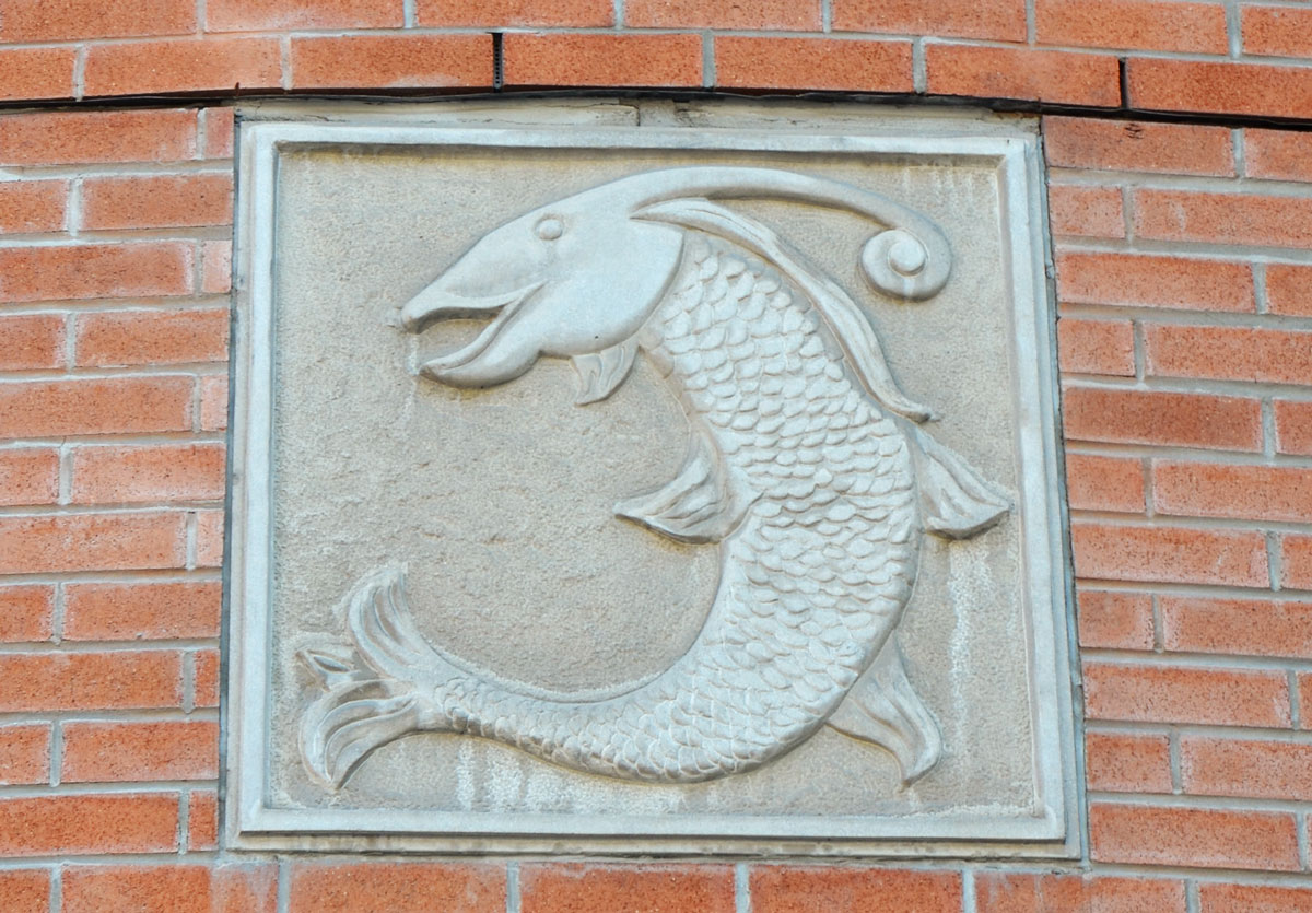
below: Continuing the lake theme, a little fish out of water, jumping over the entrance to a condo.
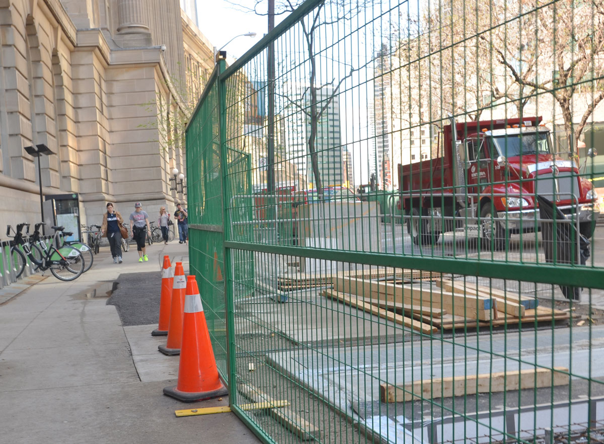
below: From the lake theme to another common theme in the city, construction. Spring is the beginning of construction season and here Berczy Park is being upgraded. In the background a new condo is being built but as we all know condo construction ‘season’ never ends. In fact, the challenge might be to find a place in this city where there isn’t a condo being built.
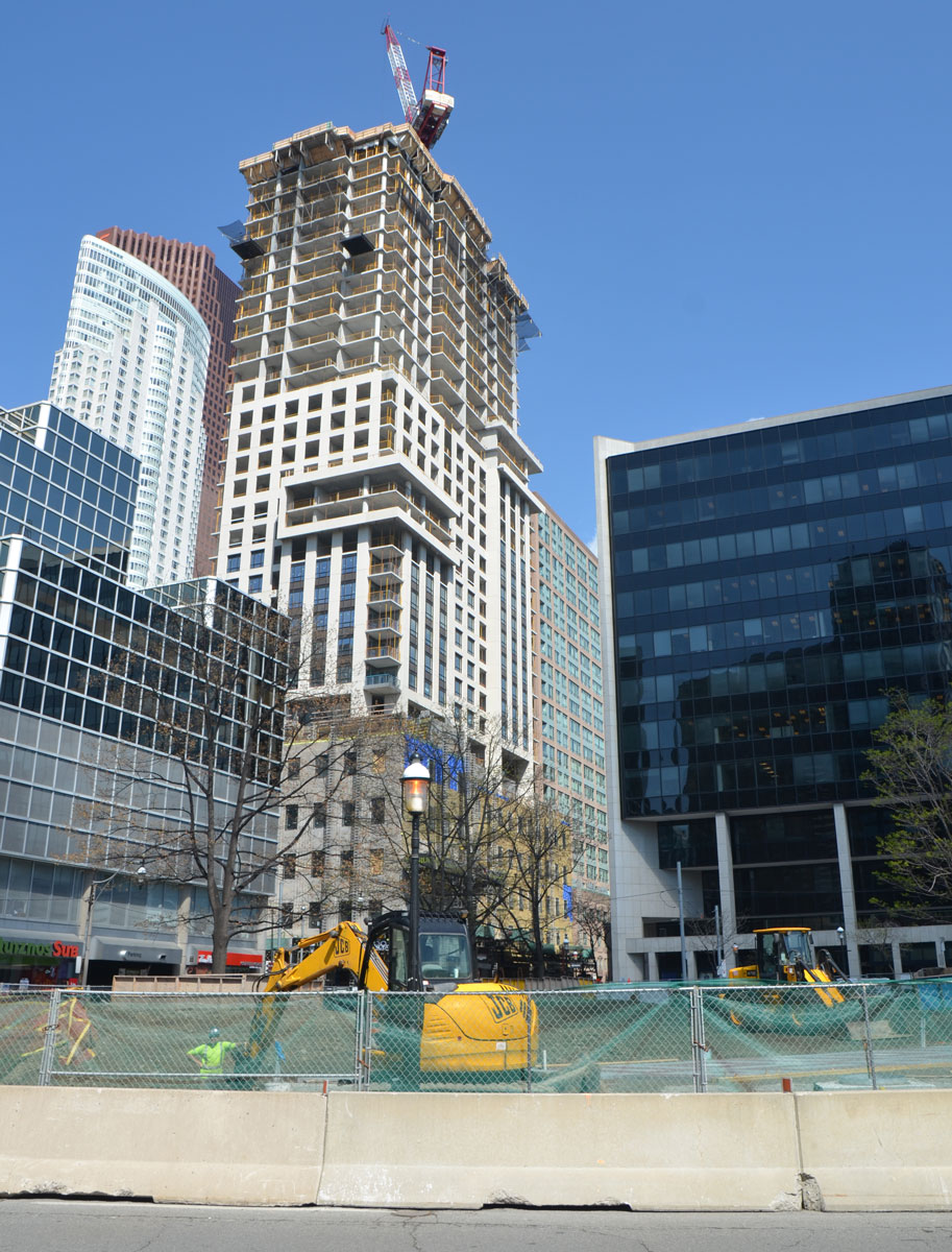
below: I walked past the never ending Front Street construction. Construction in front of Union station seems to be finished, but this stretch of Front Street just west of the station is still being worked on. There have been fences here so long that I can’t remember a time when they weren’t here.