


This is another post about an exhibit from the CONTACT Photography Festival. I know that it’s now June and CONTACT was in May, but I wanted to post these photos. I actually took them early in May as you can probably tell by how many clothes the people in the pictures are wearing. They’re certainly not dressed for the warmer weather we’ve been having lately. I have had trouble deciding what to write in this post.
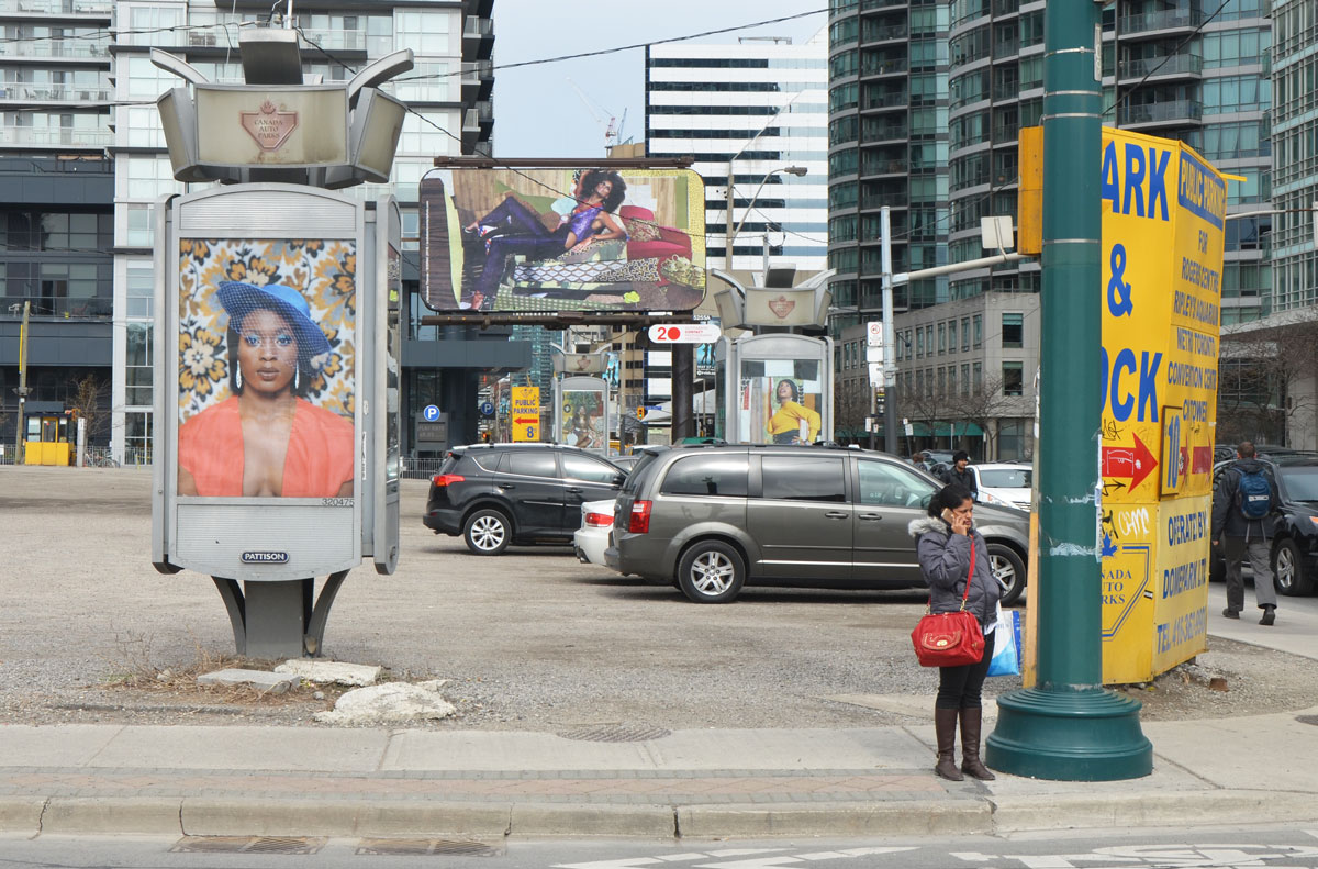
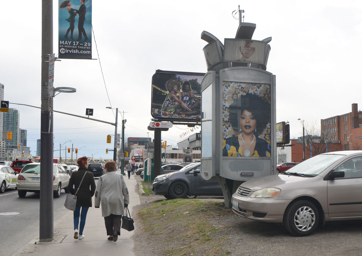
There is a parking lot at the NE corner of Front and Spadina with some billboards in it. Maybe you saw them as you drove or walked past but maybe you passed by and missed them. There are so many things on the street vying for our attention and a billboard is just another piece of street ‘furniture’.
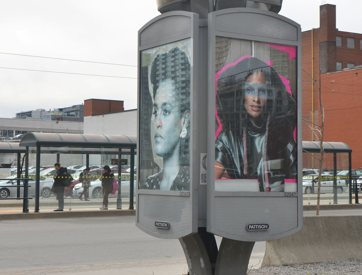
For the month of May, an installation titled ‘What it Means to be Beautiful’ by Mickalene Thomas occupied a number of billboard spaces at the above mentioned corner. All the images are portraits of women and are “shown within the context of street advertising, where women are constantly bombarded with narrow notions of female beauty.” A sample of the billboards:


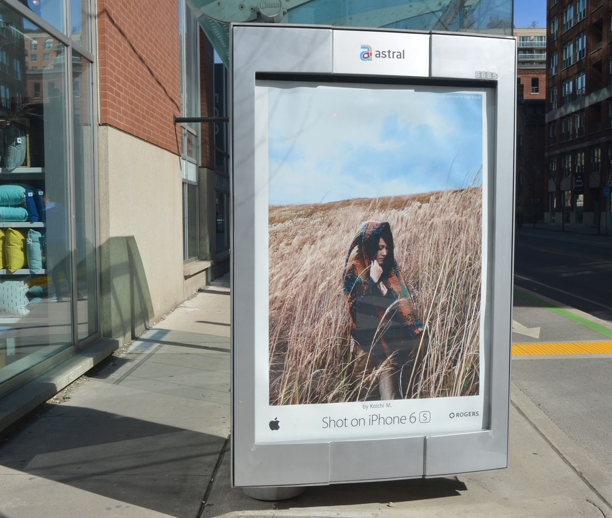
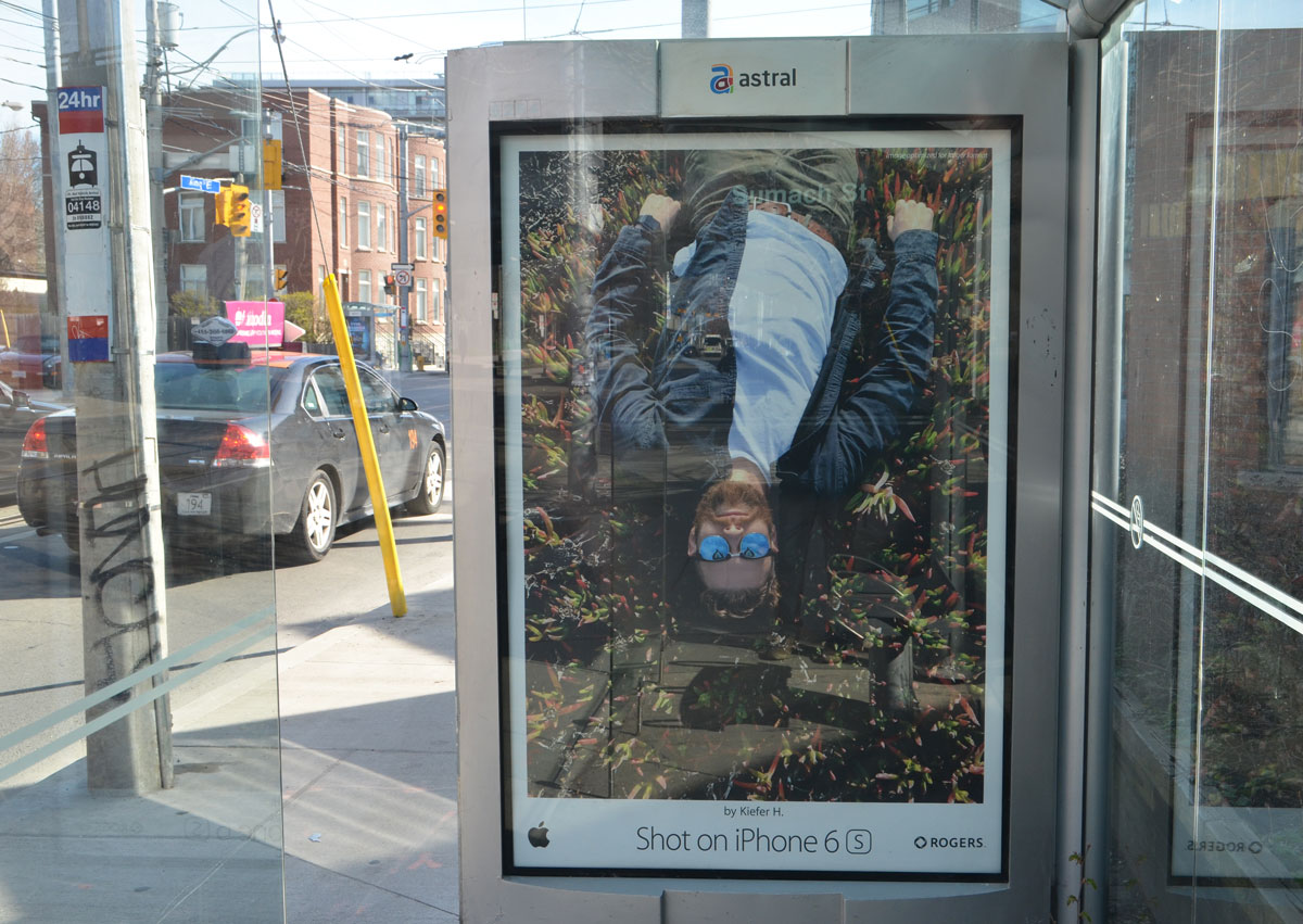
Part of the reason that I hesitated to write this post was the fact that the iphone 6 ad campaign was on at the same time. It was a campaign that used photos taken with the phone and the ads were very visual and used very few words. In my opinion, they are more eye catching and visually appealing than Thomas’s work. I found a few of them to show here (below). I know that there were many more but unless I was consciously looking for ads, I didn’t notice them as billboards are one of the things that I block out as I walk. That led to a few thoughts about what catches a viewer’s attention on the street – Faces? Colours? Contrast?
There is more going on in Thomas’s photos and collages than just visual appeal but I still question the validity of asking the viewer to look at them in the context of street advertising. Is it fair to compare her images to ads produced by, and in aid of, a large corporation? Would it have been better to exhibit her work in different form or a different place? I don’t have the answers for those questions. Do you?

And now I will go back to ignoring billboards as I walk.
