Archive for the ‘galleries’ Category

Keeping warm at the Art Gallery of Ontario.

Below are 5 works of art that I saw recently when I decided to spend the afternoon inside instead of walking in the cold.  The AGO is definitely a great way to stay warm!

below: There is a room at the Art Gallery of Ontario that is home to four large metal sculptures at the moment.  Large structural pieces. These creations are the work of Sir Anthony Caro (1924-2013).  They are made of discarded metal pieces.  At one point in his career, he made scale models for a giant art project for Park Avenue in New York City.  When the project was cancelled, he took apart the models and used the pieces to make a new series.  Three of those on display here are from that series, ‘Sculpture Laid Bare’.  It would be interesting to see what the Park Avenue sculpture models looked like.
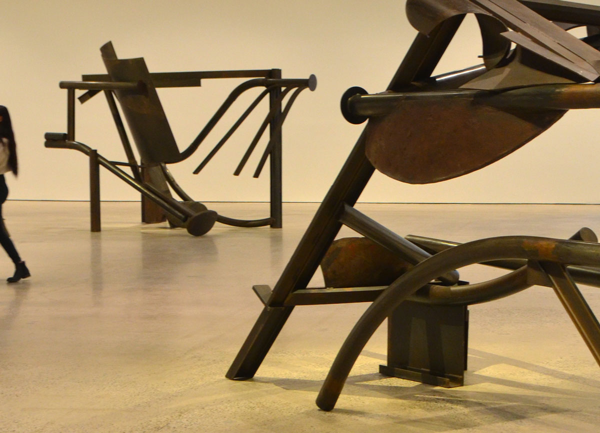
a woman with long hair walks away from a large metal sculpture made of cast off pieces of metal, on display at the Art gallery of Ontario,

In the early part of his career, Caro made modeled figurative pieces cast in bronze.  In the 1960’s he started to use prefabricated steel and aluminum, sometimes in bright colours such as the example below:
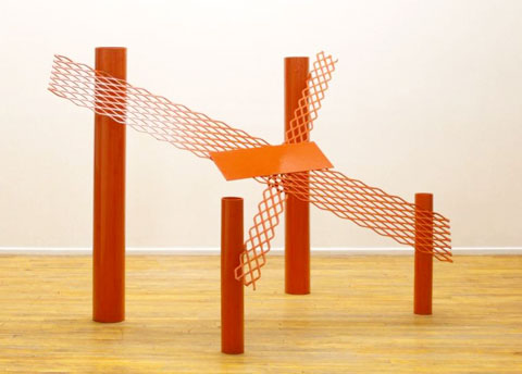
red sculpture by anthony caro, metal, 4 upright cylindrical tubes with metal mesh forming an X on top of them.

Red Splash, by Anthony Caro. Image found online at source.

If they were outside, they would invite interaction.  Touch them.  Climb on them.  In this gallery setting, there is a no touching policy.   The words on the wall says that: “He [Caro] meditates on the passage of time, processes of decay, the painful realities of aging, and the future of modern sculpture.”  Isn’t that why the gallery is doing their best to preserve them just the way they are?


below: ‘The Distinctive Line Between One Subject and Another’ by John McEwen, 1980.  Two steel wolves looking at each other across the room.  On the wall behind the wolves is ‘Folia Series #1 and #2 by Nobuo Kubota, 1976, representations of the wrinkles on the cerebellum in the brain.
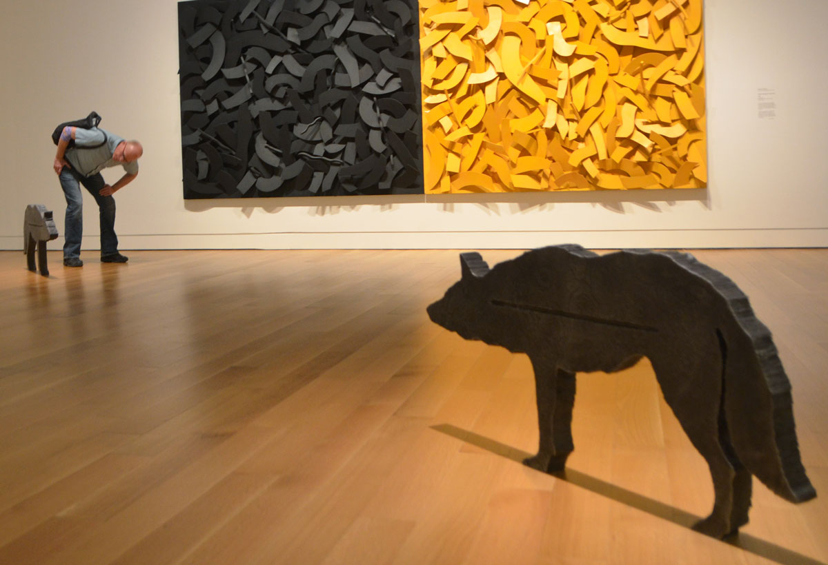
two metal sculptures of life sized wolves looking at each other across the room, a large panel art work is on the wall behind them, half black and half yellow.

John McEwen is a Canadian sculptor.  A number of his sculptures can be found around Toronto.  He designed the boat hull like shapes for the Victory Peace memorial on the waterfront that I mentioned in a previous blog post – down to Coronation Park.  The three metal tubes outside the Air Canada Centre – the Searchlight Starlight Spotlight – are also his work.


below: More lines, this time its “Aforim” by Rita Letendre, 1975.  Which lines are parallel?  Is there a horizon line?  If so, which one is it?
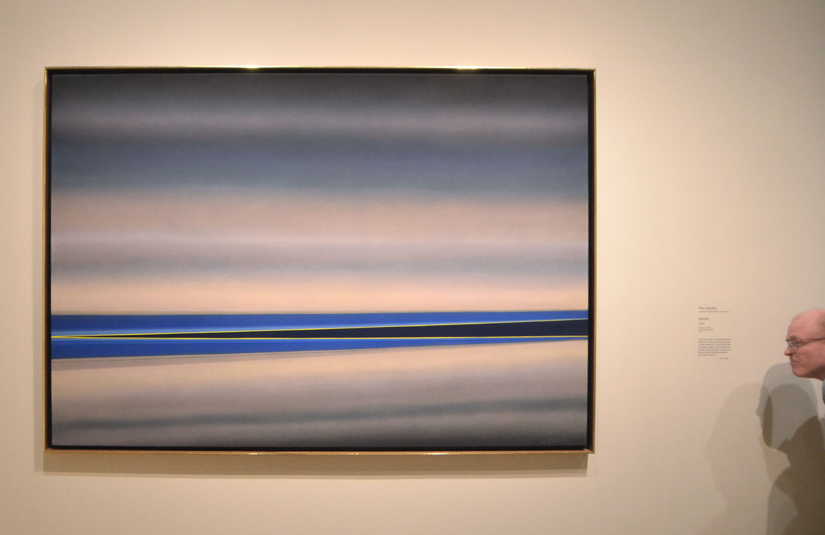
horizontal lines, some parallel and some at slight angles, in blues and greys, painting on a gallery wall called Aforim by Rita Letendre


… And lastly, another reference to structure.  But not structure in the 3D, physical form, sense of the word.  Instead, it is a painting called ‘Number Structure II’ by Canadian artist Kazuo Nakamura (1926-2002).  Nakamura graphs out number-structure patterns and calculations and presents them as art.

below: One of the structures that Nakamura used was the Pascal Triangle.  This image shows the first 6 lines of the triangle.  Each number is the sum of the two numbers above it.  Can you figure out what the next line would be?   When expanded, it contains many number sequences and can be used to answer probability questions – as well as other mathematical things that I don’t understand.

the top 6 lines of pascals triangle, a mathematical structure of numbers

below: A small (maybe 1/8th) section of the painting … which unfortunately doesn’t give you much of an idea as to the composition of the artwork.  It does though give you an idea of the detail.  Some of the parts that I have omitted are triangle shapes that conform to Pascals triangle as pictured above.   Is it mathematics?  Is it art?  Where do you draw the line between the two?  Is there a line?
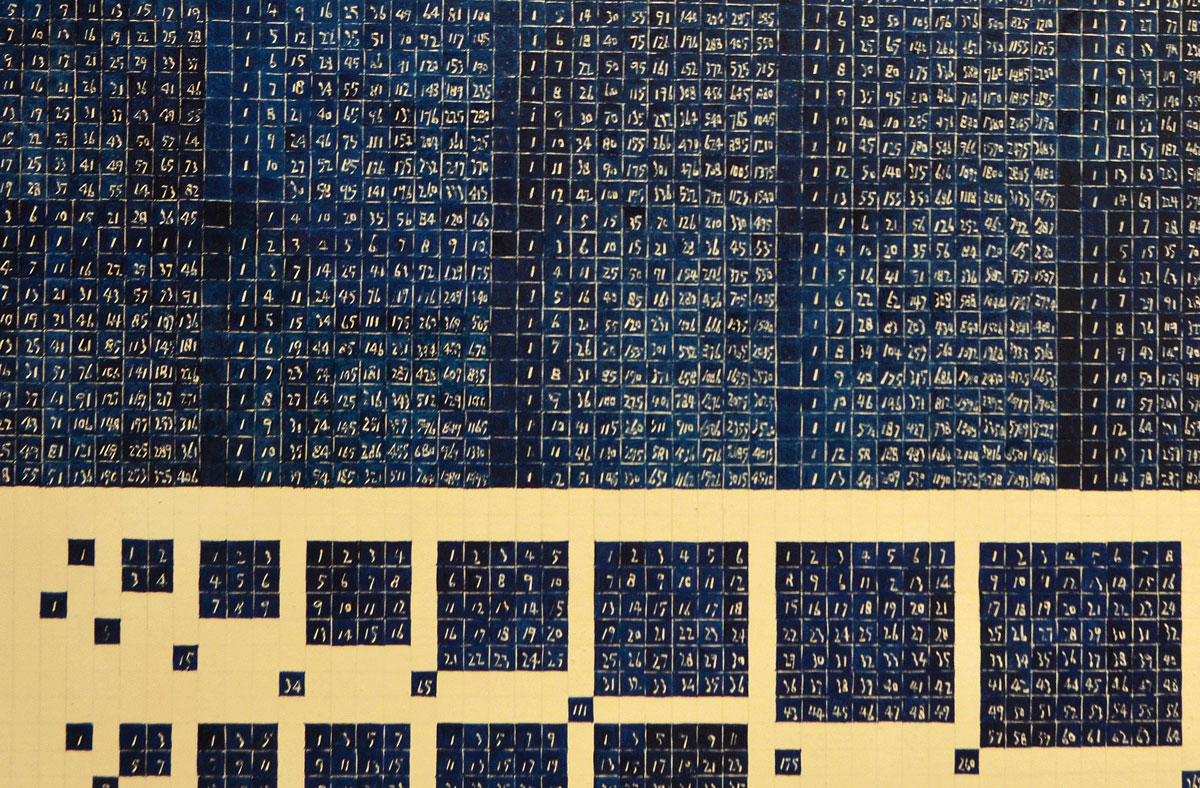
a detail picture of a painting by Kazuo Nakamura called Number Structure 2 which is based on Pascal Triangle. Lots of numbers written in white on blue and black background. the background is made into rectangles, squares and triangles.

It’s the kind of painting that a photograph can never do justice to.  It’s best seen in person.   Oh yes, the answer to the question above:  The next line of the triangle would be: 1, 6, 15, 20, 15, 6, 1.
If By Dull Rhymes
an exhibit by David Armstrong Six and Kristan Horton
Clint Roenisch Gallery, St. Helens Ave

 Dull rhymes may not be the best title as there was nothing dull about the exhibit.

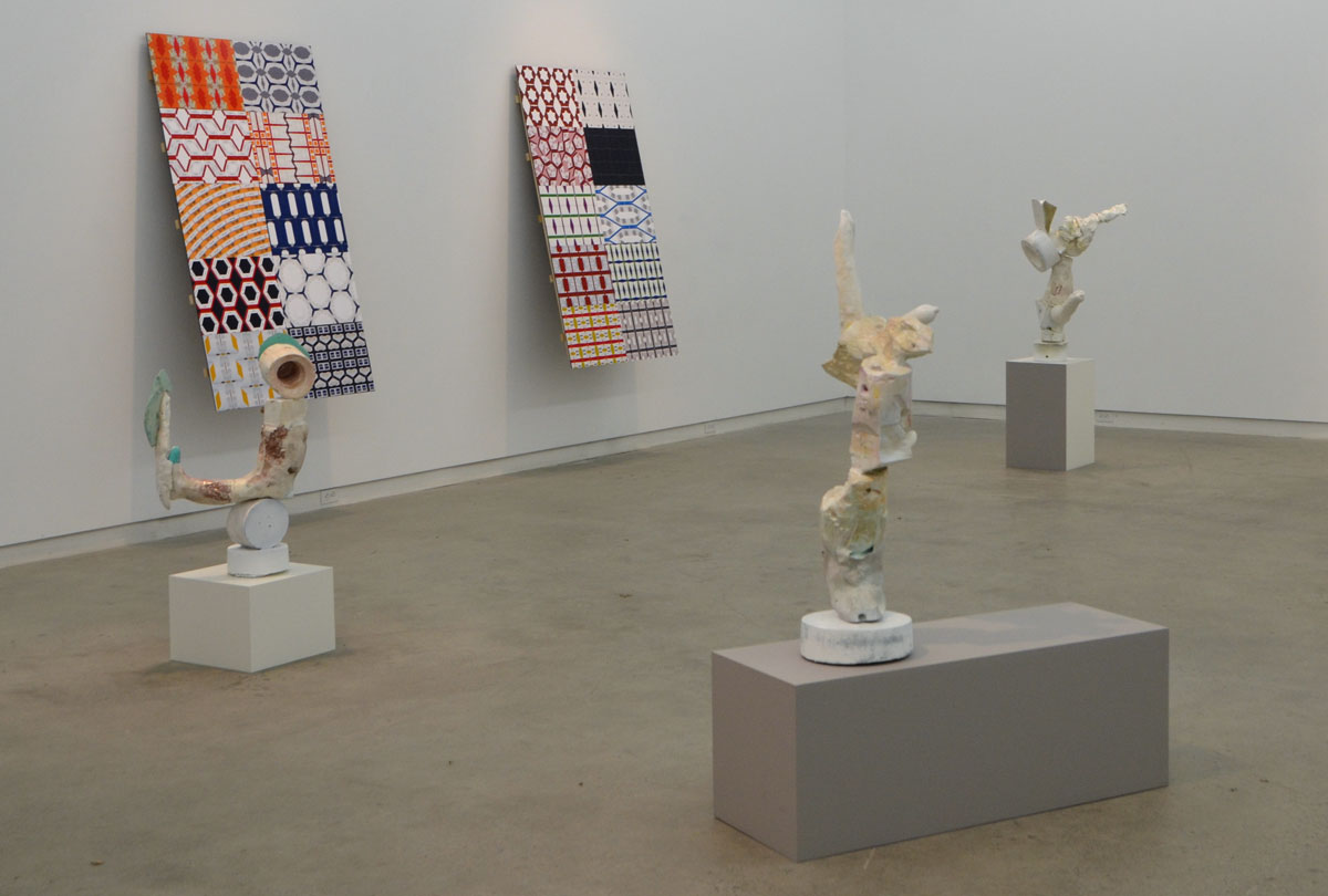
This exhibit  features two Canadian-born artists.  The sculptures that you see are by David Armstrong Six.  They are playful mashups of broken and cast off pieces and many resemble the human form in one way or another.  You can imagine them dancing around the room when the lights are off and everyone’s gone home.   For now, their dance is frozen in time as they await tonight’s revelry.  The two works on the wall are by Kristan Horton.

artwork by David Armstrong Six (sculpture) and Kristan Horton (prints on the wall) at the Clint Roenisch gallery - three sculptures and two pieces on board on the wall

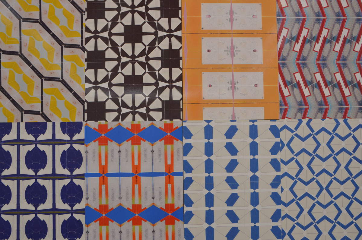
below: Close up of one of the panels.   Details.  Eye catching.  Mesmerizing. Geometric Patterns.  Each section is made with a single part of a piece of packaging that has been manipulated (rotated, flipped, etc) to make a repeating pattern.

eight different patterns made with labels that are displayed side by side.

below: Here you can see the barcode from a box of something.  The number 2729 appears with the barcode – sometimes it in the ‘correct’ orientation and sometimes it’s the mirror image.

close up of the patterns made with different labels and barcodes by Kristan Horton

artwork by David Armstrong Six (sculpture) and Kristan Horton (prints on the wall) at the Clint Roenisch gallery - close up of one of the sculptures, it looks like a face, head, body and outstretched arm, patterned artwork on the wall in the background.

This is only a sample of the works on display.   There is a lot more information on by Kristan Horton‘s website.  I haven’t found a website for David Armstrong Six, but there are images of some of his other work online if you are interested.

artwork by David Armstrong Six (sculpture) and Kristan Horton (prints on the wall) at the Clint Roenisch gallery - one sculpture on the floor and one panel on the wall. The panel is a 10 sections, each section is a different pattern made of labels from packaging.

The exhibit is only on until the 17th of December.

You’ve probably never heard the word asafo before.  You probably have no idea what it means.

Until last week I didn’t know the word existed either.

I went to the Royal Ontario Museum to see the Wildlife Photographer of the Year exhibit.  There were 100 excellent pictures of insects, animals, marine life, the sort of thing you’d expect.  There was no photography allowed in that exhibit so I have no photos of the images on display.  You’ll have to take my word for it that I was there.

I can appreciate the skill and patience that it takes to capture rabbits in the snow or a school of fish in a certain light underwater but those kind of pictures don’t excite me.   That’s not to diminish the work of the photographers, it was all very high caliber both technically and visually.    What I think I’m trying to say is that I left the exhibit wanting more, something more from my visit to the ROM.

Luckily I didn’t have to look far.  In the next room was Art, Honour, and Ridicule: Asafo Flags from Southern Ghana.

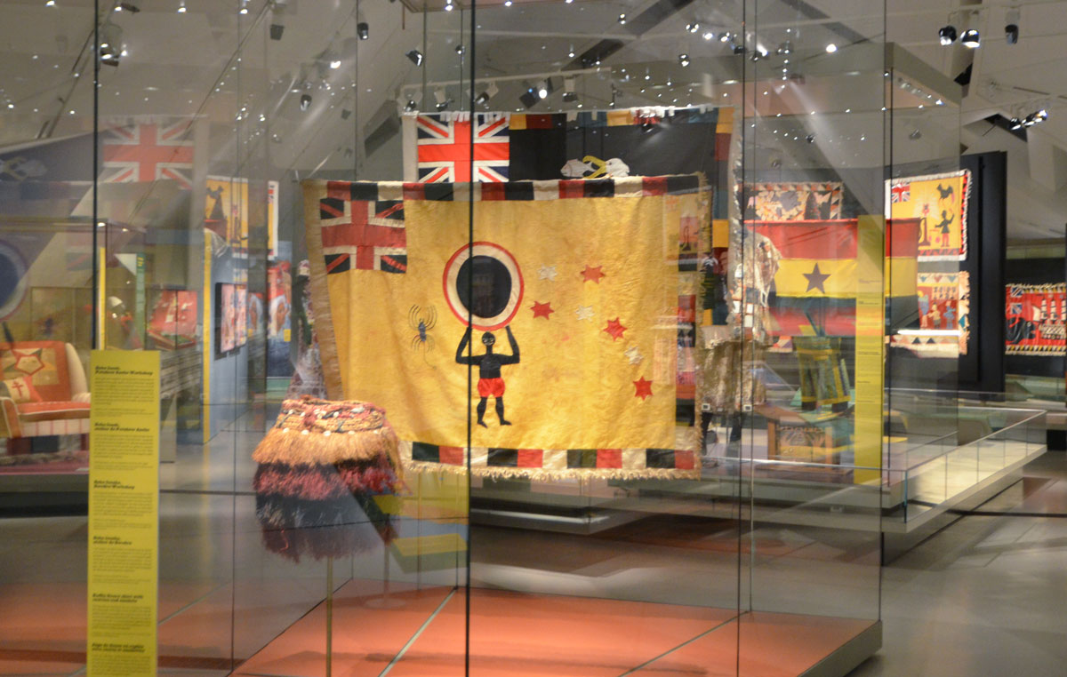
museum exhibit of asafo flags from Ghana, colourful flags of militia groups in yellows, reds and black. Many are hanging in display cases.

Colour, lots of colour.  And a subject that I knew nothing about, asafo flags.  I wasn’t even sure what part of Africa Ghana is in (It’s on the south coast of Western Africa between Togo and the Ivory Coast as it turns out.).

The flags are hand made with an assortment of different motifs.  The British Jack in the upper left corner is a very common feature.  That’s a clue.  Yes, Ghana was a British colony.   Reading the history of Ghana is like reading the colonial history of large parts of Africa.  The Portuguese built a fortress at Elmina in 1482.    Interest in the region was piqued by the presence of gold, hence the name Gold Coast.   By the early 17th century the first African state,  Akwamu, controlled an extensive part of the coast.  They were displaced by the Ashanti who were very involved in the slave trade, especially in trading slaves for weapons.   When European countries outlawed trading in slaves in the early 1800’s,  Ashanti power suffers.   Some tussles ensue, a few battles, some back and forth, and by 1902 what was Ashanti becomes is a British colony.    It remained a colony until 1957.

close up of a flag, hand made, British Jack in the top left corner, a man walks in front of a church in the center, a black bear in the top right.

I’m not going to pretend to know or understand African history.  I’m only trying to give some context to the flags.    First, jump back to my mention of Elmina and the Portuguese. When the Portuguese arrived in this area in the 15th century, it was the Fante (or Fanti) people that they encountered.  Both the Fante and the Ashanti belong to the Akan people.  The Fante prevented them from venturing inland and leased properties for Portuguese trading missions. But when the Portuguese objected to Fante rules and regulations the Fante expelled them.  Soon after, the Dutch arrived.  The Fante served as middlemen in the commerce between the interior and Dutch traders on the coast.

Around 1724 the Dutch either established or made important a number of militia groups of local Fante.  These are the Asafo companies.  Historically, Asafo companies were in charge of the safety and protection of the local community.   At the height of the slave trade they protected individuals and communities.   They exerted power, exercise political influence and maintain codes of conduct within Fante communities. Each company has a flag and that flag has many roles.   They represent proverbs and depict narratives of pride and wisdom.  They accompany oral history and provide a means to preserve customs and traditions.

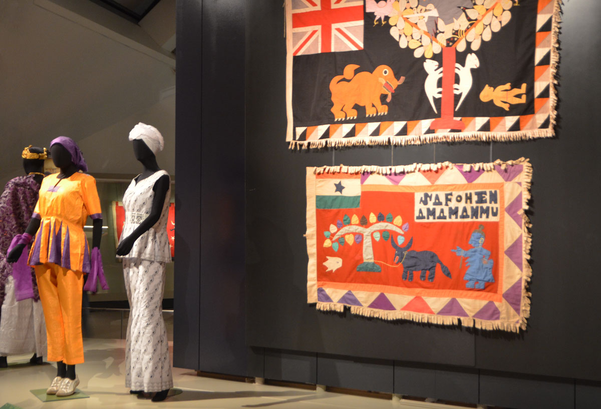
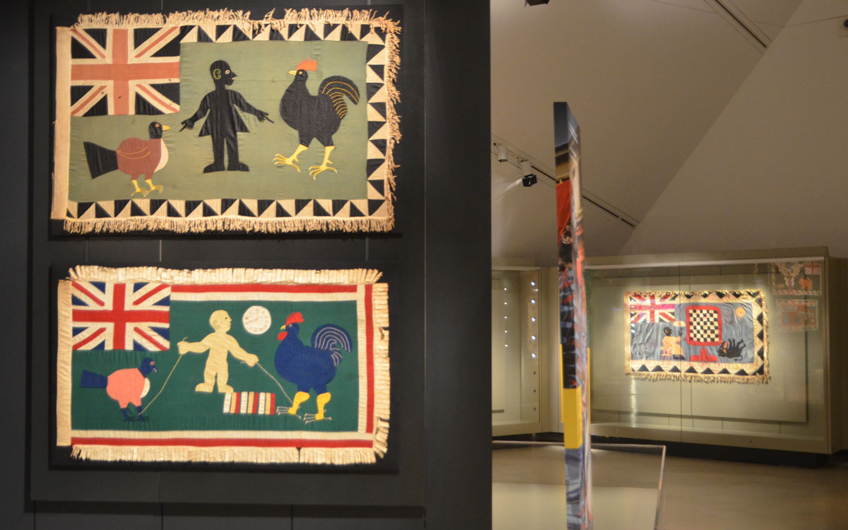
below:

  1. top flag, by Kweku Kakanu, Saltpond Workshop. “Only a brave man goes under a large tree” because only large animals go under large trees. Made sometime between 1950 and 1957.
  2. bottom flag, artist unknown, Kromantse Workshop. “Only tie a bull to a large tree”. Both the animal and the tree are acknowledged to be strong and mighty.  Made around 1980.  It has a Ghanese flag in the top left corner.


two flags displayed on a black background, with three femail mannequins dressed in traditional Ghanese costume.

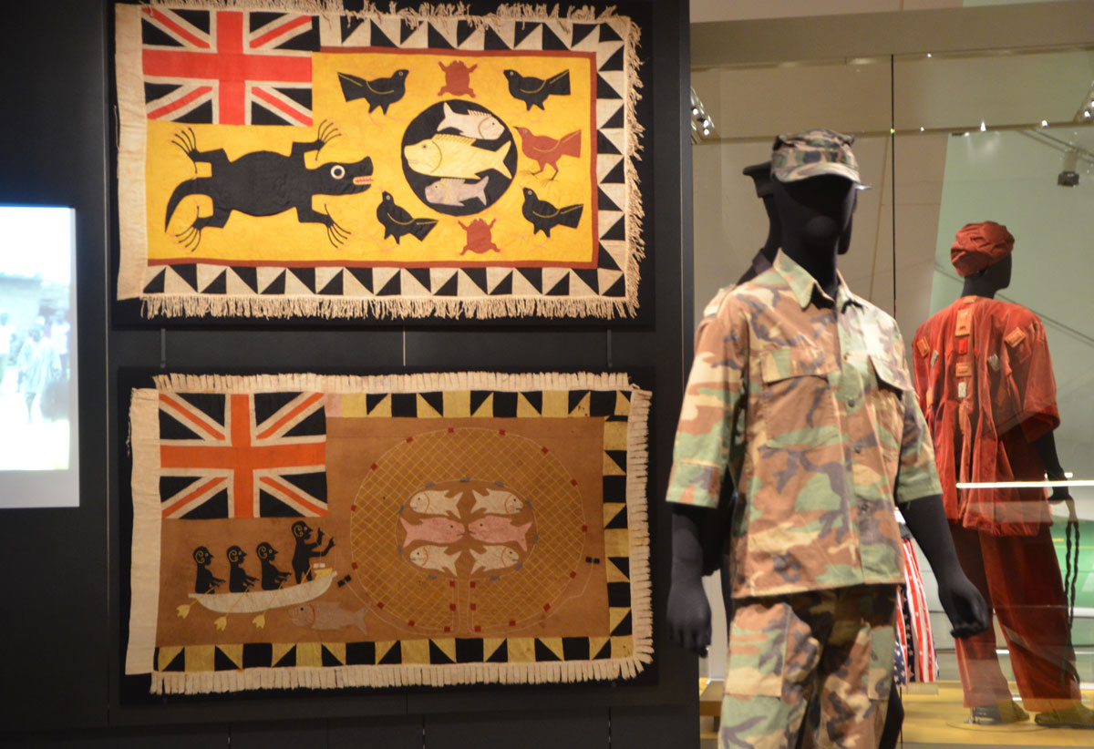
below:

  1. top flag, by Kweku Kakanu, Saltpond Workshop. A crocodile dominates and controls a pond of fish. Made around 1940.  The prey can not escape.
  2. bottom flag, by Kwesi Budu, Saltpond Workshop. The fish cann’t escape the net of the fishermen just like enemies will not be able to escape when confronted by the company.  Made around 1950.

two flags displayed on a black background, with two male mannequins dressed in military Ghanese costume.

Fante asafo flags from Ghana, two on display in a museum, chickens and roosters,

Fante asafo flags from Ghana, two on display in a museum, griffons

two mannequins in military uniforms as part of a museum exhibit at ROM


Patricia Harris Gallery of Textiles and Costumes,
ROM, 4th floor,
until March 2017.


me a visitor, a looker, and and a skeptic.

I happened upon a gallery yesterday, the Robert Kananaj Gallery, on the second last day of a show by Oscar Figueroa called ‘me a talker’.    As I type this, the show should be wrapping up.  So you’ve missed it.  I’m not sure what you’ve missed.

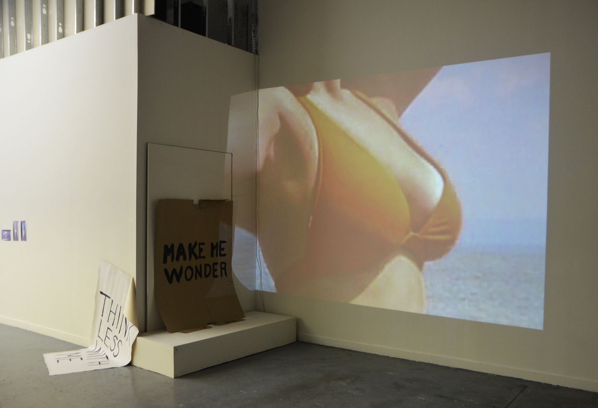
below: The paper that is half on the floor and half propped up by the wall has the words “Think Less With Me” written on it.  This summarizes a lot of Figueroa’s work in that it is a rejection of the verbose and often jargon filled ‘artist statements’ found in contemporary art and especially conceptual art where the words on the wall are more important than the technical or visual aspects of the work.   The gallery website says this: “What if instead of a logical artist statement we decided to write thoughts, or sentences, that go through our heads when making art. This is not poetry per se, this is a form of idea communication, just as the conventional artist statement was intended.”  Does it make you wonder?

walls of a n art gallery with some of the work of Oscar Figueroa. A projection of a woman's chest in a bikini top, a piece of brown cardboard with the words 'Make me wonder' and a piece of paper, large white paper, half on the floor and half propped up on the wall that says

I want to cheer him on for trying to reject the overthought concept behind art these days.  I appreciate the fact that he does not confront me with an essay that bears no relationship to the artwork.  But all is not well.  He wants us to think that his art is special because he rejects the mainstream thinking. Too bad it also rejects all attempts at, well, everything.  The gallery looks like a space that someone has just moved out of but neglected to take their garbage with them.

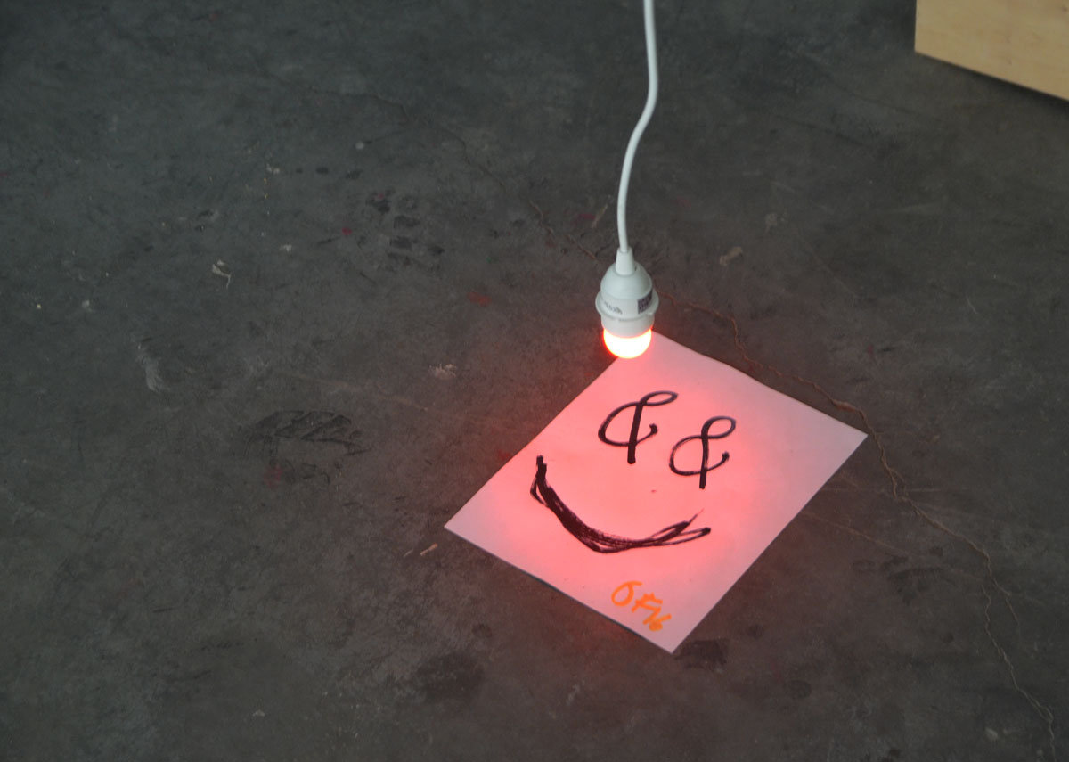
a piece of paper with a happy face drawn on it, with ampersands for eyes, and a single red light bulb hangng from the ceiling and stopping just above the paper.

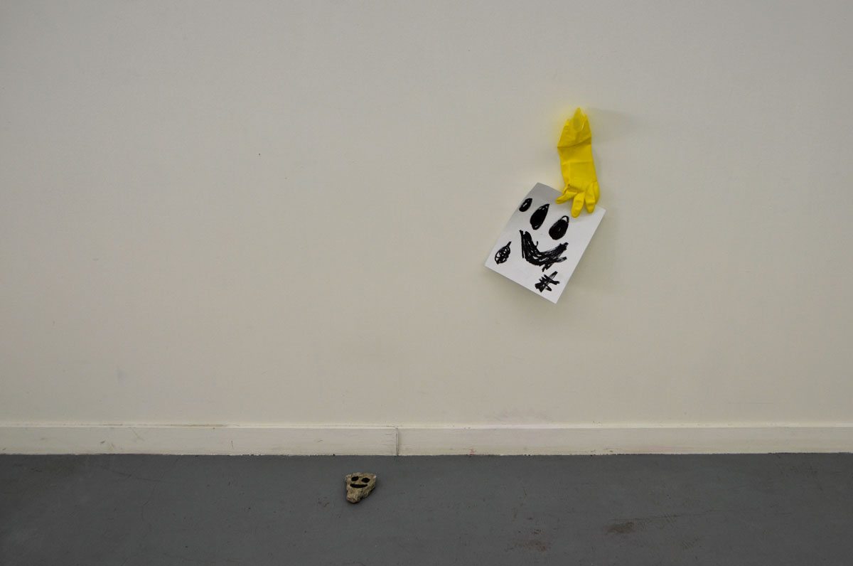
below: A yellow rubber glove taped to the wall, a happy rock on floor.  Does it talk to you?

a black happy face scrawled on a piece of paper, a yellow rubber gloved taped to the wall that is holding the paper. A small rock on the floor with a happy face painted on it.

I found it all rather depressing.   There could be more to it than this.  No, make that: there should be more to it.

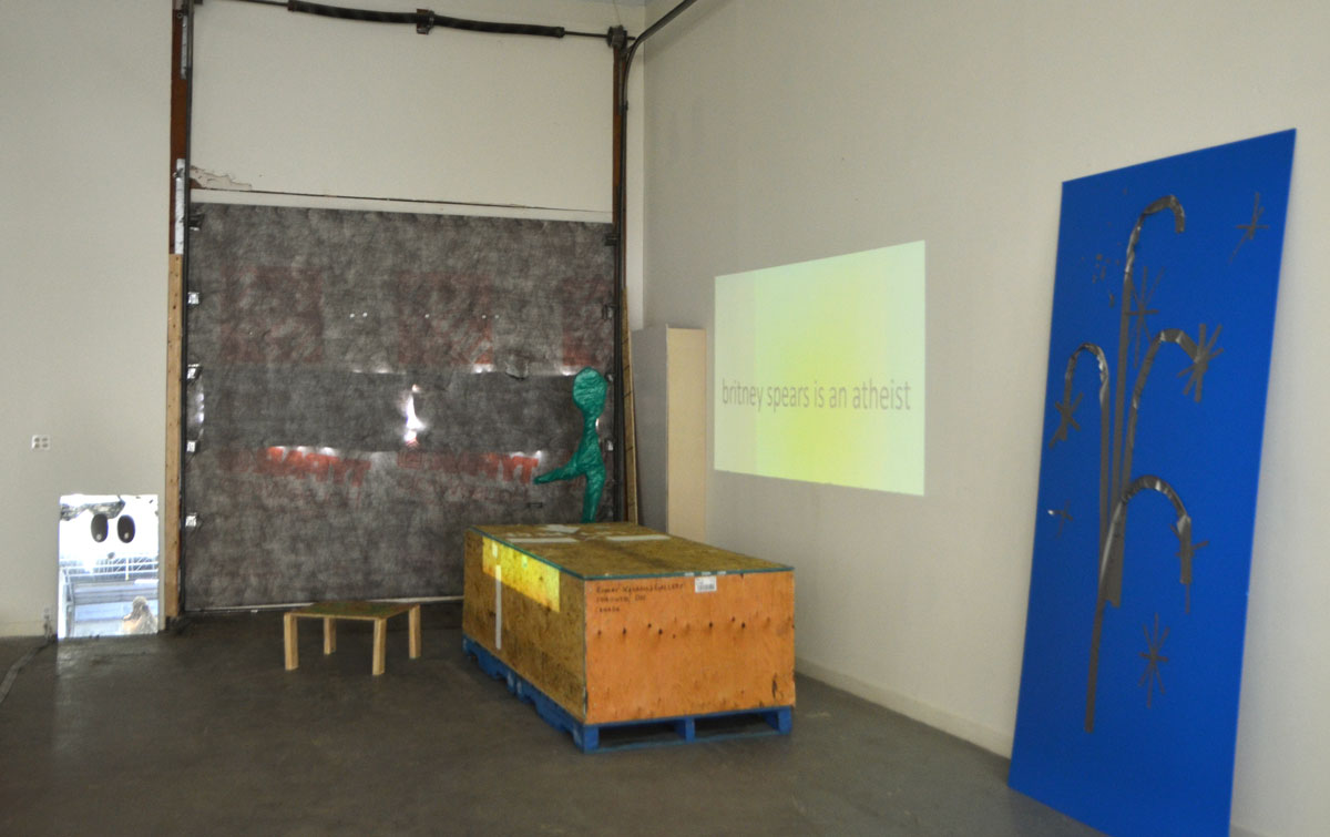
blog_britney_spears_athiest

below:  him: “Be a sidewalk or be a balloon, there’s no fucking difference.”
me: Be a piece of art or a piece of garbage, there’s no fucking difference.

4 pieces of art in a gallery. a white happy face on black paper, a shiny piece of paper with a corner ripped off with the word picturesque written on it.

Yesterday afternoon I wandered into The Power Plant Art Gallery.  It was late enough in the day that the sun was already low in the sky.  It shone through the large windows in the main gallery and cast a warm glow on the current exhibit, works by Yto Barrada titled ‘Faux Guide’ .

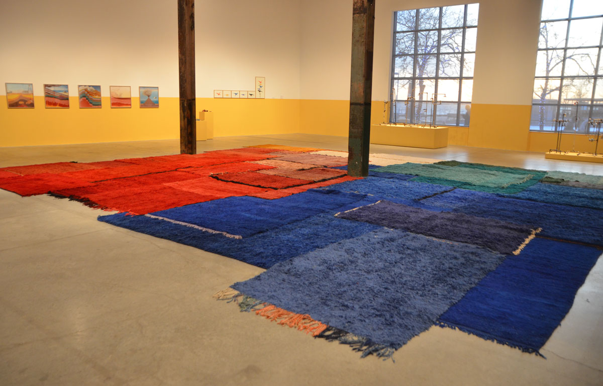
The first thing you see when you enter the rooms is a collection of carpets.  This is ‘Geological Time Scale’ and it consists of bright and bold red, blue, and green carpets – Beni Mguild, Marmoucha and Ait Sgougou pile rugs from Western Central, Middle Atlas, Morocco.   It’s definitely eye catching and it definitely draws the viewer into the exhibit.

main exhibit room of The Power Plant Contemporary Art Gallery, large room with two large windows in which the low afternoon sun is shining. Exhibit by Yto Barrada consisting of red, green and blue carpets on the floor. some framed pictures on the far wall, walls have been painted yellow up to about 4 feet from the floor.

A series of  small exhibits are arranged around the room and most of them are the result of the artist’s research on Moroccan dinosaurs, fossils, and the industry that has built up around them including the trade in fake fossils sold to tourists and museums.   I have not shown most of these exhibits – I will leave it up to you to discover them.

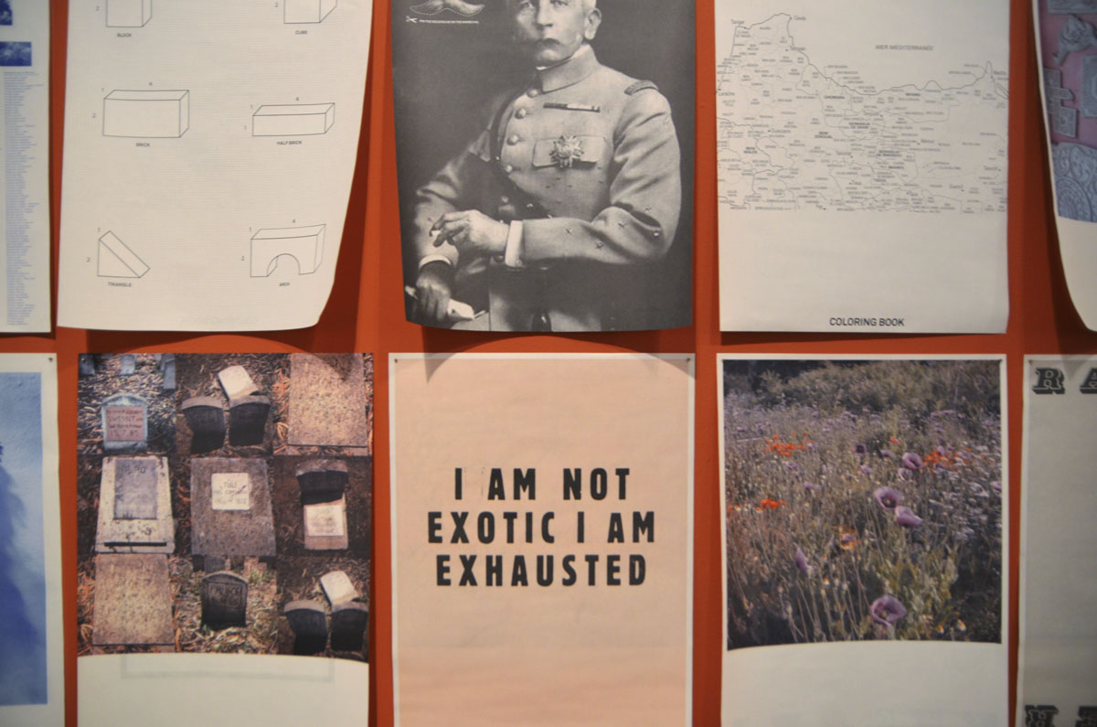
below: “I am not exotic I am exhausted”.  I suspect that this comes as Barrada’s response to living in a place (Tangiers Morroco) where tourists come to see “exotic things”.  But it is also the lament of anyone trying to live and work in a place that is also a “tourist attraction”.

Part of an exhibit by Yto Barrada of a series of posters printed on paper and loosely tacked to the wall, of images and words. 6 shown in this photo. Including one that only has a few word on it, I am not exotic I am exhausted.

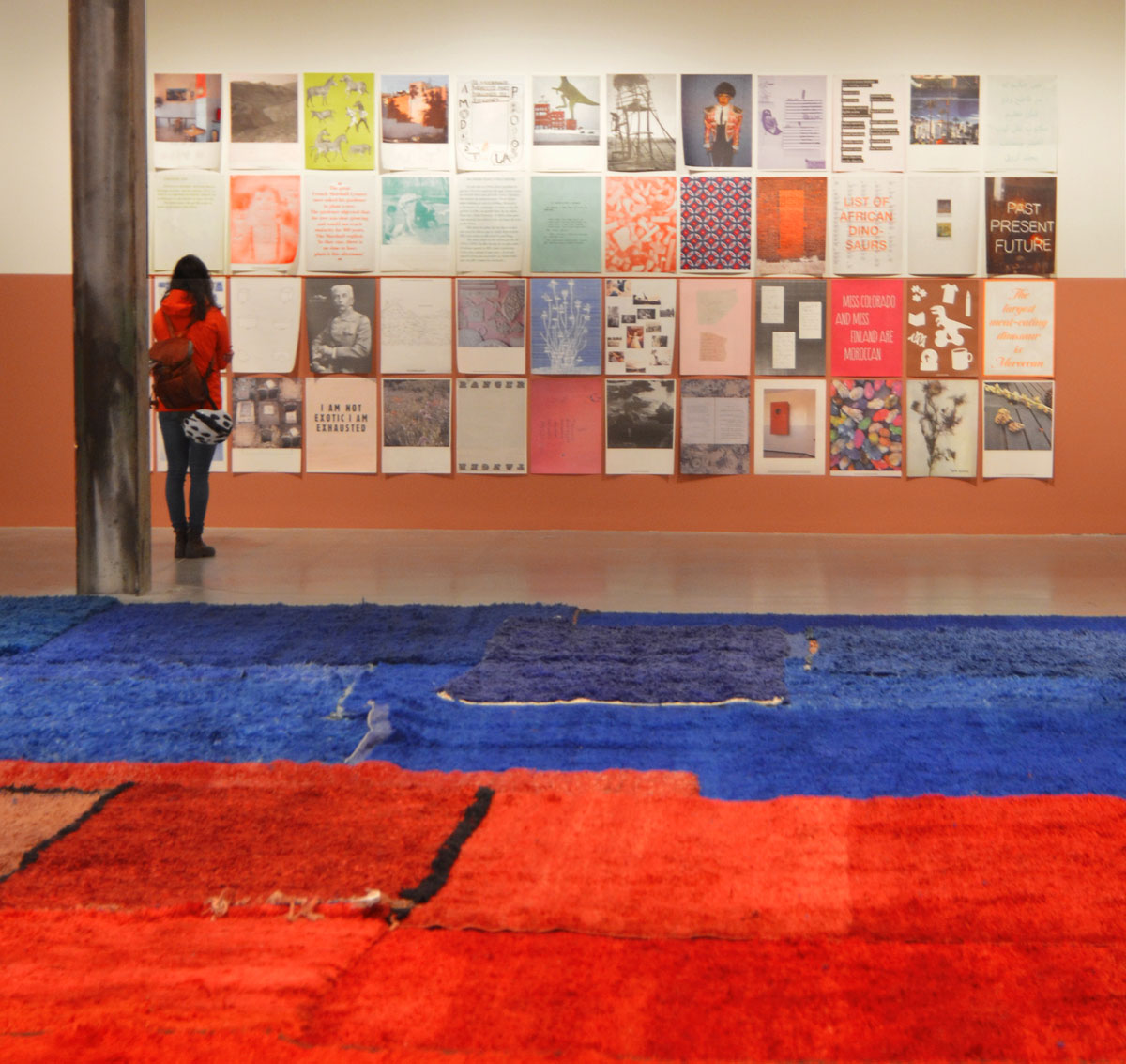
below: The whole of ‘A Modest Proposal’ and ‘Faux Guide’, 2015.  A set of 48 posters loosely tacked to the wall.  A mix of humorous and poignant.  One is an alphabetical listing of all the types of dinosaurs found in Morocco.  One says “Miss Colorado and Miss Finland are Moroccan” – which did happen in 2012.

Part of an exhibit by Yto Barrada of a series of posters printed on paper and loosely tacked to the wall, of images and words. They are arranged in a grid of 12 x 8 pictures. A woman is standing in front of them, reading the words on one. Blue and red carpets are on the floor in the foreground.

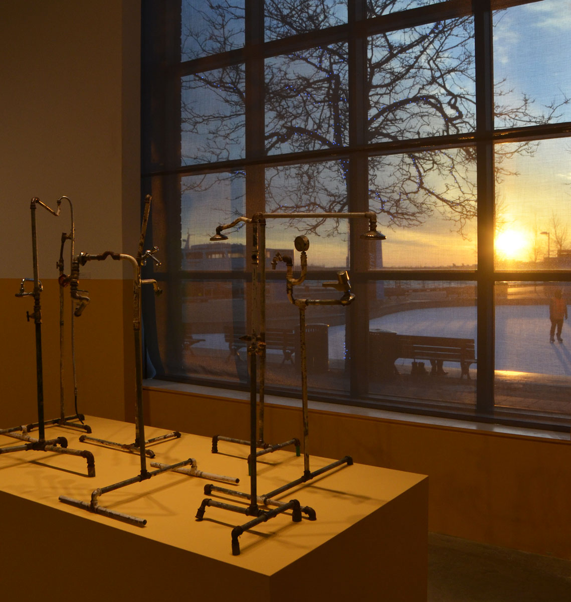
below: ‘Plumber Assemblage’ by the window, with skaters outside in the fading light.

plumber assemblage, an artwork by Yto Barrada consisting of a few sculpture like pieces made from pipes, faucets, taps, shower heads and other plumbing things.

There are many, many things that you can take from this exhibit.  Many things to think about.

An article in the  Toronto Star claims that Barrada  “explores the cultural heritage of her homeland through a colonial lens” and how that heritage has been used to make money from tourists.   But….   Is this the making of money by exploiting one’s culture and history?  Or the exploiting of Moroccan culture and history by the tourists?

Tourists go searching for the foreign and the exotic.  Many of them are souvenir hunters – Sometimes it’s a selfie in front of every “famous” place (or interesting building or whatever) and sometimes it’s a “find”.  But we live in a world that is full of  ‘made in China’ souvenirs and we are a people that don’t care to distinguish between the real and the fake.  We just want a story to tell the folks back home.

There were once dinosaurs living in a tropical land in what is now Morocco….  how the world has changed, and is changing.   Insert your opinions on climate change here.

Because it is a collection of exhibits under one umbrella, it has been compared to a museum.  Very trendy.   One description of the exhibit claims that it is “Meant to make us question the ways in which museums confer value on things”.  Can I take that one step further by asking, how do art galleries confer status on art and artists?  Museums make curatorial choices and so do art galleries.  Barrada too has surely made choices as have I.

You are probably wondering what carpets on the floor have to do with all those words that I just wrote.  Good question.  I think that Yto Barrada is on to something – an exhibit that has visual appeal, offends no one, and is flexible in its interpretation (i.e. it says something different to everyone and fits nicely into most people’s narratives).   You can agree with me, or disagree.  Best to go and see it for yourself and form your own opinions…. mine just might be fake.

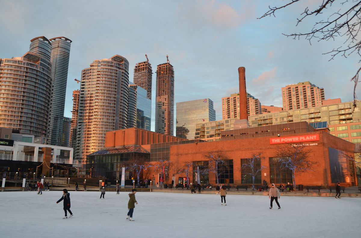
below: People skating on the frozen Natrel Pond beside The Power Plant.

late afternoon with the sun low in the sky casting yellowish glow on the world, Toronto skyline in the background with its condos and construction cranes, also The Power Plant Center and art gallery. In the foreground is the frozen Natrel Pond of Harbourfront and on it people are skating.

Yto Barrada’s exhibit will be on at The Power Plant until the 2nd of January.

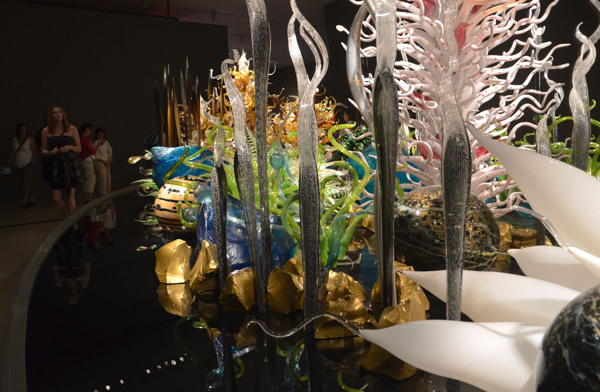
The word Chihuly in the title refers to Dale Chihuly, an American artist who has been working in glass since the mid 1960’s.   At the moment there is a special exhibit at the Royal Ontario Museum (ROM) of some of the sculptural work produced by him and his team.

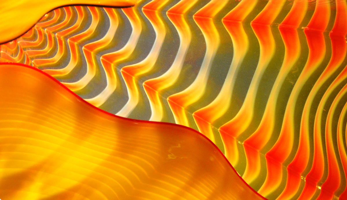
detail of a glass sculpture showing ripples and waves of colour, ornages, greys and yellows

I’ve now wandered through this exhibit three times.   The first time, I found it a bit overwhelming and I wasn’t sure how to photograph it.  The second time I went I just looked.  Yesterday I went back with my camera and tried again.  I’m reasonably happy with the photos but I know that I have only captured a small part of the art.  Perhaps it is enough to enable you to imagine more of it, or to refresh your memory if you have already seen the exhibit.

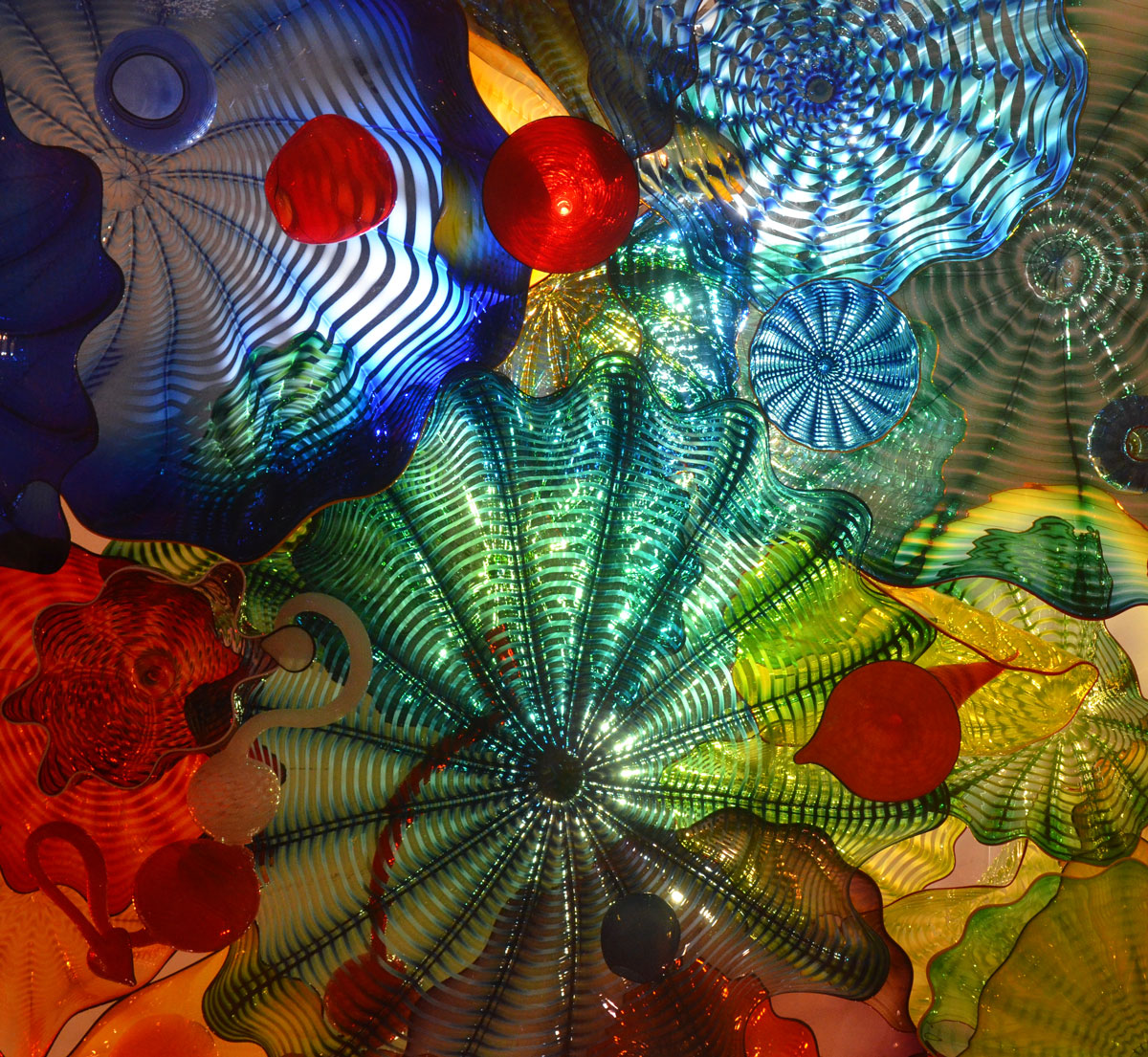
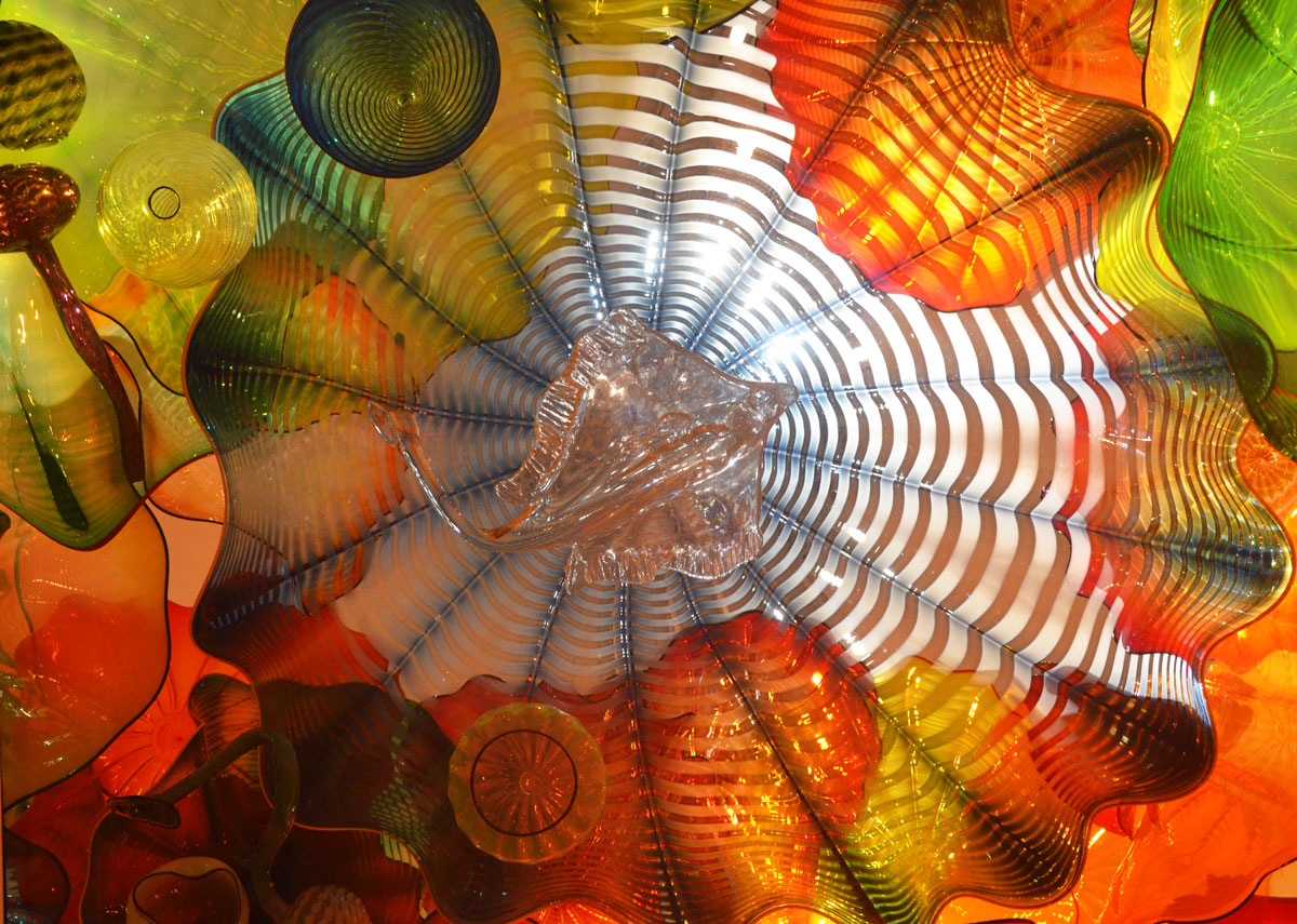
below:   Admirers looking at “Persian Ceiling”, 2012 .  Large cushions were provided for those who wanted to lie down to get a view of the ceiling in its entirety.  Of course, looking at the sections up close was also fascinating.  All the different shapes and colours overlap and produce new colours and textures.

people lying on the floor looking a ceiling that is made of different coloured glass pieces, back lit, also some people standing and pointing at different pieces

below:  Section of the “Persian Ceiling” installation.

bits of coloured glass, circular shapes, ridges, back lit,

The round slight scalloped glass shapes that look a bit like flowers are called Persians.  At least that’s the name that Chihuly has given them as described in this quote that appears on the wall just outside the room.    “I just liked the name Persians.  It conjured up sort of Near-Eastern, Byzantine, Far East, Venice, all the trades, smells, sense… I don’t know, it was an exotic name to me, so I just called them Persians.”

below: A ray swims amongst the waves of colour.

bits of coloured glass, circular shapes, ridges, back lit,

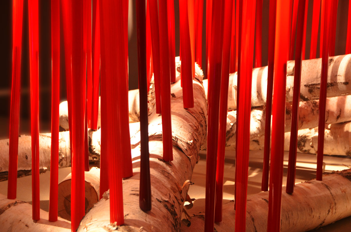
below: “Red Reeds”.  I thought of candles when I first saw this piece, red candles in a birch bark candle holder.  Then the  young girl standing beside me announced that it was a campfire and I changed my mind.  I think she’s right.  Marshmallows anyone?

The red tubes are hollow glass.  Metal rods have been inserted into the birch logs and the glass tubes sit over these rods.  You can see the darker sections at the bottom of the tubes where the metal rods are.

red glass tubes inserted into large birch logs, looks like a campfire with tall flames

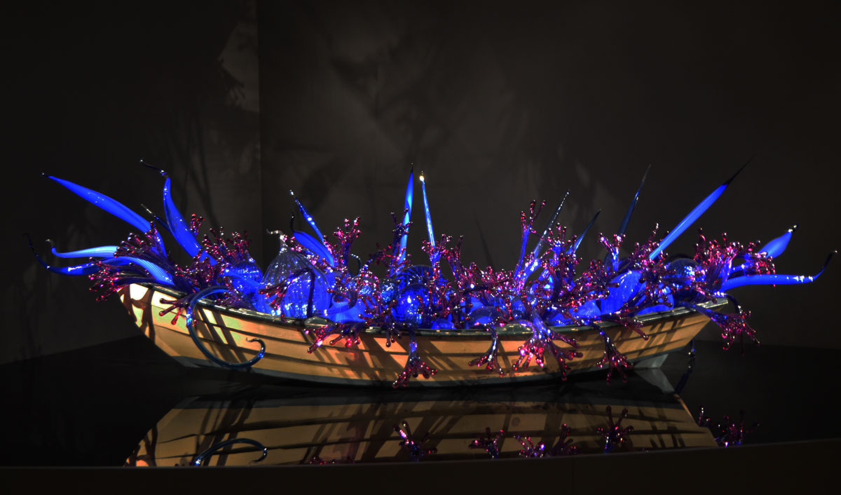
below: “Blue and Purple Boat, 2006”.  Back in 1995 Chihuly floated some glass pieces on a river in Finland.   Local teenagers collected the pieces in their wooden boats and this provided the inspiration for a number of installations featuring glass in boats.  This is one of two on display at the ROM.  It is on a reflective surface, like a calm river.

a wooden boat on a black reflective surface. The boat is filled with blue and magenta pieces of sculpted glass

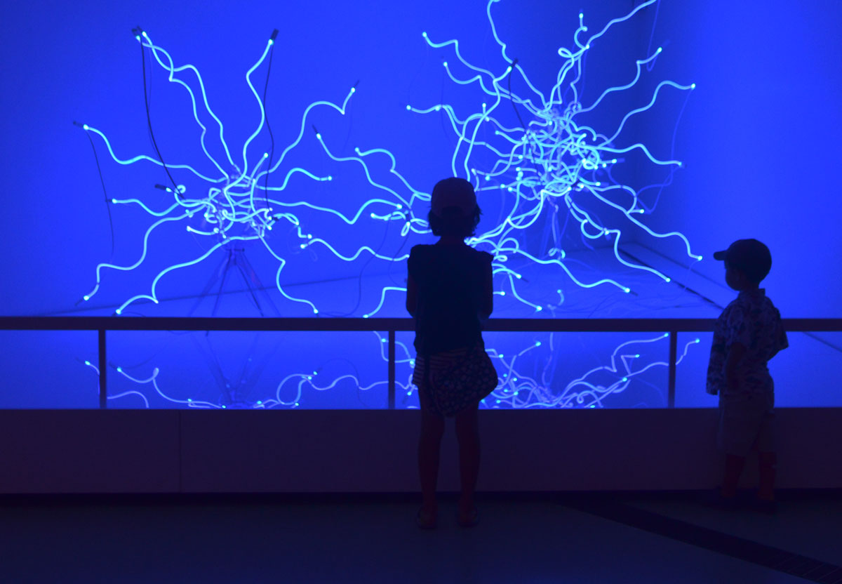
below: “Sapphire Neon Tumbleweeds” constructed from factory made neon tubes that have been heated and bent into organic shapes.  The lighting is magenta in real life but blue in my photos.

two kids standing in front of an exhibit with blue neon lights twisted into tumbleweed shapes, backs to the camera

below: The next few photos are of a large and elaborate installation called “Laguna Torcello”,  named after a lagoon island in Venice.  It is a garden of fantasy in glass.  Parts seem to be aquatic, growing under water.

aquarium like structures, water plants, and large shells, made of glass, on a black glass reflective surface

As an aside, I suspect that the logistics and cost of transporting and installing these pieces is not minor.  Like the red tubes above, this garden is made of hollow glass pieces that are arranged on, and supported by, rods.  The whole thing sits on a flat, dark, and reflective surface which adds another dimension to the artwork.

green glass and silver metallic horn shaped pieces on a black reflective surface, part of a large glass art installation by Chihuly at the ROM

different shaped glass sculptures that look like stylized underqater scene, aquatic plants

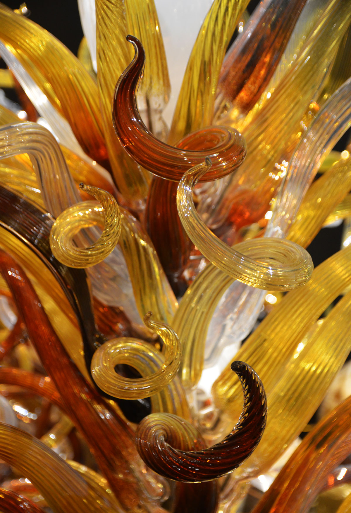
curly pieces of glass in different shade of amber, look a bit like curly seaweed growing under water

The exhibit continues until the end of 2016.

Dale Chihuly website

This post is subtitled ‘Staying Cool on a Hot Hot Day’.  When the temperatures are into the 90’s (old style) and the humidity makes the air thick, walking streets and alleys is not very comfortable.  Instead I took refuge in air conditioned arty places.  With the help of the (mostly) air conditioned TTC I only needed to take a few steps outside.

below: At one point I walked through an air conditioned building rather than going outside.  This is what I found there. ‘August 6, 1945’ by Matthew Day Jackson.  Moments after I pulled my camera out of my backpack, a security guard appeared.  I was sure that once again I was going to get the “this is private property” talk but instead we ended up discussing the work and how it is displayed.

It is constructed of four panels and it’s very heavy.  The base is made of lead; you can see the lead where Lake Ontario is.  It is attached to the wall with 18 very long bolts and each bolt is wired to an alarm.

map of toronto made of charred wood and lead, meant to resemble the city after an atomic bomb, large, made by Matthew Day Jackson, hanging on a wall behind a metal railing.

below:  Looking a bit more closely at it you can see that it is a map of Toronto.  As you might have surmised,  the title is a reference to the dropping of the atomic bomb on Hiroshima by the USA during WW2.    This isn’t just any map of Toronto, it’s an aerial view of a burnt out city after a nuclear explosion.  It is one in a series of cities given similar treatment, all with the same title.

detail of the islands and downtown area of map of toronto made of charred wood and lead, meant to resemble the city after an atomic bomb, large, made by Matthew Day Jackson

From the effects of man made death to the life enhancing effects of nature….

below: A few steps outside took me past the Gardiner Museum where I noticed that the front garden was redone about a year ago.  ‘Vertical Crevice Garden’ was designed and donated by landscape artist Neil Turnbull.  From the Gardiner museum website, a quote by the artist: “When the massive forces of continental drift push against layers of sedimentary rock, they cause it to crack, break, and rise. Over centuries, through exposure to wind, sun, and the freeze-thaw cycle, the layers split open. These fissures and crevices collect rain, dust, and an array of windblown bits like seeds and spores; plants take root, and life takes hold.”

limestone rocks arranged on a slant in a garden, stripes of red rock and grey rock, all just a few inches off the ground

below: When walking past the Gardiner Museum, one can’t help but notice the striped head.  It’s actually called ‘Untitled’ (why do artists do that?) and it’s by Jun Kaneko, 2002.  It’s made of glazed ceramic and galvanized steel.   Before heading underground at Museum subway station I took a few minutes to try to take a ‘pretty’ picture of the head.  The plants in the garden next door haven’t quite grown up enough to hide that ghastly table that the head sits on.  I have always wondered why the museum chose such a mundane bland platform for the sculpture but now that I look at it again I wonder if it’s possible that the table is actually part of the artwork.  Could it be?

large striped head sculpture on a table, outside, by Jun Kaneko, old building behind it, lavender and other plants growing in front of it.

below:  A photograph in the doorway of a gallery caught my eye.  The picture below is not the one in the doorway, but one that was hanging on a wall inside that I liked even more.  ‘Paris Rooftops 4’ by Michael Wolf.  It is 48″ x 68″ and is a chromogenic print (full-colour silver-based photograph), edition of 9.   To buy it will set you back $22,000 but looking is free – check out more of Michael Wolf’s work on the Bau-Xi gallery website.

picture of a photograph by Michael Wolf of Paris rooftops. Concrete grey with lots of lines of little terra cotta chimneys

below: A man with a camera stares at a painting on a gallery wall.  ‘Watching’ 2010, (26 inches high) by Tom Campbell on the left and ‘Brown Trail #7’ 2016 by Shi Le, a Toronto based landscape artist.  These are at the other Bau-Xi gallery (the non-photography one)

a small sculpture of a man holding a camera is placed in an art gallery such that he seems to be looking at a painting on the wall.

below: Three paintings by NUBARR Gallery, a collection of the works of Armenian-Canadian painter Noubar Sabag (Noubar Sabbaghian) 1920-2006.   These, and others by the same artist, are on show at the Art Square Cafe & Gallery but unfortunately I just learned that today is the last day.

a woman in a floppy black hat is taking pictures of three paintings hanging on a gallery wall.

below:  How many people try to paint pictures like this?  How many people sell such paintings, not to mention have them hang in the Art Galley of Ontario?  But they aren’t Robert Motherwell.      So I ponder on the age old question of what makes a piece of art valuable or collectable?  Is the AGO (and other galleries) collecting paintings or names?  Motherwell painted this in numerous variations – a few changes in colour, a slight change in the lines.  Cheating?  Or brilliant marketing?  One for every gallery of note? This is Motherwell’s ‘Untitled (In Orange with Charcoal Lines)’ c1970.  There’s that “untitled” again, the most popular name for an artwork.

all orange with 3 black lines that form three sides of a square, top line of the square is missing. It's a picture of a painting by Robert Motherwell in an art gallery

My last stop of the afternoon was at the photography exhibit by Thomas Ruff at the AGO.  Part of the exhibit was a few large photographs of stars,  ‘Sterne’.  Large pictures of stars in the night sky were made from negatives that Ruff bought from the European Southern Observatory in Chile in 1989.

below:  They are difficult to look at, or rather it is difficult to what is the picture because the blackness of the photograph creates a mirror when placed behind glass.   This is me taking a picture of the picture – me plus the picture on the opposite wall plus the lights and light fixtures in the ceiling plus a table plus another person in the room plus a few white spots that are stars.

large photograph of the night sky, lots of stars and blackness. The black acts like a mirror and parts of the gallery are reflected in the picture.

below: ‘Walking Away, Walking Through the Universe’ a manipulation of a manipulation.

a reflection of two people walking hand in hand as seen reflected in a photograph of stars in the black night sky

below:  One last photo.  Let’s end this on a positive note and give Thomas Ruff credit for some interesting work.   These two pictures are part of his press++ series where he has taken old photos used in print medium and merged the front (picture) and back (words and markings) of the print into one.

a woman is standing in an art gallery and she is looking at two large pictures on the wall.

Thomas Ruff, Object Relations, at the AGO until 1 August 2016

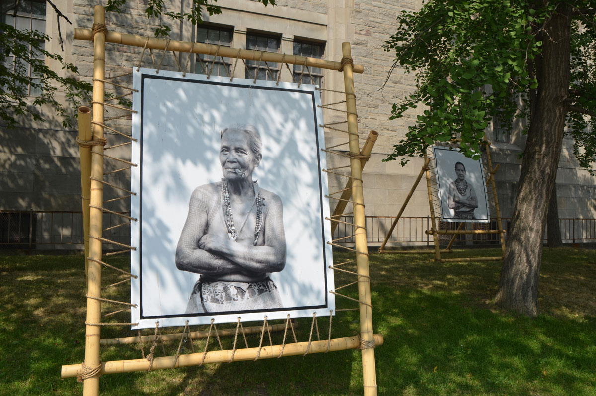
There are seven or eight large photographs, portraits of older women, on University Avenue.   They were actually part of the CONTACT Photography Festival and they have been on display outside the Royal Ontario Museum since early May.  The photos are the ‘The Last Tattooed Women of Kalinga”, portraits by Jake Verzosa.

large black and white photo of an older woman with many tattoos, black and white, displayed outside, another portrait in the background

In the villages of the Cordillera mountains of northern Philippines the women have been tattooed with lace-like patterns for centuries.  The tattoos are symbols of stature, beauty, wealth and fortitude and are traditionally applied during rituals.  The tradition is dying out as standards of beauty change and as the old ways are replaced with more modern methods.

Each village once had their own tattooist, or mambabatok, but today only one remains.  Born in 1918, Whang-od (or Fhang-od), is the last person to practice the centuries old technique called batok.  The ink is made of charcoal and water and it is applied by tapping the skin with a thorn.

two older women with their shoulders tattooed, wearing necklaces and a patterned skirt, seated. Black and white

Once the men were also tattooed.  The Kalinga tattoo has evolved from their ancient tradition as warriors and headhunters.  Heads were taken from fights and battles as a trophy; each time a man brought home a head he would receive another tattoo as a reward.  Tattoos were a mark of social status.

Indigenous groups throughout the Philippines practiced tattooing for centuries.   When the Spanish arrived in the 1500’s they called the people ‘pintados’ or ‘painted people’ as it was not uncommon for people to have tattoos covering their whole body.  While some tribes used tattoos to mark status, other tribes believed that tattoos possessed special spiritual or magical powers which gave the individuals strength and protection.  The use of tattoos as protective symbols is an idea that occurs in many cultures.

large black and white photo of an older woman with many tattoos, black and white, displayed outside, another portrait in the background

In conjunction with the Kalinga portraits, the ROM is featuring an exhibit that examines the beliefs surrounding tattoos, and the role that they and other forms of body art play in different cultures over the years.  “Tattoos: Ritual, Identity, Obsession, Art” is on view until September 5th.  It is a global tour of tattoos past and present.

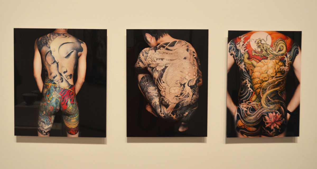
One of the cultures that is featured is the Chinese.  For centuries, tattoos were forbidden, or at least taboo, in China.  To be tattooed was to be discriminated against as they were associated with prisoners or vagrants.  Recently that has begun to change.

below: Three large modern picture tattoos by Taiwanese tattoo artist Gao Bin featuring traditional Chinese images, Buddha, lion and dragon.  Tattoos as a cultural expression.  In some countries such as Sri Lanka and Thailand images of Buddha are considered sacred objects of worship.  While it’s not illegal to have such a tattoo, wearing one could get you into trouble.

Three pictures of the backsides of men, each with a large picture tattoo from neck to thigh. Chinese art pictures as tattoos

below:  Here is another example of why people get the tattoos that they do.  This is a picture of one photograph in a series by Isabel Munoz.  Munoz spent three weeks inside several prisons in El Salvador and photographed mara gangs.  Gang members wear offensive tattoos to assert their antisocial behaviour and express their loyalty to the gangs.  Tattoos as statement; tattoos as a mark of membership and belonging.  Tribal.

photo of a picture in a museum of a man's face that has been tattooed with gang symbols and words,

below: A silicone arm with a tattoo by Montreal artist Yann Black on display.  This is one of 13 commissioned tattoos on silicone body parts – arms, legs and torsos both male and female that are part of the exhibit.   Tattoos as artwork.  Individuality.

a silicone arm has been tattooed with a design that looks something like a cross between Frank Lloyd Wright and Mondrian. It is in a glass showcase in a museum.

The oldest known tattoos were found on Otzi the Iceman, a natural mummy who was found in the Otzal alps near the Austria – Italy border in 1991.  His tattoos were 61 lines ranging in length between 7 and 40 mm.  The lines were arranged in groups.  Most of his tattoos were on his legs where there were 12 groups of lines.  Otzi is estimated to have died between 3239 BC and 3105 BC.

Tattooed mummies have also been found in other places – Greenland, Alaska, Siberia, Mongolia, western China, Egypt, Sudan, the Philippines, and the Andes in South America.  We will probably never know what significance the tattoos had.  Theories abound of course and they often involve reasons like protection, spiritual, status, tribal, or just for decoration.  Reasons that probably ring true today too.  The methods have changed and some of the images have changed, but human nature remains just that, human nature.


A comparison of sorts.  Two painters from two different time periods.  One looked north and the other looks south.  The north with its barren cold and blue in comparison to the south and its lush greenness.  A famous anglo Canadian painter who went searching for simplicity and a relatively new British painter with Jamaican roots who explores complexities.

Lawren Harris and Hurvin Anderson.  You should know which is which!

I didn’t purposely set out to compare them.  I saw the ‘The Idea of North’ exhibit that features the Steve Martin paintings of Lawren Harris first.  As much as I like the Group of Seven, Harris’s minimalist snow and ice paintings have never been my favorite.  Still, it was an interesting collection to see.  After I finished there, I headed up to the contemporary art floors.  The fifth floor is still closed (new installation opening later this week) but I discovered that the fourth floor is devoted to the works of Hurvin Anderson.  As I walked around the Anderson installation I kept thinking of similarities and differences between him and Lawren Harris.

many people in a room in an art gallery, standing around and looking at paintings.

below: Mountains in Snow: Rocky Mountain Paintings VII, 1929.  One of the many famous Lawren Harris snow and ice paintings.  Light, reflected light, shadows, and contrasts.  The elements reduced to their simplest form.   The landscape itself is almost secondary.  Or the landscape is the medium, not the message.

a Lawren Harris painting of a snow covered mountain, blue sky in the background.

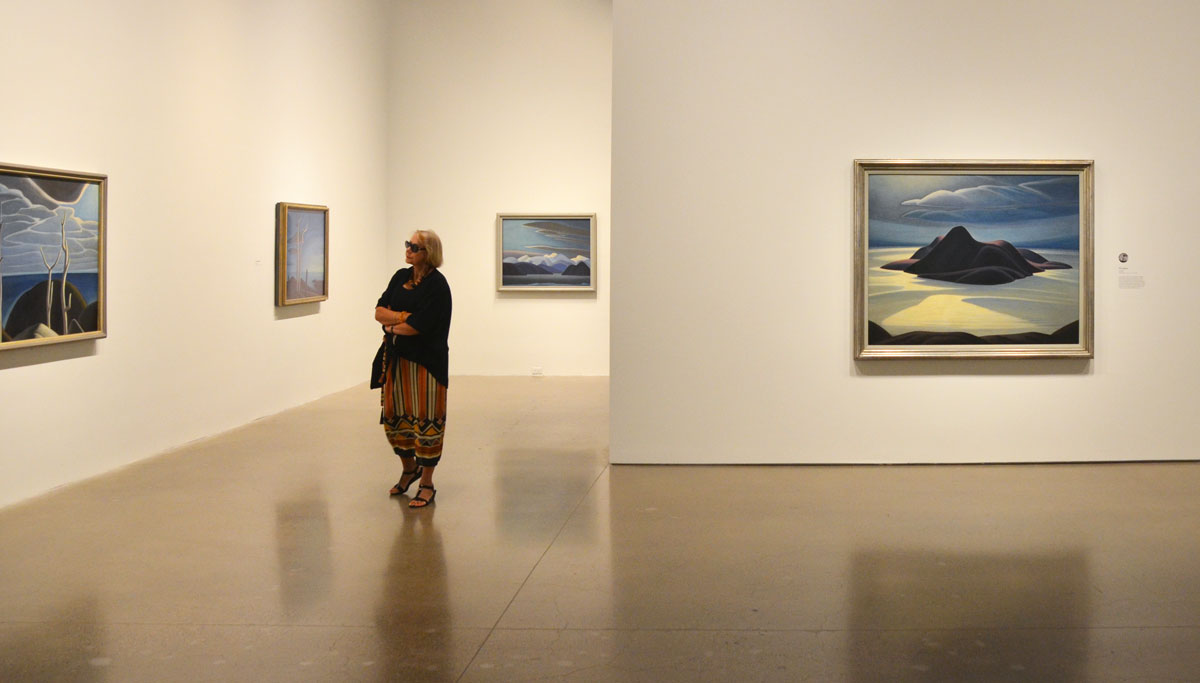
below: The large painting on the right is ‘Pic Island’ painted about 1924.  Pic Island is an unpopulated island along the north shore of Lake Superior.  Today the island is part of Neys Provincial Park.

a woman walks through a gallery with paintings on the wall. She stops to look at one of them.

below: Two of Hurvin Anderson’s paintings from his Caribbean landscape collection.  On the left is ‘Beaded Curtain – Red Apples’, 2010.

three young women sitting on a couch with their backs to the camera, they are looking at two large paintings on a wall, by Hurvin Anderson.

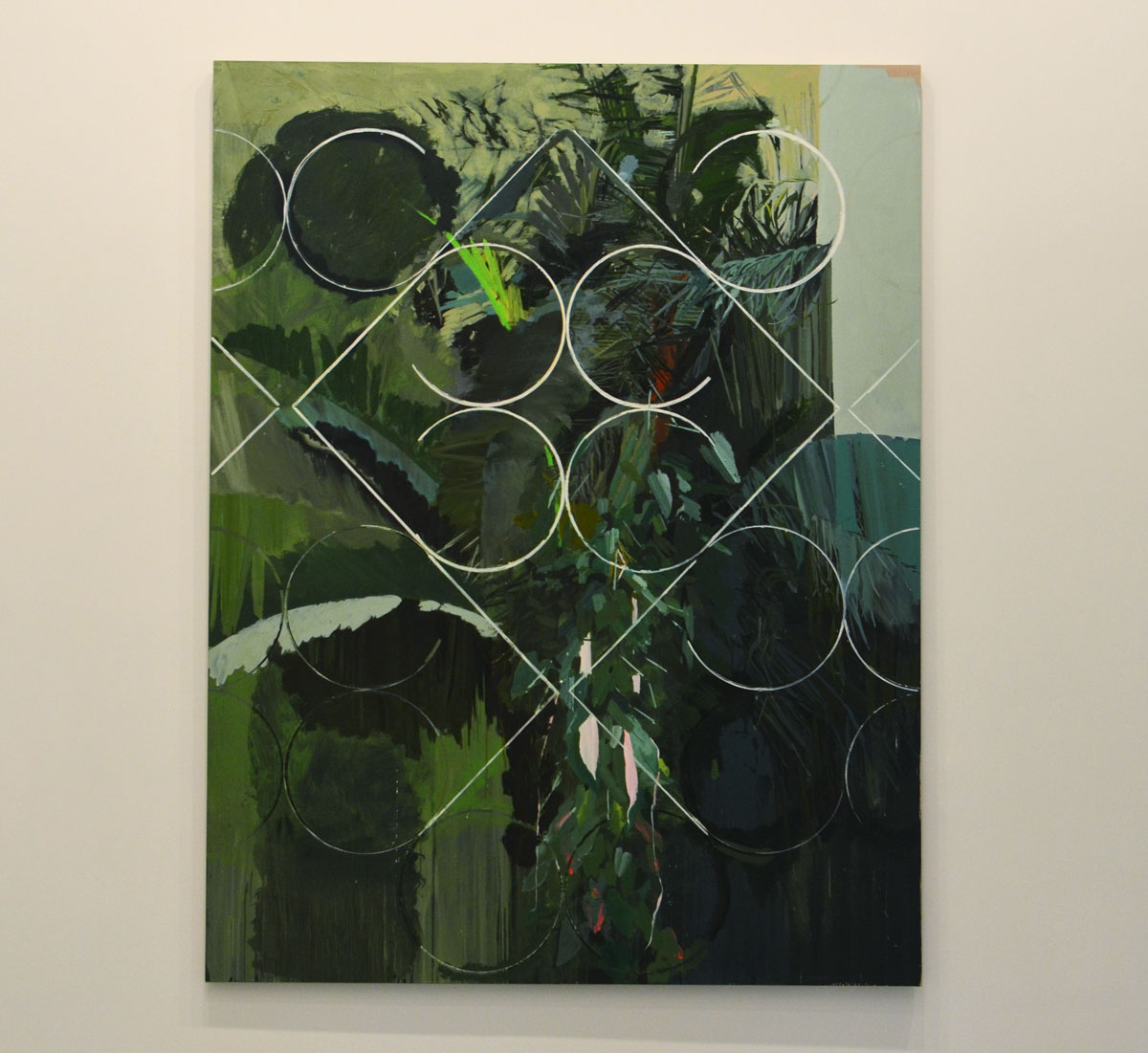
below:  ‘Constructed View’, 2010.  Anderson’s Caribbean paintings have grilles incorporated into them.  These are the security features prevalent on houses and businesses in the Caribbean (and elsewhere in the world), metal fixtures over windows and doors to keep out the unwanted.  They contain what’s inside.  They are a barrier.  They intrude on the landscape and cut it up.  Again, the landscape is almost secondary.  The message, or emotion, is more important.  [aside – There is a grille in the painting above (right) but it’s more subtle.]

a landscape painting in shades of green with fragments of white grille overlayed, repeating pattern of 4 circles with a square

Lawren Harris painted his famous mountain pictures in the late 1920’s.  In 1930 he visited Baffin Island and a few paintings resulted from that trip.  I learned that although I associate Harris with icebergs and arctic scenery, most of his snow and ice paintings were from the north shore of Lake Superior or from the mountains around Banff Alberta.

The repetoire of both painters is not limited to landscapes.  Harris painted many houses and street scenes from downtown Toronto including houses and streets that were demolished years ago.  The examples of Anderson’s non-landscape work were interiors.  Both men used bold colours but Anderson tends to show more detail in his paintings.

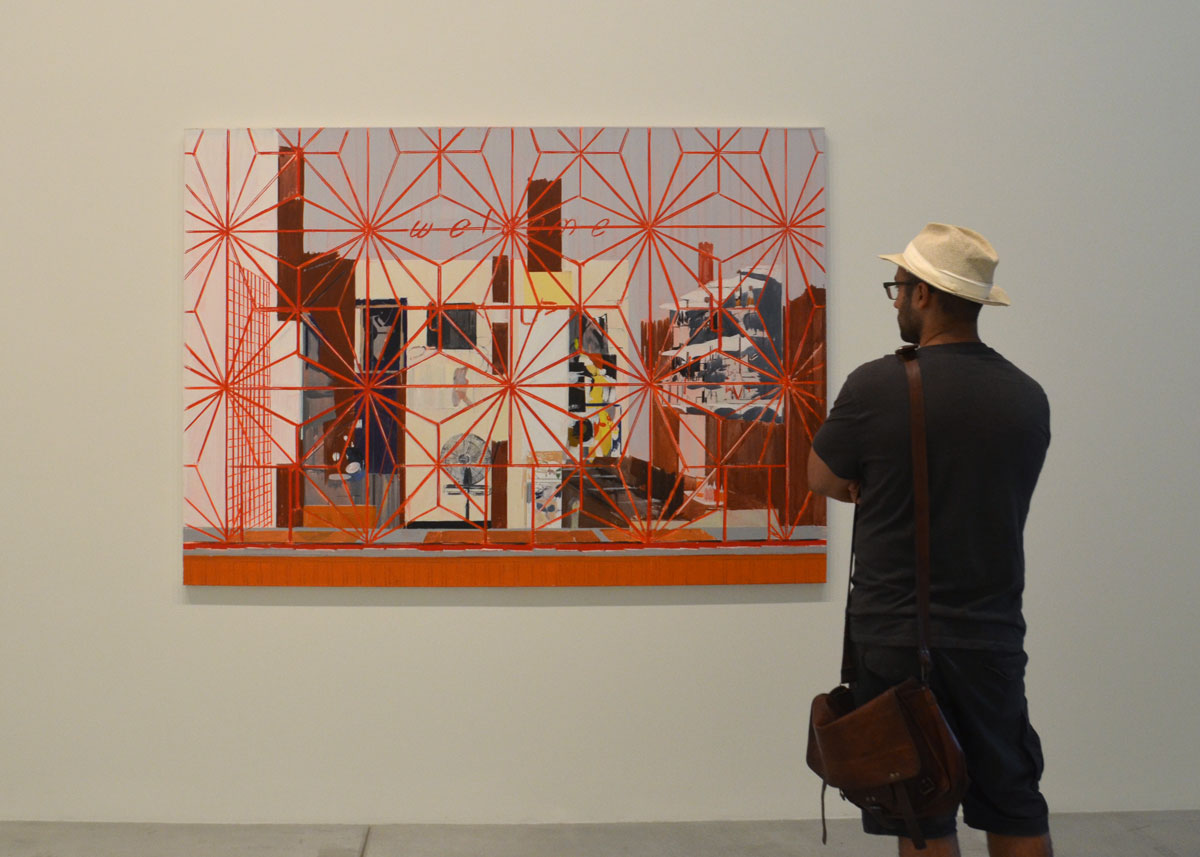
below: ‘Welcome: Carib’  The Welcome sign of the bar in  juxtaposition with the red metal work covering the window.  The picture beckons to us but keeps us out.

a man in a straw fedora stands in front of a painting called Welcome: Carib by Hurvin anderson, it features a red star patterned grille over the painting, over the window that is in front of the interior scene.

below: One of the paintings from Anderson’s Barbershop collection, ‘Flat Top’ 2008.

two young women walk away from a large painting hanging on an art gallerywall.  two barber chairs in a barber shop, empty.  Bright pink wall with squares of colour.

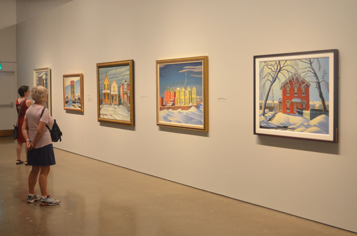
below: A selection of colourful Toronto houses in winter painted by Harris in the 1920s.

two women look at a line Lawren Harris paintings of brightly coloured houses in winter on a wall in an art gallery

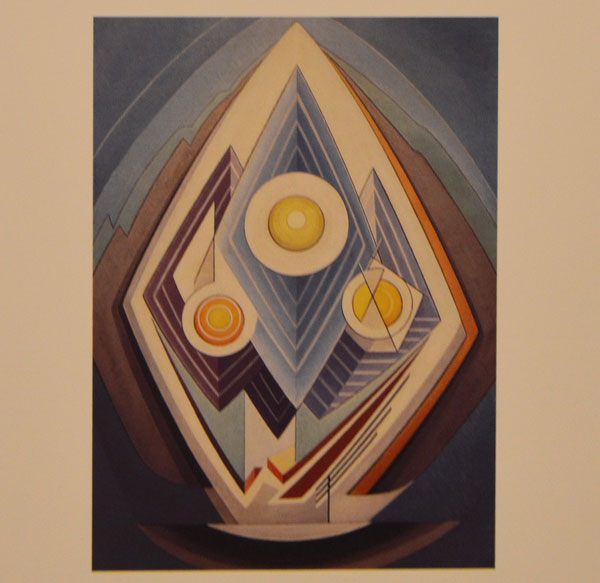
In the 1930’s Lawren Harris’s personal life went awry.  The words on the wall at the AGO says that he divorced, remarried and moved to the states.  That’s a bit of spin.  He didn’t divorce his wife because that would be messy, apparently.  Instead in 1934 he just married the wife of an old friend.   And of course that turned messy and the new couple left for the USA for a few years before eventually settling in Vancouver BC.   Harris’s post-1934 work is very abstract and was never as successful as his earlier paintings.

below:  You can see the influence of the mountain paintings in this,  ‘Painting No. 4’, about 1939, painted when he was a member of the Transcendental Painting Group.  This was a collective of artists in New Mexico that Harris help to found.

an abstract painting by Lawren Harris, circles and diamonds in an egg shape

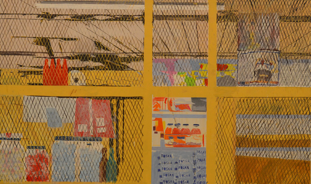
below: Since I have no idea where the art of Hurvin Anderson is headed, I will leave you with one more of his present paintings (I’m not sure those two ideas actually go together!).  ‘Foska Foska’, the interior of a shop behind yellow bars and black mesh.

a painting by Hurvin Anderson called Foska Foska, shows the interior of a store with a yellow metal gate in front.  and a wire structure covering the ceiling too


The Idea of North – until 18 September

Hurvin Anderson – until 21 August

#HarrisAGO | #HurvinAndersonAGO

‘Cutlines’, an exhibit of old photographs from the Globe & Mail,
part of the CONTACT Photography Festival

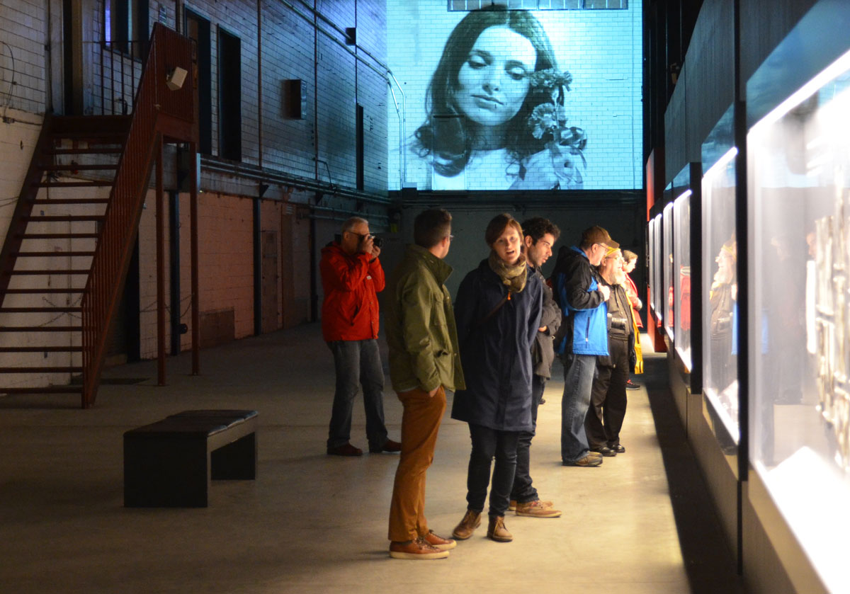
people standing in a large room, the old Press Hall at the Globe and Mail newspaper, looking at an exhibit of old photos. Some photos are being projected onto a wall

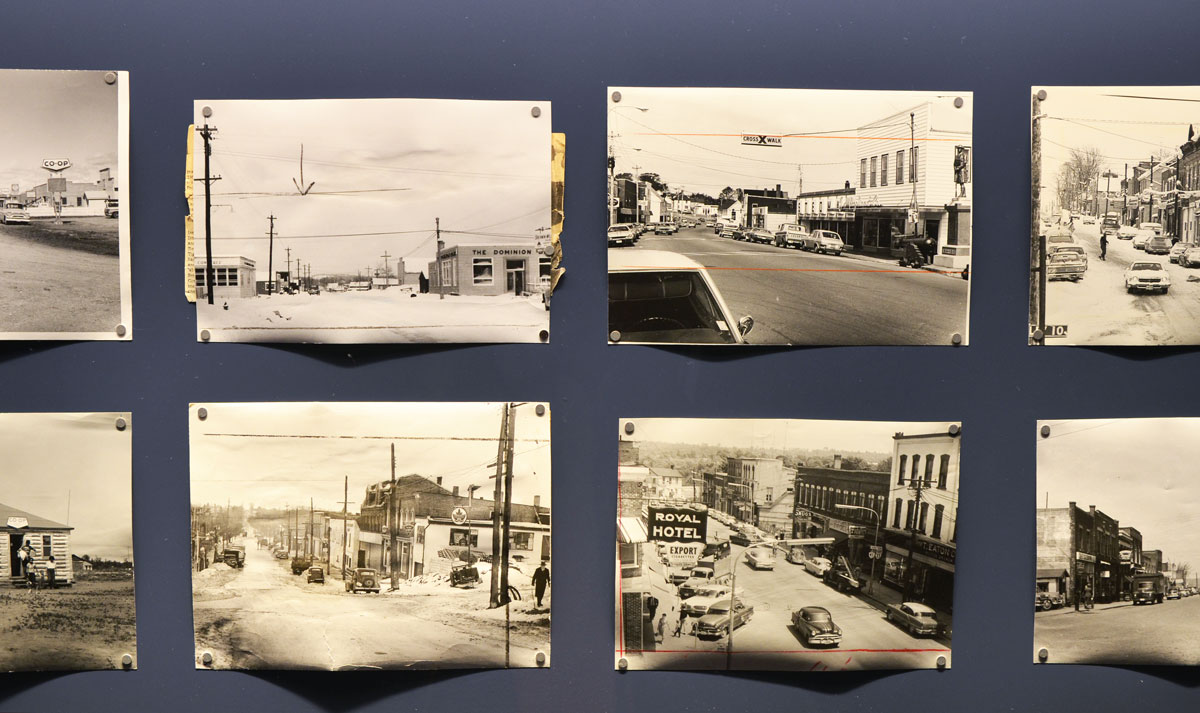
below: A small sample of the 175 vintage black and white photos from the vast collection held by the Globe and Mail newspaper on display.

old photographs, black and white, of small towns, in a display case, as part of an exhibit called Cutlines, old photos from the Globe and Mail collection

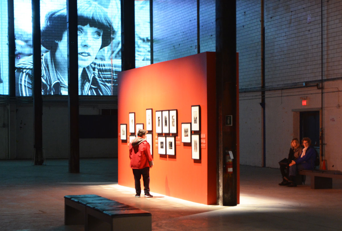
below:  The exhibit is being held at the Press Hall on Wellington Street (near Spadina).  This old building is slated for demolition in the near future as the Globe and Mail is in the midst of moving to a new home.  Prints were in cabinets in the center of the room while other images were projected high on the walls.

people standing in a large room, the old Press Hall at the Globe and Mail newspaper, looking at an exhibit of old photos. Some photos are being projected onto a wall

The Globe & Mail has amassed a collection of about 750,000 photographs.  As they transition from print to digital images, they are ‘cleaning house’ with respect to their photo archives.  About 100,000 of the prints are going to be digitized and a portion of those donated to the new Canadian Photography Institute at the National Gallery of Canada in Ottawa.

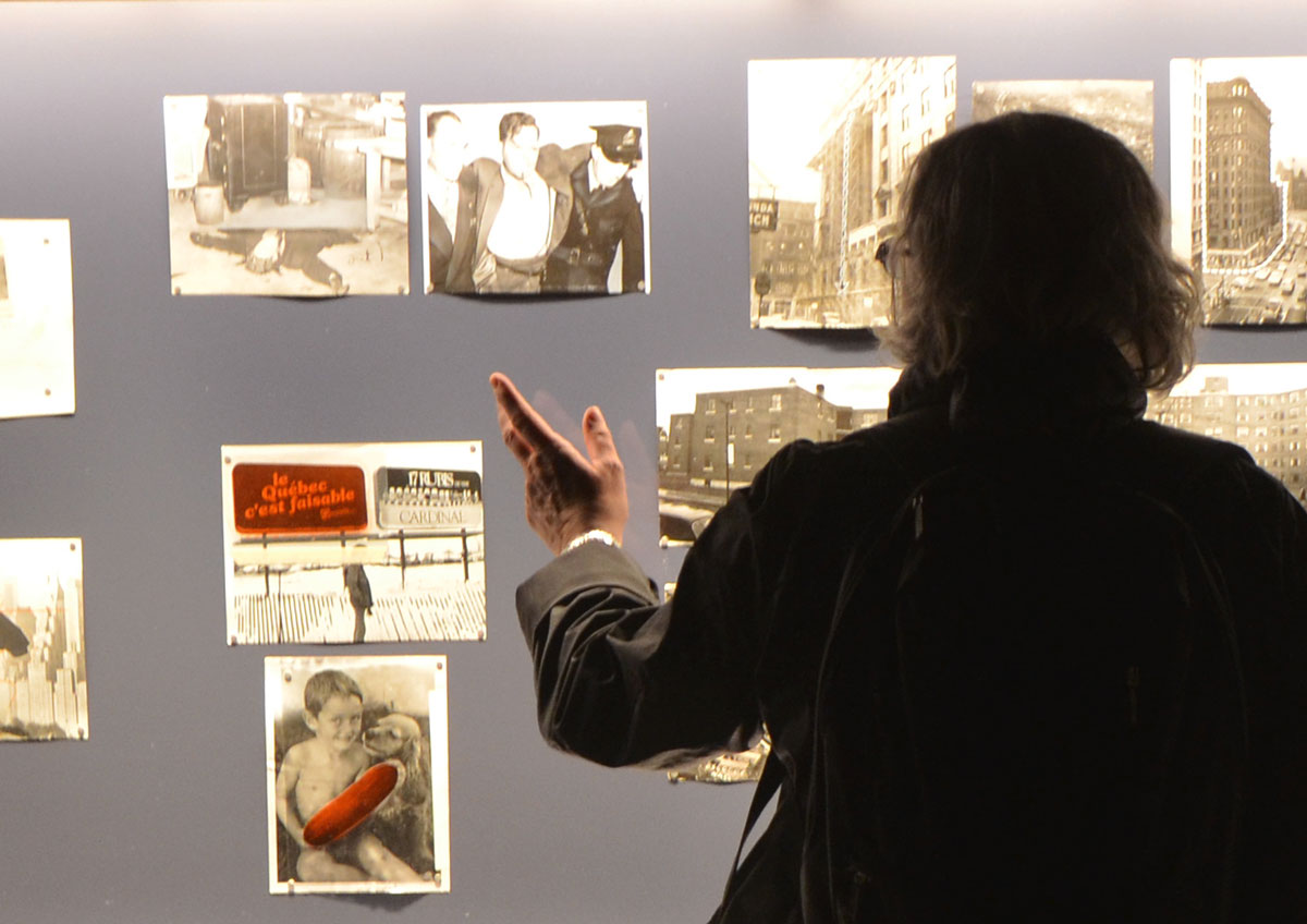
below: Some of the pictures were covered with red, with what is known as a rubylith mask.  When the images were printed, the portions covered in red remained as they were while the rest of the picture could be changed to suit the needs of the story of the day.

silhouette of a woman standing in front of a lit display case of old photographs

people standing in a large room, the old Press Hall at the Globe and Mail newspaper, looking at an exhibit of old photos. Some photos are being projected onto a wall

people standing in a large room, the old Press Hall at the Globe and Mail newspaper, looking at an exhibit of old photos. Some photos are being projected onto a wall

people standing in a large room, the old Press Hall at the Globe and Mail newspaper, looking at an exhibit of old photos. Some photos are being projected onto a wall

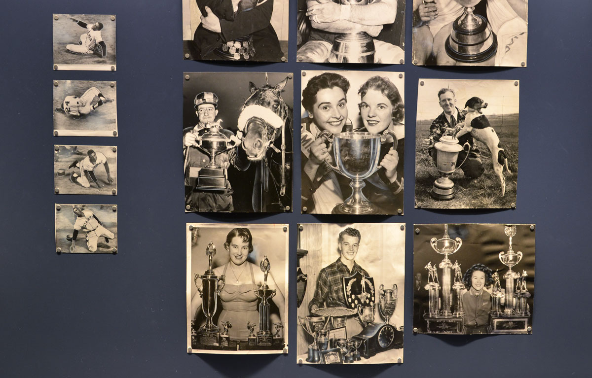
below: The woman with the two trophies, bottom left, is Marilyn Bell who swam across Lake Ontario.  I know that the man beside her is from a story about a cowboy championship of some sort in Calgary and my apologies for not remembering more of the details.

old photographs, black and white, of people with trophies, in a display case, as part of an exhibit called Cutlines, old photos from the Globe and Mail collection

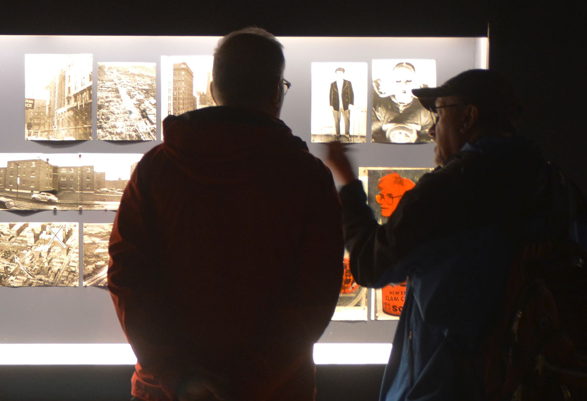
silhouette of two men standing in front of a lit display case of old photographs

On view at 425 Wellington St. West until 26 June 2016

#CONTACT16