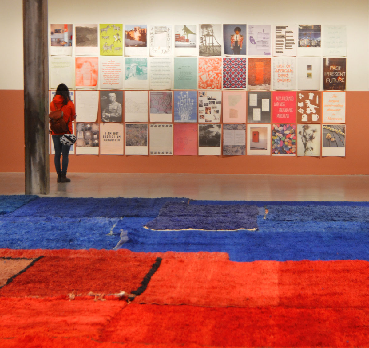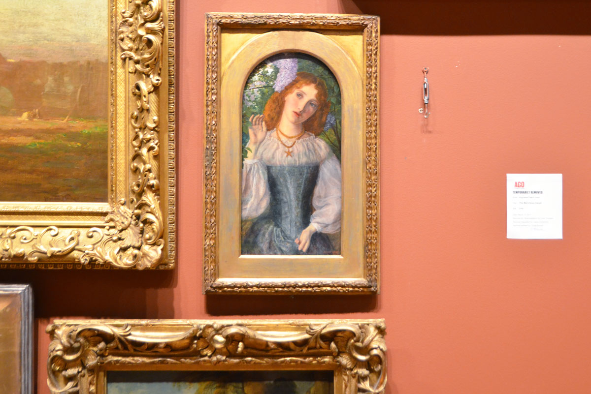
All kinds of thoughts went through my head as I stood and looked at this painting at the Art Gallery of Ontario (AGO). A little ho hum and a little melancholy and a little well what next. There were no new exhibits since the last time that I visited the AGO and quite a few galleries were being prepared for new showings (i.e. closed). A little bit of that’s a waste of time. Even here there’s a painting missing. … no, it’s only a waste of time if I let it be.
I stood and studied her face, the expression on her face, the tilt of her head and one hand held up. What was going through her head? Was the artist trying to tell us something about her? Or was he just playing with composition in a limited space? And that’s when the game began – what expressions hang on the walls of the AGO? A sample:
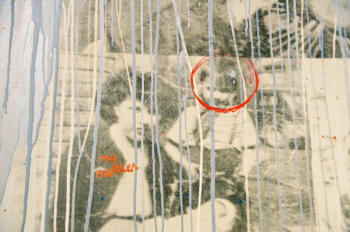
below: part of “Time Dissolve” created around 1992 by Carl Beam (M’Chigeeng Ontario 1943-2000) using photo emulsion, acrylic and pencil on canvas.
below: manipulating a series of portraits by Will Gorlitz (b. Argentina 1952). The paintings were done in 1984 and are called Genre IV, Genre XVI, etc. Nameless. Unless her name was Genre and he’s painted her 6 times (one of the paintings in the row is not included here).

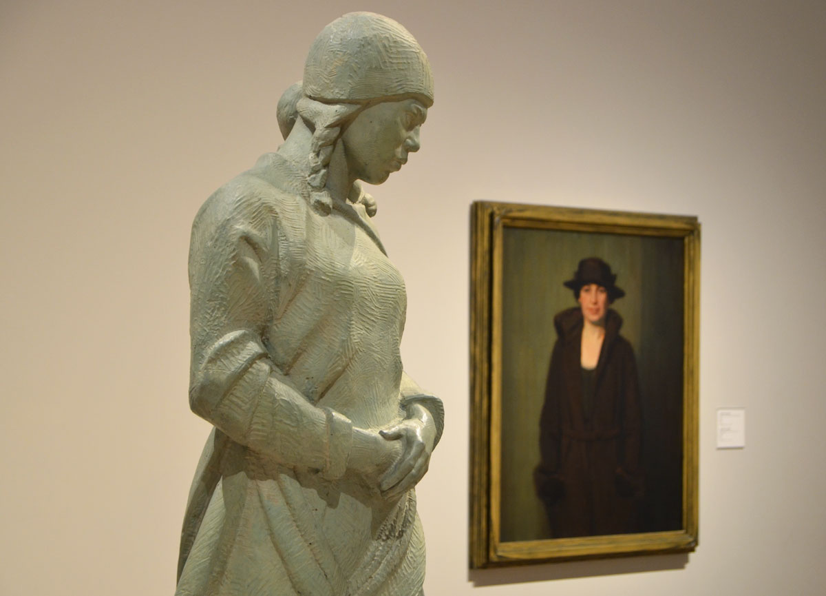
below: Two pieces. A sculpture called “Eskimo Mother and Child” (about 1938) by Frances Loring and the portrait “Bess” by Canadian painter Lawren Harris. I have talked about Loring in a previous post.
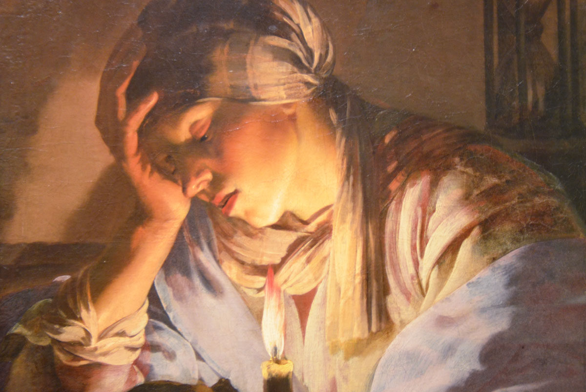
below: part of “Melancholy”, oil on canvas, by Hendrick Terbrugghen (The Netherlands, 1588-1629)
below: part of “Waitress”, oil on canvas, by Shelley Niro, 1986 (b. USA 1954)

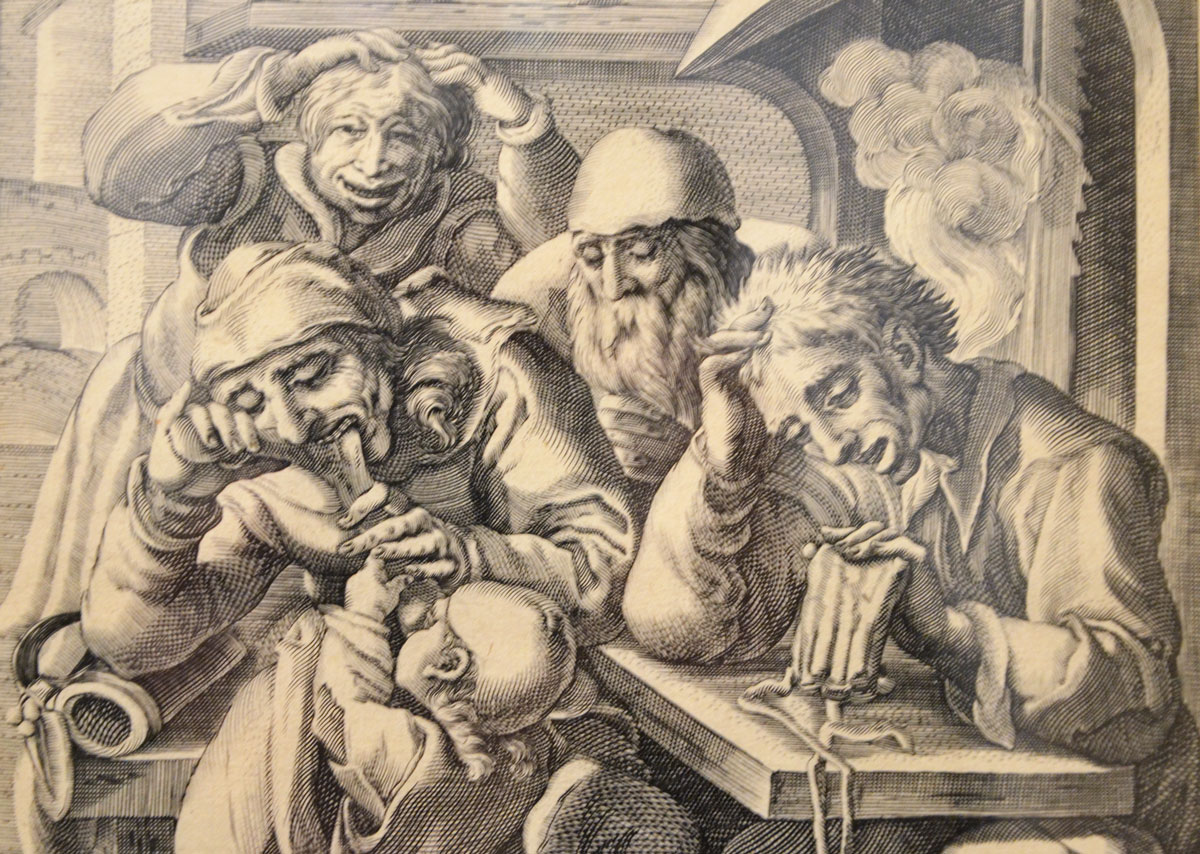
below: Engraving on paper, “Drunken Men at a Table” by Gillis Van Breen, Dutch, around 1600.
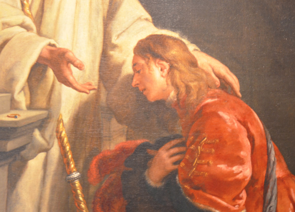
below: The last picture is obviously from a painting with a religious theme. Unfortunately, the photo that I took of the tag with the artist’s name is too blurry to read. I tried a google search on the image and the first hit was the Wikipedia page for Paul Bernardo. Oh dear, Google that’s a fail… apparently it’s similar to a figure in a painting by Bernardo Carbone who was a painter in the 1600’s. So Google put 2 and 2 together and got 17. Hopefully you (and I) don’t get many 17’s!