Archive for the ‘galleries’ Category

I was away for most of the month of May so I missed a lot of the annual Contact Photography Festival.  In the few days that I had to catch up, I visited a few of the exhibits.  One of these was ‘Nous ne somme pas des heros’ (We are not heroes) by Valerie Blass at the Allen Lambert Galleria in Brookfield Place.

two large cubes constructed from pieces of photos of different people in different positions sit in the middle of Brookfield Place, under the glass arched roof.

Blass arranged people in sculpture-like poses and then photographed them from different angles.  The photographs were then cut into sections, glued on blocks,  and then the ‘sculptures’ were re-assembled.

a large stack of blocks with black and white photos of people on them by Valerie Blass.

The subjects of the sculptures are anonymous.  Their “bodies fold inward, their differences intertwine and merge into single entities” (source).

photographs of the back of a person with another person sitting on his shoulders, upper person is leaning forward with head down, the blocks on which the photos are printed are in the walkway at Brookfield Place

bottom part of photos by Valerie Blass on a block at Brookfield Place as part of Scotiabank Contact photography festival, feet. Also the feet of people walking past.

small painting of a red headed woman torso, amrs, and head, in a gold frame on a wall with lots of other paintings, except on e is missing and there is a white sign saying why its missing

All kinds of thoughts went through my head as I stood and looked at this painting at the Art Gallery of Ontario (AGO).  A little ho hum and a little melancholy and a little well what next.  There were no new exhibits since the last time that I visited the AGO and quite a few galleries were being prepared for new showings (i.e. closed).   A little bit of that’s a waste of time.   Even here there’s a painting missing.  … no, it’s only a waste of time if I let it be.

I stood and studied her face, the expression on her face, the tilt of her head and one hand held up.  What was going through her head?  Was the artist trying to tell us something about her?  Or was he just playing with composition in a limited space?  And that’s when the game began – what expressions hang on the walls of the AGO?  A sample:


below: part of “Time Dissolve” created around 1992 by Carl Beam (M’Chigeeng Ontario 1943-2000) using photo emulsion, acrylic and pencil on canvas.

part of Time Dissolve, an artwork by Carl Beam. Old photo of a woman seated on the ground bRed letters saying my mother are written on the woman and a red circle is around the boy's head

below: manipulating a series of portraits by Will Gorlitz (b. Argentina 1952).  The paintings were done in 1984 and are called Genre IV, Genre XVI, etc.  Nameless.   Unless her name was Genre and he’s painted her 6 times (one of the paintings in the row is not included here).

a series of 5 women's faces hung in a row on the art gallery wall, paintings by Will Gorlitz

below: Two pieces.  A sculpture called  “Eskimo Mother and Child” (about 1938) by Frances Loring and the portrait “Bess” by Canadian painter Lawren Harris.   I have talked about Loring in a previous post.

a sculpture of a woman with a child on her back, called Eskimo Mother and child by Frances Loring. She stands by a painting by Lawren Harris called Bess which a portrait of a woman in a black hat and black coat

below: part of “Melancholy”, oil on canvas, by Hendrick Terbrugghen (The Netherlands, 1588-1629)

a painting of a young woman sitting, with her hand resting on her hand, elbow on table, lit by candle light, called Melancholy painted by Hendrick Terbrugghen

below: part of “Waitress”, oil on canvas, by Shelley Niro, 1986  (b. USA 1954)

a painting of a waitress wearing black glasses serving a plate of food to a surprised looking red head woman with green eyes, called Waitress, painted by Shelley Niro

below: Engraving on paper, “Drunken Men at a Table” by Gillis Van Breen, Dutch, around 1600.

engraving on paper called Drunken men at a table, by Karel Van Mander, done late in the 1500's

below: The last picture is obviously from a painting with a religious theme. Unfortunately, the photo that I took of the tag with the artist’s name is too blurry to read.  I tried a google search on the image and the first hit was the Wikipedia page for Paul Bernardo.  Oh dear, Google that’s a fail… apparently it’s similar to a figure in a painting by Bernardo Carbone who was a painter in the 1600’s.   So Google put 2 and 2 together and got 17.   Hopefully you (and I) don’t get many 17’s!

part of a religious painting of a young man in a red robe kneeling before another man in white who has one hand on the young man's shoulder.

This is a story about an exhibit that is showing at the Art Gallery of Ontario at the moment, “A Story of Negotiation” by Francis Alys.  The exhibit is a look at three of Alys’s large projects.  For each project there were many studies, notes, and sketches.  Drawings and paintings dot the walls and cover many tables.  There are three large videos to watch (not the ones shown below).  It is a fairly complex installation and only a small part of it is included here.

two women looking over a table with art displays on it , in an art gallery

below: In 2006 Alys tried to organize two lines of fishing boats, one from Florida and one from Cuba, that would form a bridge between the United States and Florida.  It was unsuccessful.  He repeated the project in 2008, this time between Spain and Morocco.

a young man is looking at two video screens that are mounted on the wall

a line of little sailboats on the floor, all parallel to each other, the base of the boat (hull) is a flip flop or sandal.

below: More on borders, pairs of words that depend on which side you’re on.
Words such as leave/return and us/them.

4 small green and yellow pictures on a pink wall

Alys also spent time embedded with British forces in Afghanistan.

a display of pictures, paintings, drawings, sketches, and notes as part of an art exhibit

below: Alys made a videos on kids flying kites in Afghanistan.  There was also a video of kids rolling a large reel of film through the streets and alleys in an Afghan city.

3 wood benches in front of a table mounted to a wall, art on the table, a video screen on the wall with a movie about kids in Afghanistan flying kites, some people in the background

below: Weapons made of found objects

in a yellow room with two small pictures hanging crookedly on the wall. A table in the middle of the room, glass covering artwork on the table. Sitting on the table is an automatic rifle (artwork) made of found objects

below: Instead of a round of ammunition, there is a reel of film. This is true in all of Alys’s ‘automatic rifles’ that are displayed here

close up of a sculpture of an automatic rifle where the round of ammo is replaced by a reel of film

a circle of art weapons, automatic rifles, made of found objects, with barrels all pointed inwards,

The exhibit continues at the AGO until April 2nd.

a little wooden human figure is doing the front crawl, one arm outstretched, on a bubble of clear plastic on a table top

Myseum of Toronto is a fairly new addition to the cultural fabric of the city.  It is a museum without walls.  It is an organization that helps deliver programming to different locations in the GTA.  Last night, March 6, at City Hall, Myseum of Toronto launched its second annual festival of events and exhibitions.  This festival, Myseum Intersections,  consists of 36 different events and exhibits spread around the city throughout the month of March.   “One Toronto.  Infinite Perspectives” is the motto of this year’s festival.

In keeping with that motto is an exhibit called ‘Cosmopolis Toronto: The World in One City’.   It was showcased at the Myseum Intersections launch party.   A few months ago it was on display at 18 libraries around the city but it has been brought together in one exhibit for the festival.   At the moment it can be seen on the ground floor of City Hall but it will also spend some time at Metro Hall and then end the month at the North York Civic Center.   (schedule at the bottom of the post).

people looking at an exhibit of photos and stories that are printed on upright posters standing on the floor.

“Cosmopolis” consists of a series of portraits and interviews by Colin Boyd Shafer.   The goal was to find a person from every country in the world who now calls Toronto home, hence its tagline “Photographing the world, one Torontonian at a time”.   I am not sure if that goal was attained, but the series is a fascinating look at a very diverse group of people.

Cosmopolis posters on display at City Hall as part of Myseum Intersections festival

Cosmopolis posters of Andrea from the Congo and Nevena from Serbia

Two photos were taken of each person.     The first was a portrait taken in a Toronto location where they felt “at home”.  The second was of an object that they felt connected them to their country of birth.

cosmopolis posters of immigrants to Toronto from different countries

The Cosmopolis website has more information as well as the portraits and stories of many more new Torontonians.

portrait and story about Yosvani from Cuba, a violin player

cosmopolis posters of immigrants to Toronto from different countries

***

EXHIBITION DATES & TIMES:
MARCH 5 – 8 & 13 – 19
MONDAY – FRIDAY, 8:30AM – 4:30PM
City Hall
100 Queen St W, Toronto

MARCH 9 – 12
MONDAY – FRIDAY, 7:30 AM – 9:30 PM
SATURDAY & SUNDAY, 8AM – 6PM
Metro Hall
55 John St, Toronto

MARCH 20 – APRIL 2
MONDAY – FRIDAY, 7:30AM – 9:30PM
SATURDAY & SUNDAY, 8AM – 6PM
North York Civic Centre
5100 Yonge St, Toronto

#myseumTO | #myseumX


There are four exhibitions at The Power Plant Contemporary Art Gallery at the moment.

One of the exhibits is “A Wall is just a Wall” by Kapwani Kiwanga. Here, a hallway has been transformed with pink and blue lights. If you walk down this hall, you’ll find an entranceway to another section of the gallery with more of Kiwanga’s work. The gist of the thought behind her exhibit is the affect that architecture and design (such as colour) has on the behaviour of those exposed to it.   It’s a bit disconcerting to walk through the lights – they affect your perception of space and make you feel a bit dizzy.  Or at least that’s what happened to me!

a hallway is lit in pink and blue lighting, covers all walls and ceiling too

Another hall.  Another exhibit.  This time, an installation by Latifa Echakhch called “Cross Fade”.   You can see it in the Fleck Clerestory which is the long, high hallway that runs down the middle of the building.  For the installation, the walls were painted light blue with white cloud shapes.  Chunks of the outer layer of plaster were then removed and pieces left on the floor.    The sky is falling!  I can just see Chicken Little running around.  The sky is falling!  But in this case, he’d be right.

When I first saw the installation, I only saw the lower portion and I assumed that it was a neglected wall.  It looks like many of the walls you find in lanes and alleys.  To me it represented the cycle of building and decay that plays out all around us.   I struggle with the idea that painting it to look like the sky changes how the piece should be perceived.  Are we supposed to be upset that the sky is broken and lying on the ground?  Is the use of the normal (plaster falling off a neglected wall) to try to show the abnormal (the sky falling apart) on purpose?  If so, to what purpose?

high walls in a narrow room, walls covered with plaster and painted light blue with clouds, some of the plaster is peeling away and it's supposed to look like the sky is falling . a large window is at the end of the room

below: Looking up towards the skylights.   It is more apparent from this angle that the walls are painted to look like the sky.   By the way, cross fade is the technique in sound or movie editing  where a picture or sound gradually appears at the same time as another disappears.

looking upwards to a skylight two storeys above, the walls of the narrow room (hall) are covered with plaster and painted light blue with clouds, some of the plaster is peeling away and it's supposed to look like the sky is falling

From the online description of the exhibit:  “…. Cross Fade evokes the remains of an action that has already taken place. Echakhch’s wall painting of the sky appears to be falling apart. Fragments of the sky still exist intact on the upper sections of the walls, out of reach, reminding us of its beauty. However, large parts of the sky lie on the ground, creating a peculiar feeling that something beyond our control is either happening or has just happened. The technique employed here references the classical fresco, a second skin that usually leads the viewer into a painted world, a trompe-l’œil, rendering the two-dimensionality of the wall invisible. On the contrary, Echakhch’s work shatters this illusion, rooting us in the present, which like a cross fade, is caught between the past and the future.”


Leaving the hall theme behind, the last two exhibits are:

below:  Part of “On Fishes, Horses and Man”  by Jonathas de Andrade

a room in an art gallery filled with posters of men hanging from the ceiling at various levels. All have the words museu do homem do noreste

below:  And “The One Who Keeps on Giving” by Maria Hupfield

art installation on a gallery ceiling of many light bulbs of different shapes and sizes hanging from a piece of wood on cords of different, but short, lengths.

All exhibits continue until mid May.

“Apparel oft proclaims the man” Shakespeare in Hamlet I iii.
or as Mark Twain said, “Clothes make a man”.

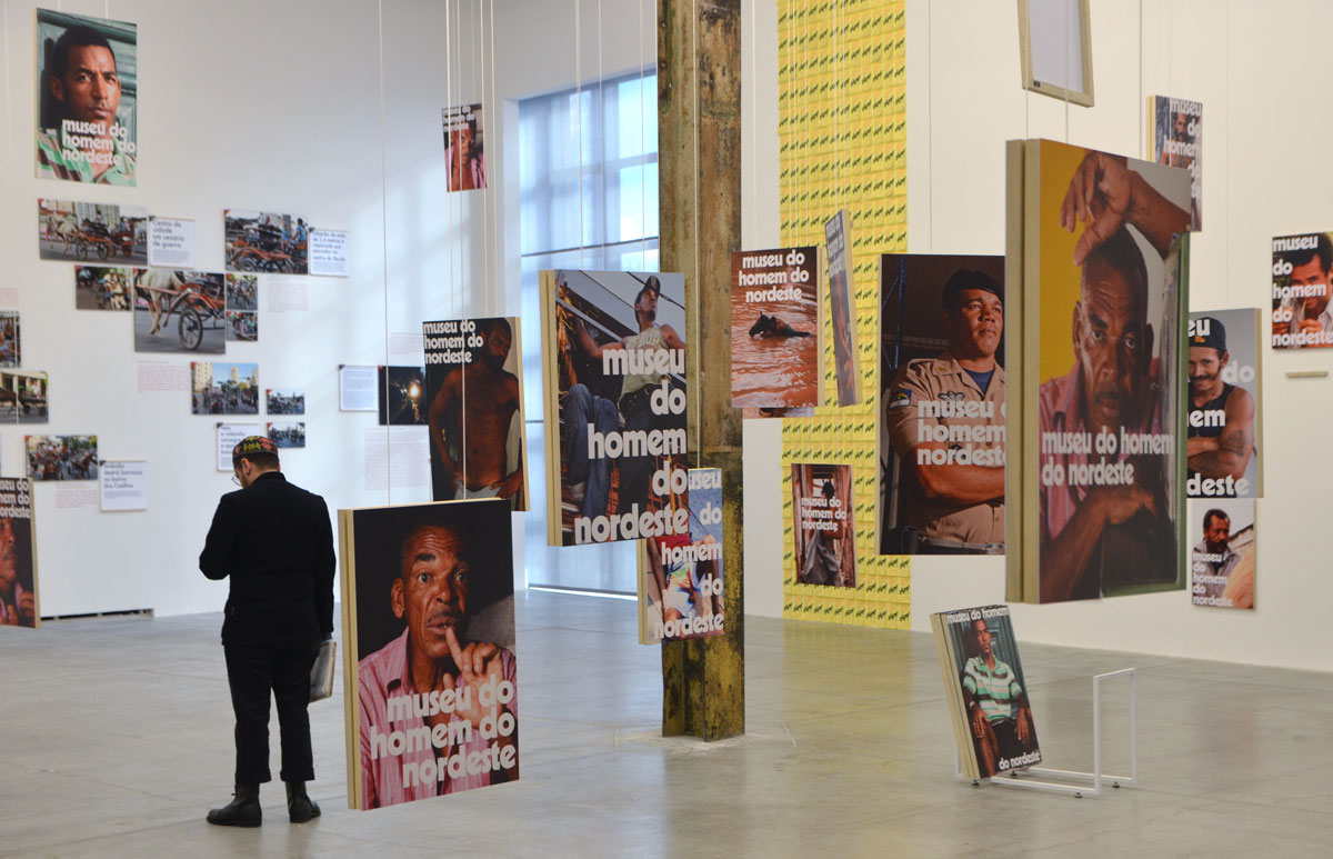
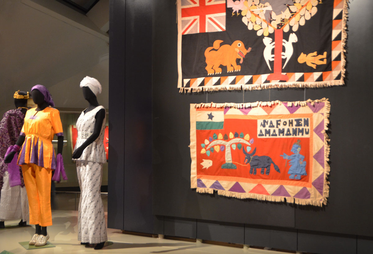
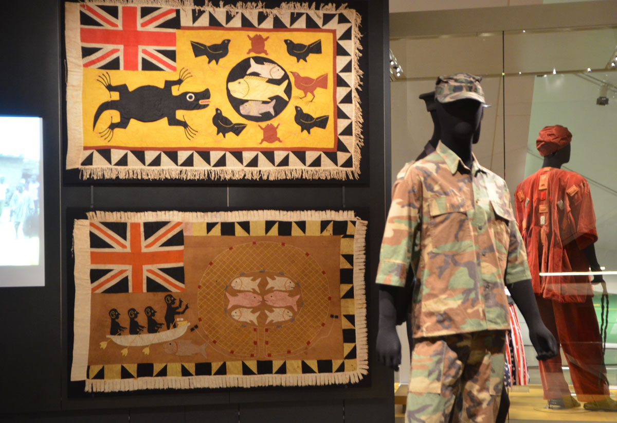
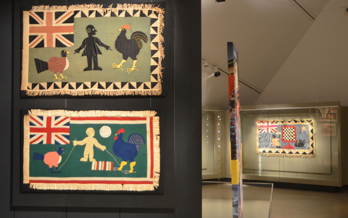
“Workware, Abiti da Lavoro”  is an exhibit at the Harbourfront Centre Art Gallery.  It is curated by Milan-based designer and artist, Alessandro Guerriero and co-produced by the Istituto di Cultura of Toronto and Triennale di Milano.  A lot of the artists who participated in the show are fashion designers

below: “Dress for a Crop-Raising Girl”, 2014, by Elio Fiorucci

a straw hat hangs with a dress made of green fabric, sleeveless, with two big shiny red hearts that would cover the breasts of the woman who wore it.

Some of the words on the wall – “Some time ago, the cowl did make the monk, the metalworker and the lawyer. Our clothes were the direct representation of our role in society and its related image. Originally, however, clothes were something else altogether. In the Biblical story of the apple, as He cast Adam and Eve out of Paradise, God made garments of skin to clothe them, saying, “Go but remember that you are just a man and that you need protection because you are limited.””

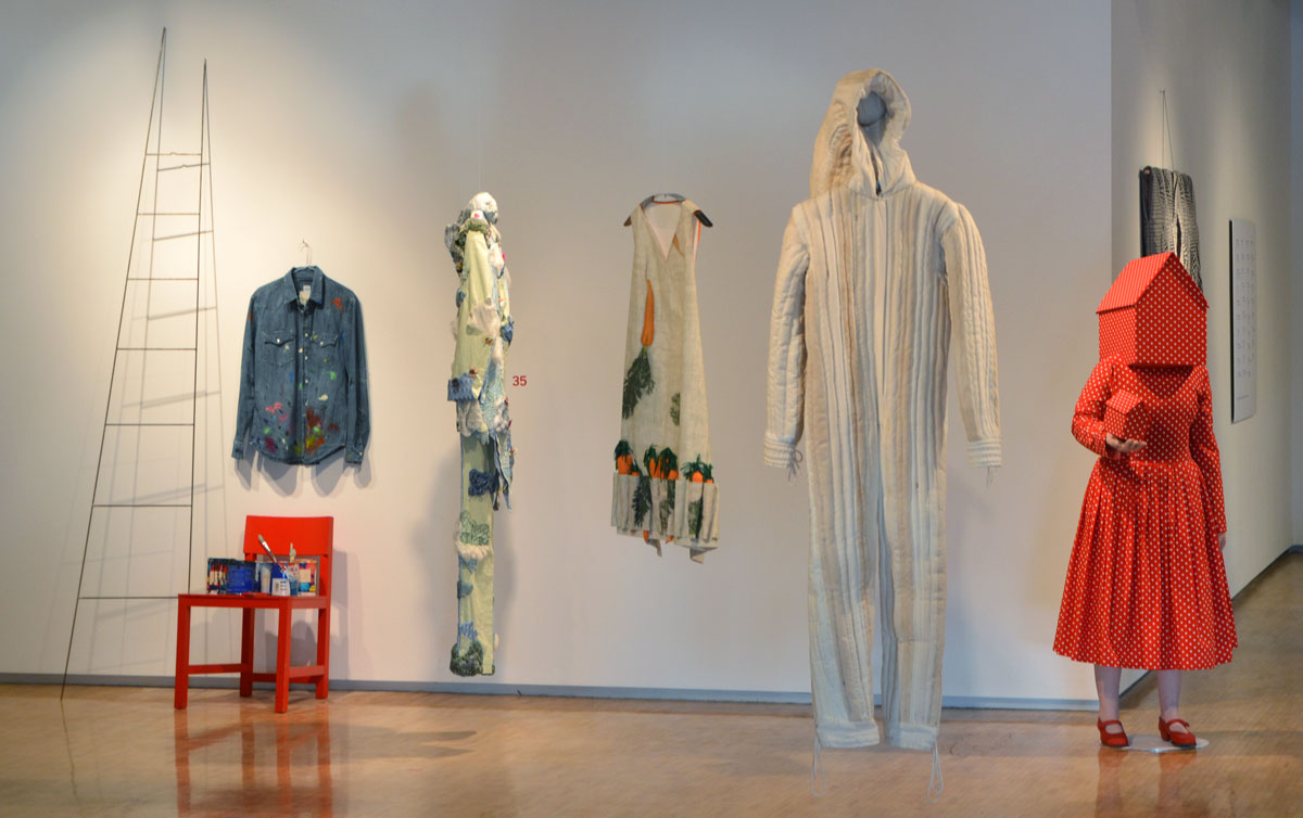
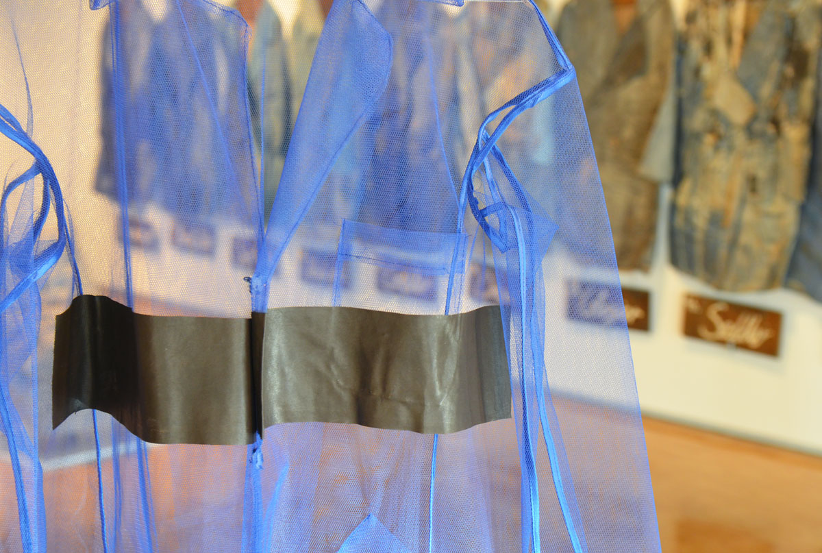
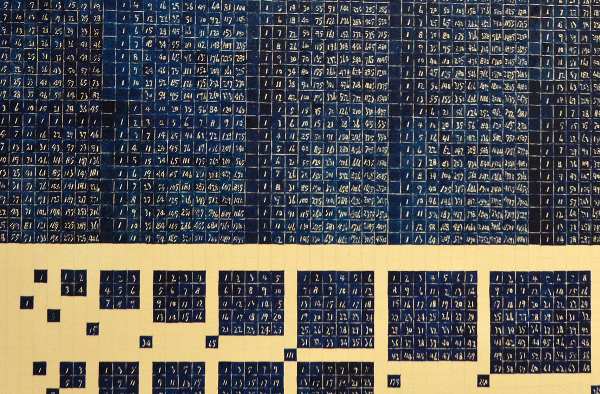
below: Hanging on the wall were a line of dirty work coats, each labeled with a job: cobbler, draper, glazier, saddler, carpenter, and hatter.    None of these jobs would have involved a coat that looked like this, i.e. that got messy in this way.

a row of dirty well used workcoats that used to be blue are hanging on the wall of an art gallery. under each one is a label with a job name, draper,

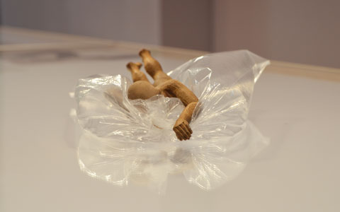
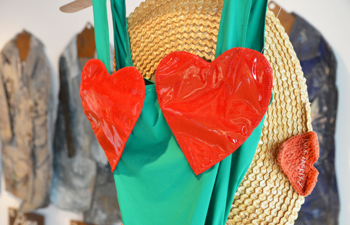
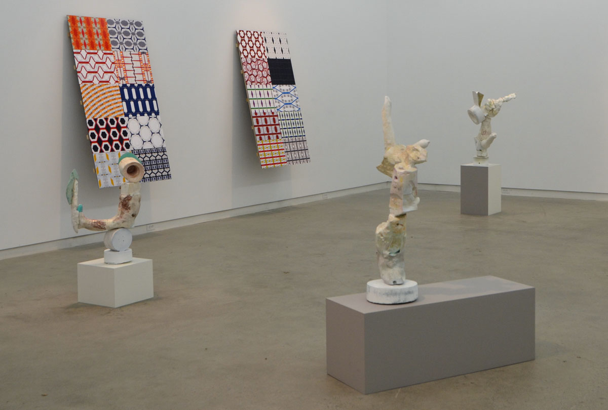
below:  left to right – “Work Shirt to Paint Dreams” 2014 by Alberto Aspesi, “Dreamers Clothes” 2014 by Angela Missoni,  “Clothes for a Carrot-Picking Girl, 2014 by Colomba Leddi,  and unfortunately two that I forgot to take note of.     The red dress is just so little red school house – so literal.  Not quite as literal as the carrots for the carrot-picking girl…. so if she’s finished picking carrots and wants to pick beans next, does she change into her bean dress?

a row of designer clothes as part of an art gallery ehbiti, a paint splotched covered blue long sleeved shirt, a red mid-calf length red dress with white polka dots with little red school house shaped head on the mannequin, and and holding a small red schoolhouse in her hand, a sleeveless dress with carrots in many pockets

More words on the wall – “This original garment was a gesture of love – protective as well as representative and foundational of the human condition. But as society rather than the sacred came to define the balance of power, these two meanings were upset so that clothing changed from being a mark of fragility into a social function and sign. Today, our individualism has once more changed its meaning making clothing an expression of the self.  It is now a way of disguising our thoughts and of giving them a new shape.”

I decided just to repeat the words verbatim.  I will let you decide their worth.  I just can’t do it.

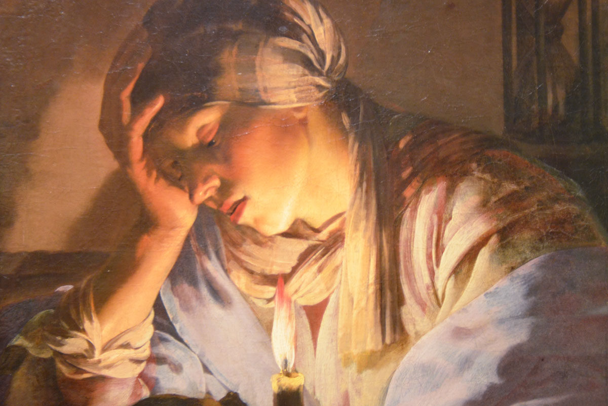
below: “Extreme Film, AW13 Collection”, 2013 by Issey Miyake

a mannequin in shiny gold pants stands with its feet apart, in between its feet are a pair of shiny gold boots

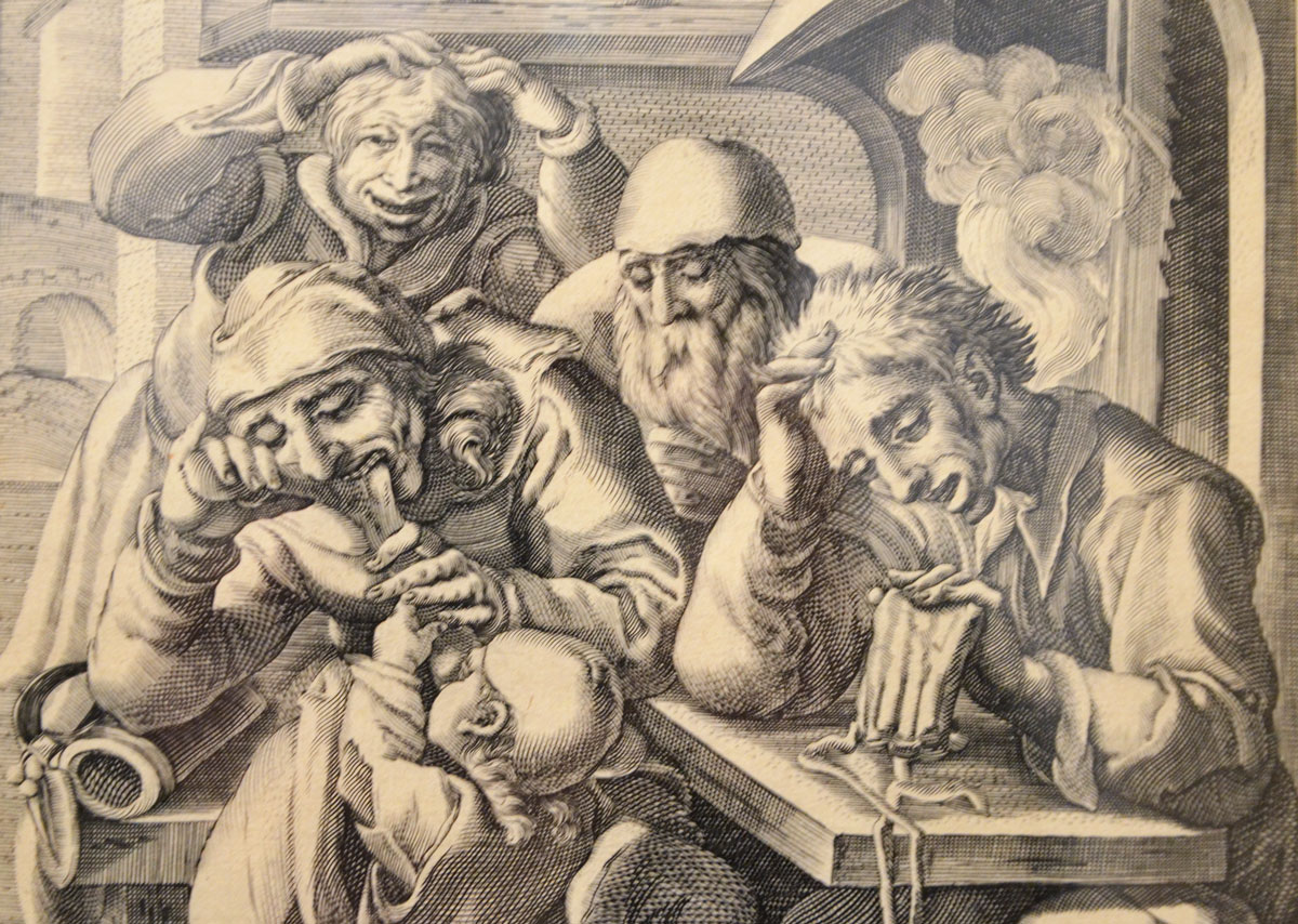
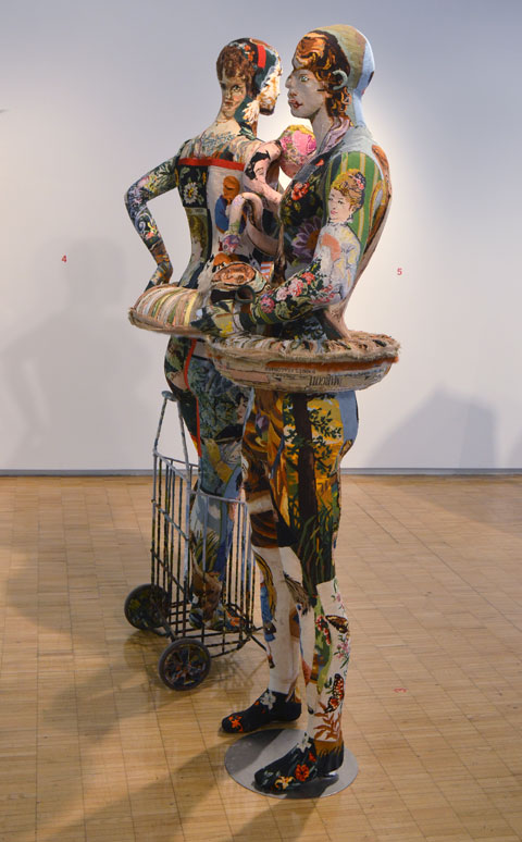
below: “Adam and Eve are Going Shopping in Costume” 2014, by Frederique Morrel.   Eve is standing in the shopping cart

two mannequins covered in patchwork of tapestry needlepoint with pictures that sort of match the anatomy of the mannequin.   The faces dont quite line up,   a man and a woman.  the woman is standing in a shopping cart

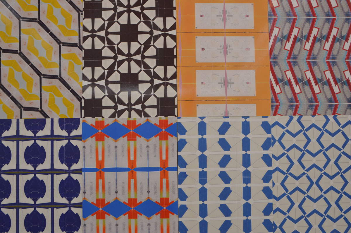
below: Some of  tapestry placements are just a little too literal.

 close up of part of a mannequin dressed in tight fighting fabric made of a patchwork of tapestry pieces. The piece shown in this image is of a brown cat

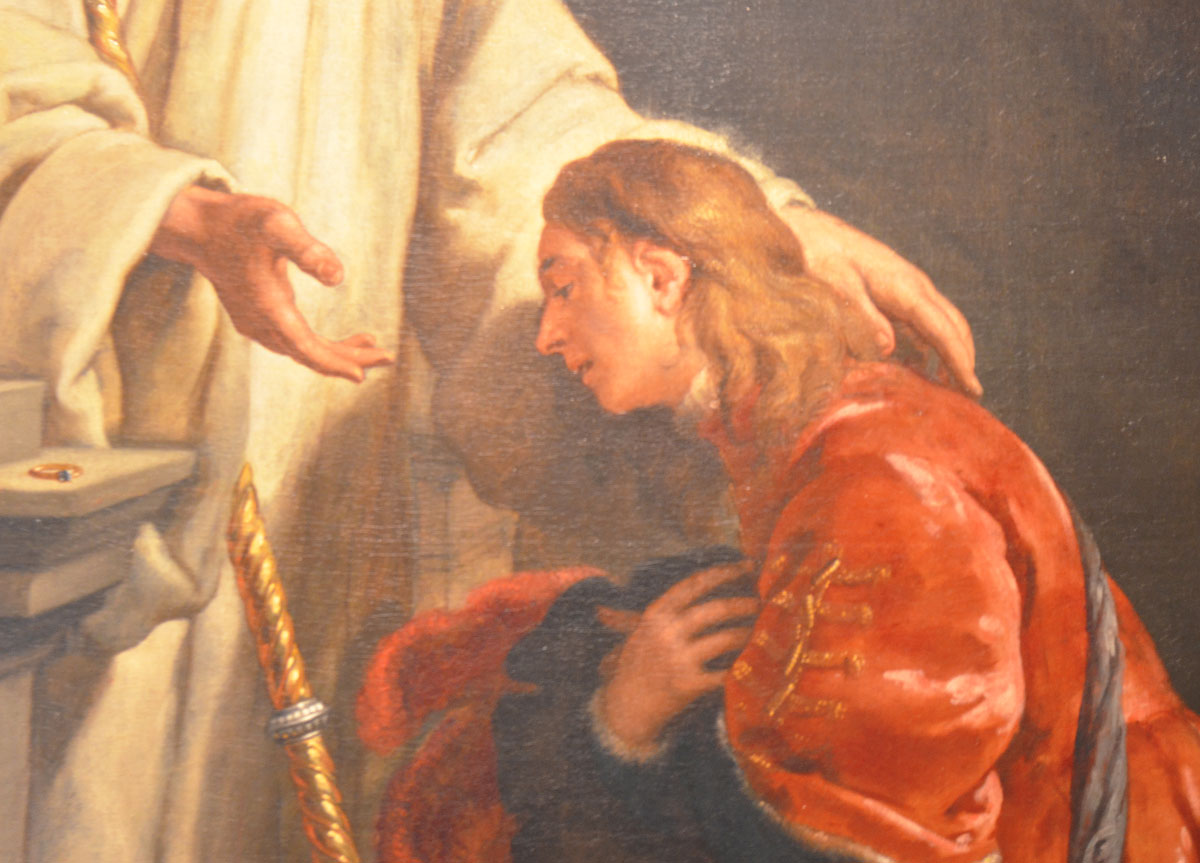
below:  “Clothes for a Dithering Monk” 2014, by Denise Bonapace.

black netting in the shape of a cross on a wall. within the cross is more black light weight fabric in the shape of a person whose arms in the horizontal parts of the cross.

below: Part of “Clothes for the Chaste Pornographer” by Gentucca Bini

a coat made of blue mesh hangs in front of a display of old dirty workcoats that are hanging on the wall

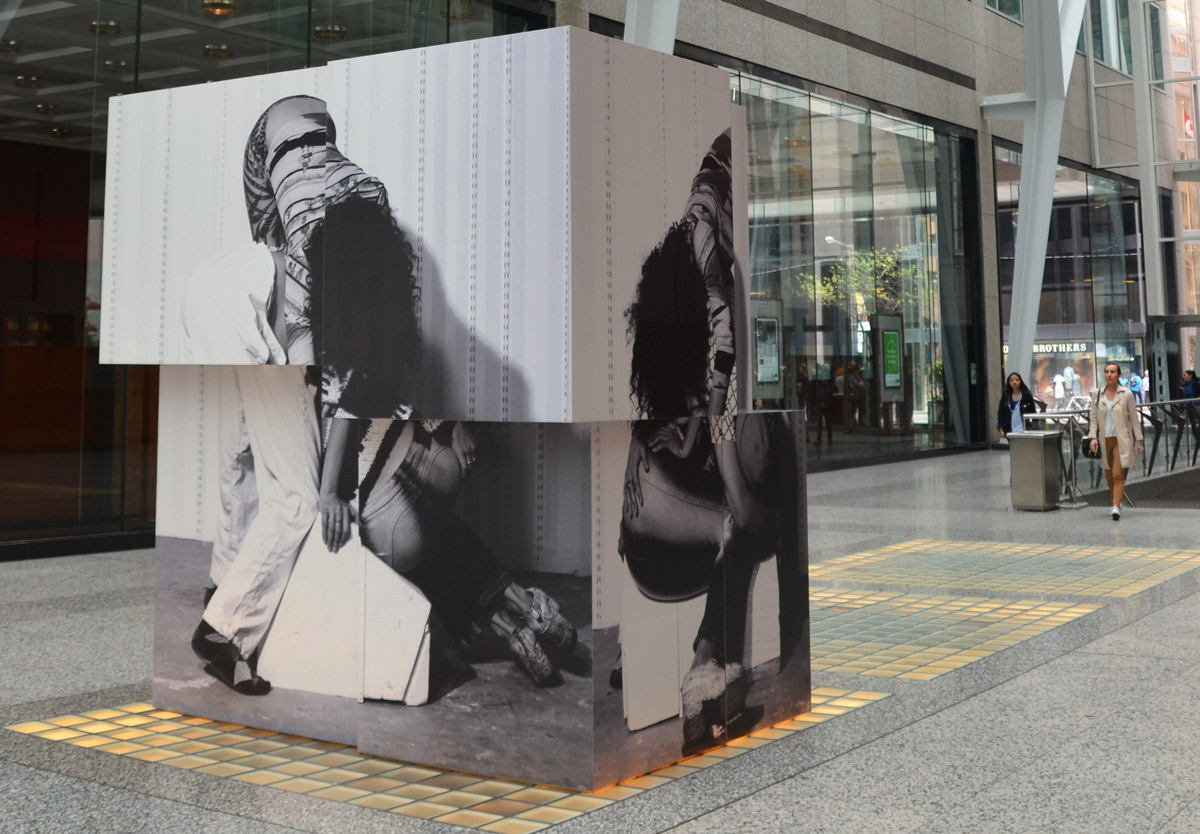
below: Close up of part of “Mirabelle Shining Star” 2014, by Melissa Zexter

part of a dress made of black and white pictures printed on fabric, and knitted squares in orange and red yarn

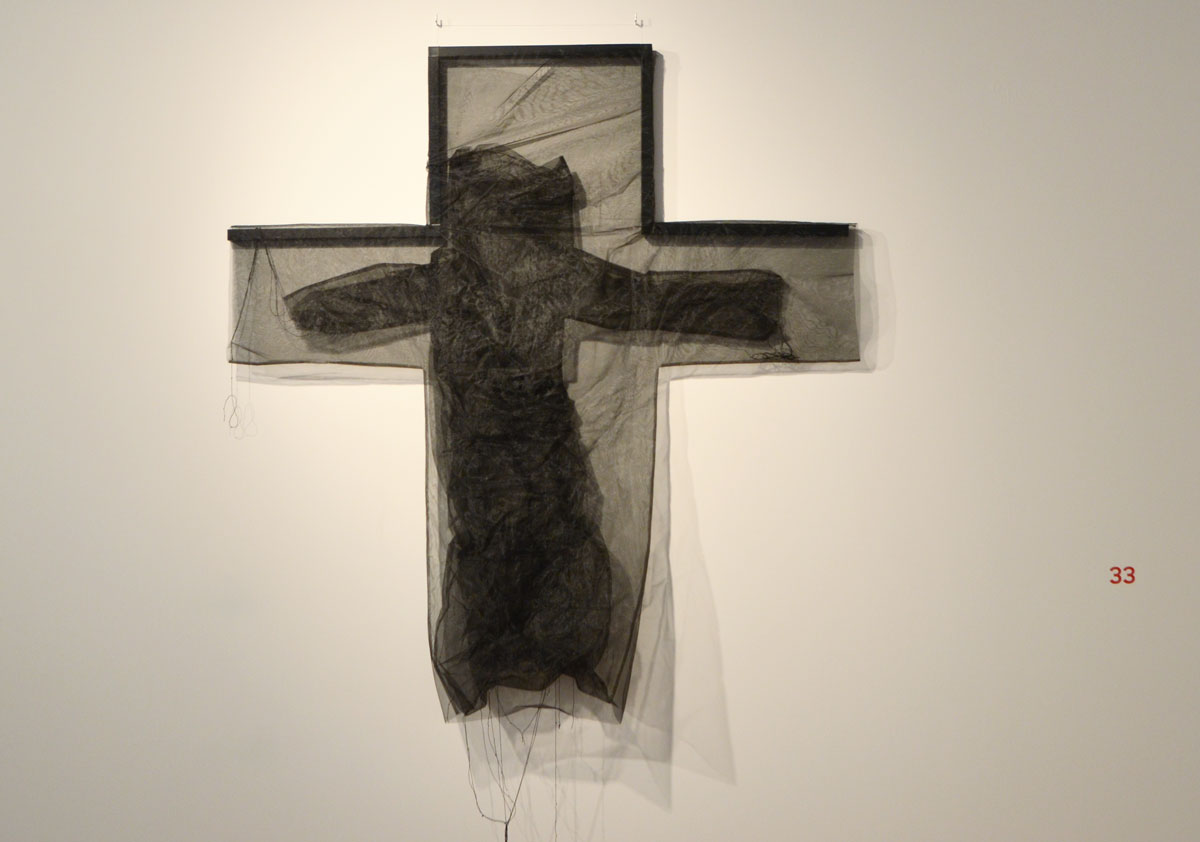
Last paragraph of the words on the wall – “This exhibition is not a display of “work clothes” but of garments for hypothetical, invented, coveted, imaginary jobs that actually invent new jobs for a new and different society. Today’s designers, including the 39 in this exhibition, work amid epochal changes – the decline of the myth of great masters and of the small factories of fine Italian design on the one side, and on the other, between the giant global entities of eastern virtual design and the complete subversion of centres of post-economic and post-industrial geography.  Nevertheless, there are those who attempt to discover new territories – empty spaces, experimental, staggering, radical and unknown. What would clothes look like not only for bakers, carpenters and tailors but also for an email eraser, a butterfly engineer, the one who looks for a needle in a haystack, a healer of the healthy, a survivor, or a quarreller?”

…. And now I think I am going to design an outfit for a ‘skeptical photoblog writer who has read too many words’.

Exhibit continues until 23 April

Keeping warm at the Art Gallery of Ontario.

Below are 5 works of art that I saw recently when I decided to spend the afternoon inside instead of walking in the cold.  The AGO is definitely a great way to stay warm!

below: There is a room at the Art Gallery of Ontario that is home to four large metal sculptures at the moment.  Large structural pieces. These creations are the work of Sir Anthony Caro (1924-2013).  They are made of discarded metal pieces.  At one point in his career, he made scale models for a giant art project for Park Avenue in New York City.  When the project was cancelled, he took apart the models and used the pieces to make a new series.  Three of those on display here are from that series, ‘Sculpture Laid Bare’.  It would be interesting to see what the Park Avenue sculpture models looked like.

a woman with long hair walks away from a large metal sculpture made of cast off pieces of metal, on display at the Art gallery of Ontario,

In the early part of his career, Caro made modeled figurative pieces cast in bronze.  In the 1960’s he started to use prefabricated steel and aluminum, sometimes in bright colours such as the example below:

red sculpture by anthony caro, metal, 4 upright cylindrical tubes with metal mesh forming an X on top of them.

Red Splash, by Anthony Caro. Image found online at source.

If they were outside, they would invite interaction.  Touch them.  Climb on them.  In this gallery setting, there is a no touching policy.   The words on the wall says that: “He [Caro] meditates on the passage of time, processes of decay, the painful realities of aging, and the future of modern sculpture.”  Isn’t that why the gallery is doing their best to preserve them just the way they are?


below: ‘The Distinctive Line Between One Subject and Another’ by John McEwen, 1980.  Two steel wolves looking at each other across the room.  On the wall behind the wolves is ‘Folia Series #1 and #2 by Nobuo Kubota, 1976, representations of the wrinkles on the cerebellum in the brain.

two metal sculptures of life sized wolves looking at each other across the room, a large panel art work is on the wall behind them, half black and half yellow.

John McEwen is a Canadian sculptor.  A number of his sculptures can be found around Toronto.  He designed the boat hull like shapes for the Victory Peace memorial on the waterfront that I mentioned in a previous blog post – down to Coronation Park.  The three metal tubes outside the Air Canada Centre – the Searchlight Starlight Spotlight – are also his work.


below: More lines, this time its “Aforim” by Rita Letendre, 1975.  Which lines are parallel?  Is there a horizon line?  If so, which one is it?

horizontal lines, some parallel and some at slight angles, in blues and greys, painting on a gallery wall called Aforim by Rita Letendre


… And lastly, another reference to structure.  But not structure in the 3D, physical form, sense of the word.  Instead, it is a painting called ‘Number Structure II’ by Canadian artist Kazuo Nakamura (1926-2002).  Nakamura graphs out number-structure patterns and calculations and presents them as art.

below: One of the structures that Nakamura used was the Pascal Triangle.  This image shows the first 6 lines of the triangle.  Each number is the sum of the two numbers above it.  Can you figure out what the next line would be?   When expanded, it contains many number sequences and can be used to answer probability questions – as well as other mathematical things that I don’t understand.

the top 6 lines of pascals triangle, a mathematical structure of numbers

below: A small (maybe 1/8th) section of the painting … which unfortunately doesn’t give you much of an idea as to the composition of the artwork.  It does though give you an idea of the detail.  Some of the parts that I have omitted are triangle shapes that conform to Pascals triangle as pictured above.   Is it mathematics?  Is it art?  Where do you draw the line between the two?  Is there a line?

a detail picture of a painting by Kazuo Nakamura called Number Structure 2 which is based on Pascal Triangle. Lots of numbers written in white on blue and black background. the background is made into rectangles, squares and triangles.

It’s the kind of painting that a photograph can never do justice to.  It’s best seen in person.   Oh yes, the answer to the question above:  The next line of the triangle would be: 1, 6, 15, 20, 15, 6, 1.

If By Dull Rhymes
an exhibit by David Armstrong Six and Kristan Horton
Clint Roenisch Gallery, St. Helens Ave

 Dull rhymes may not be the best title as there was nothing dull about the exhibit.

This exhibit  features two Canadian-born artists.  The sculptures that you see are by David Armstrong Six.  They are playful mashups of broken and cast off pieces and many resemble the human form in one way or another.  You can imagine them dancing around the room when the lights are off and everyone’s gone home.   For now, their dance is frozen in time as they await tonight’s revelry.  The two works on the wall are by Kristan Horton.

artwork by David Armstrong Six (sculpture) and Kristan Horton (prints on the wall) at the Clint Roenisch gallery - three sculptures and two pieces on board on the wall

below: Close up of one of the panels.   Details.  Eye catching.  Mesmerizing. Geometric Patterns.  Each section is made with a single part of a piece of packaging that has been manipulated (rotated, flipped, etc) to make a repeating pattern.

eight different patterns made with labels that are displayed side by side.

below: Here you can see the barcode from a box of something.  The number 2729 appears with the barcode – sometimes it in the ‘correct’ orientation and sometimes it’s the mirror image.

close up of the patterns made with different labels and barcodes by Kristan Horton

artwork by David Armstrong Six (sculpture) and Kristan Horton (prints on the wall) at the Clint Roenisch gallery - close up of one of the sculptures, it looks like a face, head, body and outstretched arm, patterned artwork on the wall in the background.

This is only a sample of the works on display.   There is a lot more information on by Kristan Horton‘s website.  I haven’t found a website for David Armstrong Six, but there are images of some of his other work online if you are interested.

artwork by David Armstrong Six (sculpture) and Kristan Horton (prints on the wall) at the Clint Roenisch gallery - one sculpture on the floor and one panel on the wall. The panel is a 10 sections, each section is a different pattern made of labels from packaging.

The exhibit is only on until the 17th of December.

You’ve probably never heard the word asafo before.  You probably have no idea what it means.

Until last week I didn’t know the word existed either.

I went to the Royal Ontario Museum to see the Wildlife Photographer of the Year exhibit.  There were 100 excellent pictures of insects, animals, marine life, the sort of thing you’d expect.  There was no photography allowed in that exhibit so I have no photos of the images on display.  You’ll have to take my word for it that I was there.

I can appreciate the skill and patience that it takes to capture rabbits in the snow or a school of fish in a certain light underwater but those kind of pictures don’t excite me.   That’s not to diminish the work of the photographers, it was all very high caliber both technically and visually.    What I think I’m trying to say is that I left the exhibit wanting more, something more from my visit to the ROM.

Luckily I didn’t have to look far.  In the next room was Art, Honour, and Ridicule: Asafo Flags from Southern Ghana.

museum exhibit of asafo flags from Ghana, colourful flags of militia groups in yellows, reds and black. Many are hanging in display cases.

Colour, lots of colour.  And a subject that I knew nothing about, asafo flags.  I wasn’t even sure what part of Africa Ghana is in (It’s on the south coast of Western Africa between Togo and the Ivory Coast as it turns out.).

The flags are hand made with an assortment of different motifs.  The British Jack in the upper left corner is a very common feature.  That’s a clue.  Yes, Ghana was a British colony.   Reading the history of Ghana is like reading the colonial history of large parts of Africa.  The Portuguese built a fortress at Elmina in 1482.    Interest in the region was piqued by the presence of gold, hence the name Gold Coast.   By the early 17th century the first African state,  Akwamu, controlled an extensive part of the coast.  They were displaced by the Ashanti who were very involved in the slave trade, especially in trading slaves for weapons.   When European countries outlawed trading in slaves in the early 1800’s,  Ashanti power suffers.   Some tussles ensue, a few battles, some back and forth, and by 1902 what was Ashanti becomes is a British colony.    It remained a colony until 1957.

close up of a flag, hand made, British Jack in the top left corner, a man walks in front of a church in the center, a black bear in the top right.

I’m not going to pretend to know or understand African history.  I’m only trying to give some context to the flags.    First, jump back to my mention of Elmina and the Portuguese. When the Portuguese arrived in this area in the 15th century, it was the Fante (or Fanti) people that they encountered.  Both the Fante and the Ashanti belong to the Akan people.  The Fante prevented them from venturing inland and leased properties for Portuguese trading missions. But when the Portuguese objected to Fante rules and regulations the Fante expelled them.  Soon after, the Dutch arrived.  The Fante served as middlemen in the commerce between the interior and Dutch traders on the coast.

Around 1724 the Dutch either established or made important a number of militia groups of local Fante.  These are the Asafo companies.  Historically, Asafo companies were in charge of the safety and protection of the local community.   At the height of the slave trade they protected individuals and communities.   They exerted power, exercise political influence and maintain codes of conduct within Fante communities. Each company has a flag and that flag has many roles.   They represent proverbs and depict narratives of pride and wisdom.  They accompany oral history and provide a means to preserve customs and traditions.

below:

  1. top flag, by Kweku Kakanu, Saltpond Workshop. “Only a brave man goes under a large tree” because only large animals go under large trees. Made sometime between 1950 and 1957.
  2. bottom flag, artist unknown, Kromantse Workshop. “Only tie a bull to a large tree”. Both the animal and the tree are acknowledged to be strong and mighty.  Made around 1980.  It has a Ghanese flag in the top left corner.


two flags displayed on a black background, with three femail mannequins dressed in traditional Ghanese costume.

below:

  1. top flag, by Kweku Kakanu, Saltpond Workshop. A crocodile dominates and controls a pond of fish. Made around 1940.  The prey can not escape.
  2. bottom flag, by Kwesi Budu, Saltpond Workshop. The fish cann’t escape the net of the fishermen just like enemies will not be able to escape when confronted by the company.  Made around 1950.

two flags displayed on a black background, with two male mannequins dressed in military Ghanese costume.

Fante asafo flags from Ghana, two on display in a museum, chickens and roosters,

Fante asafo flags from Ghana, two on display in a museum, griffons

two mannequins in military uniforms as part of a museum exhibit at ROM


Patricia Harris Gallery of Textiles and Costumes,
ROM, 4th floor,
until March 2017.


me a visitor, a looker, and and a skeptic.

I happened upon a gallery yesterday, the Robert Kananaj Gallery, on the second last day of a show by Oscar Figueroa called ‘me a talker’.    As I type this, the show should be wrapping up.  So you’ve missed it.  I’m not sure what you’ve missed.

below: The paper that is half on the floor and half propped up by the wall has the words “Think Less With Me” written on it.  This summarizes a lot of Figueroa’s work in that it is a rejection of the verbose and often jargon filled ‘artist statements’ found in contemporary art and especially conceptual art where the words on the wall are more important than the technical or visual aspects of the work.   The gallery website says this: “What if instead of a logical artist statement we decided to write thoughts, or sentences, that go through our heads when making art. This is not poetry per se, this is a form of idea communication, just as the conventional artist statement was intended.”  Does it make you wonder?

walls of a n art gallery with some of the work of Oscar Figueroa. A projection of a woman's chest in a bikini top, a piece of brown cardboard with the words 'Make me wonder' and a piece of paper, large white paper, half on the floor and half propped up on the wall that says

I want to cheer him on for trying to reject the overthought concept behind art these days.  I appreciate the fact that he does not confront me with an essay that bears no relationship to the artwork.  But all is not well.  He wants us to think that his art is special because he rejects the mainstream thinking. Too bad it also rejects all attempts at, well, everything.  The gallery looks like a space that someone has just moved out of but neglected to take their garbage with them.

a piece of paper with a happy face drawn on it, with ampersands for eyes, and a single red light bulb hangng from the ceiling and stopping just above the paper.

below: A yellow rubber glove taped to the wall, a happy rock on floor.  Does it talk to you?

a black happy face scrawled on a piece of paper, a yellow rubber gloved taped to the wall that is holding the paper. A small rock on the floor with a happy face painted on it.

I found it all rather depressing.   There could be more to it than this.  No, make that: there should be more to it.

blog_britney_spears_athiest

below:  him: “Be a sidewalk or be a balloon, there’s no fucking difference.”
me: Be a piece of art or a piece of garbage, there’s no fucking difference.

4 pieces of art in a gallery. a white happy face on black paper, a shiny piece of paper with a corner ripped off with the word picturesque written on it.