The fifth floor of the Art Gallery of Ontario is devoted to contemporary art.
Three of the present exhibits are best described as conceptual art. Conceptual art is art where the idea is more important that the look. The story behind the work trumps aesthetics.
This blog post has taken me many days to write as I struggle with the love hate relationship that I have with conceptual art. My biggest complaint about conceptual art is that skill too often gets thrown out the window; God forbid that something like artistic merit should impede the artist. I can empathize with causes and I can support ideas without liking the end product. In other words, just because I don’t the ‘art’ doesn’t mean I don’t “get it”.
Anyhow, on to the exhibits.
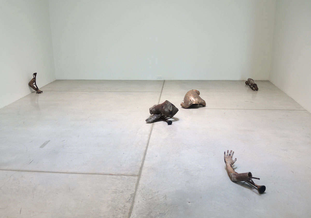
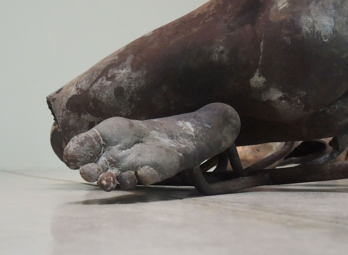
First, ‘Gustav’s Wing’ is an exhibit by Danh Vo, a man born in Vietnam but raised in Denmark. Using his nephew as a model, Vo had a bronze of cast of the boy’s body made in six pieces. The pieces are then arranged within a room. “The resulting installation gives a fragmented and evocative portrait of a boy whose Danish and Vietnamese heritage echoes that of the artist, but who represents the next stage in the family’s story – that of the first-generation Danish citizen”, according to the description of the exhibit.


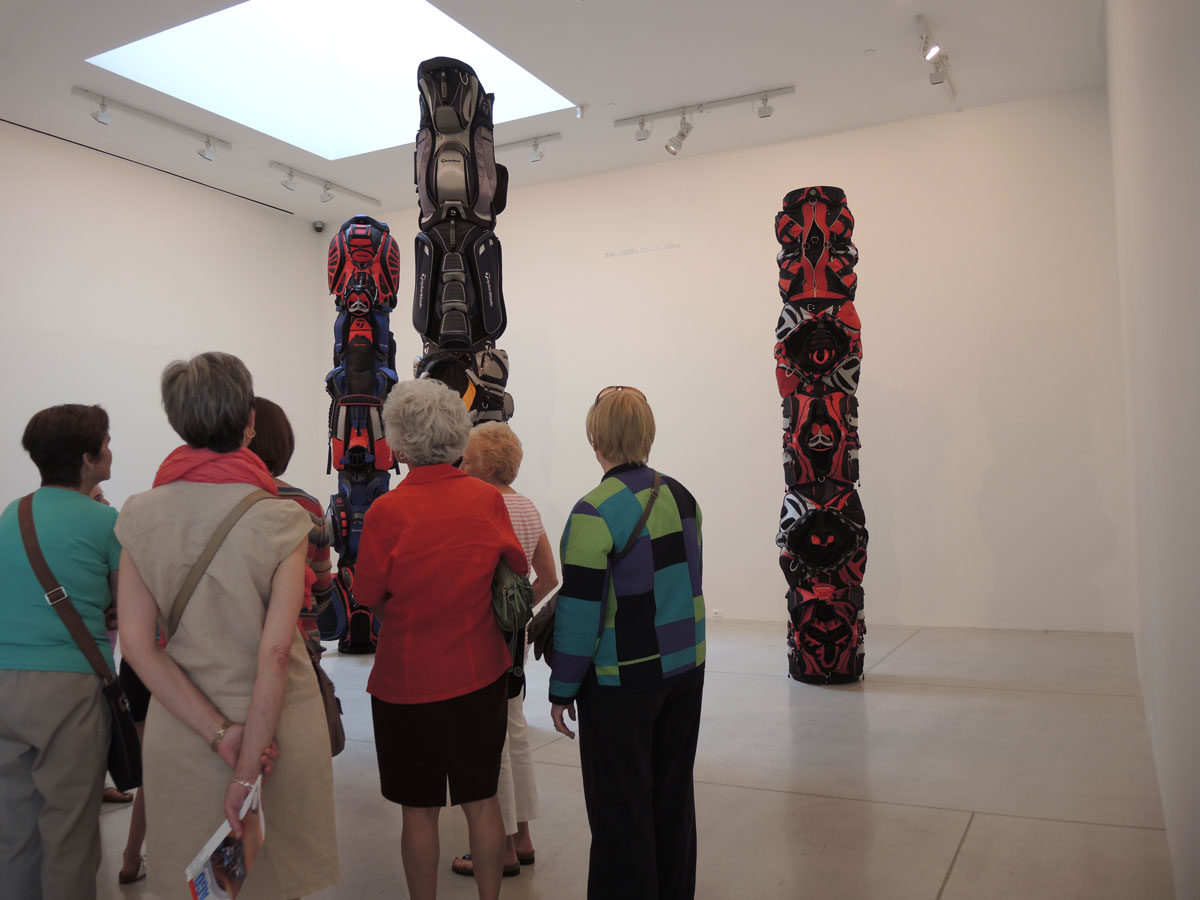
Second, there are three totem poles by Brian Jungen entitled ‘1960’, ‘1970’, and ‘1980’. All three were made in 2007. The words in the artist’s statement about this piece say “The towering works recall the complex social and political tensions that can result from First Nations land claims.” Part of the artist’s reasoning is that golf courses are manicured and their use is quite different from the way land is used by First Nations.

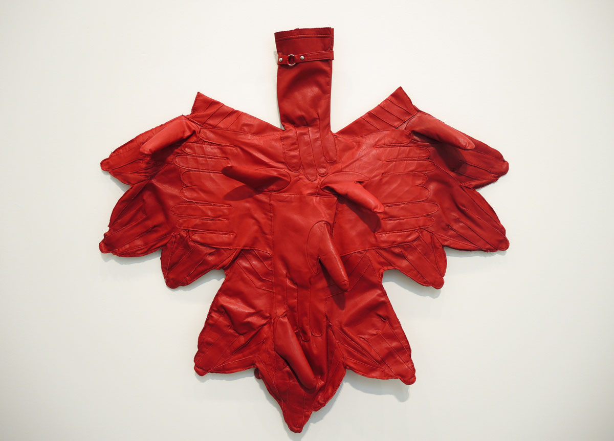
below: Anther piece by Brian Jungen, this one is called ‘Wieland’ and it is made of red women’s leather gloves. It is supposed to be an upside down maple leaf, i.e. a Canadian symbol turned on its head. When I first saw it, I saw an eagle with its wings spread but maybe that’s just me.
The words on the wall for this piece: “Its title celebrates Canadian artist Joyce Wieland (1931-1998) whose work in the 1960s and 1970s proposed a gendered patriotism in which indigenous art and culture were given only tokenistic inclusion. With Wieland, Jungen positions himself as part of and against an established narrative of Canadian art history.”
In Wieland’s opinion Canada was female I guess that that is what “gendered patriotism” means. Otherwise, you will have to figure this one out for yourself.

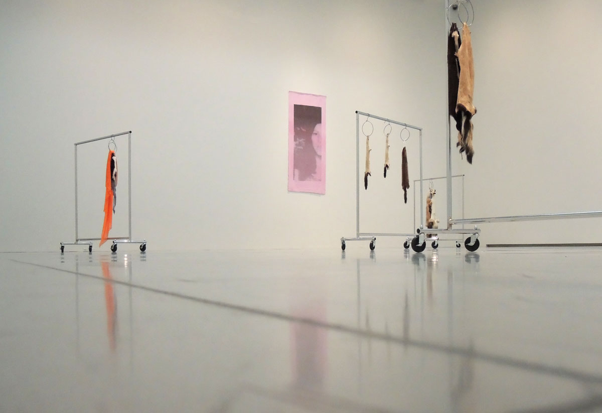
Lastly, there is an installation by Duane Linklater. Each garment rack is piece and they have names like “My brother-in-law, my sister” and “The marks left behind”. Furs of different animals such as fox and skunk hang from the garment racks. One has an old T-shirt and one has a piece of orange fabric. “The evocative titles of the pieces speak to family ties, articulating a sense of personal loss” according to the description of the work found on the gallery wall.


The two pink pictures on the wall are each a half of a portrait of a woman called Anna Mae Aquash who died in 1976. Together they form ‘Family Photograph’. Aquash was a Miqmaq woman who was involved as a “radical activist” in the American Indian Movement of the early 1970s. She was murdered. If you read the description of the work on the gallery wall, you will read these words: “By including her image, Linklater expresses a sense of familial connection with Aquash and establishes a symbolic relationship with the previous generation while asserting himself in the present. ” Pardon?
The words on the wall don’t tell you that she was murdered by her own people because they thought she was an FBI informant. So what relationship is the artist trying to establish? How does this even remotely lead to “asserting himself in the present”? Sorry, but empty jargonish words leave me cold. This isn’t art. Linklater may have a valid idea but that doesn’t make it art.